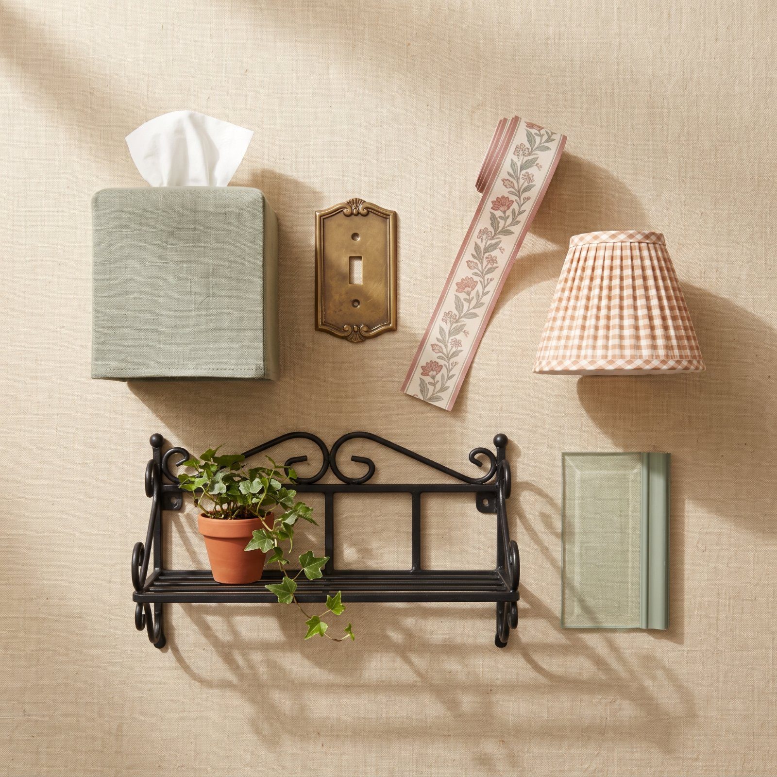
The tissue-box cover was a punchline for twenty years. Now it sits on a design editor’s nightstand in slubby Belgian linen and nobody is laughing. Funny how that works. The decade that gave us balloon valances and mauve everything turned out to have better bones than its reputation suggested — and what’s crawling back out of the time capsule isn’t the full 1990s, thank goodness. It’s the ideas underneath, stripped of the fuss and rebuilt in better materials with a lighter hand. The ones below are cleaned up, and genuinely worth a second look.
Please note that some of the images in this article were created with the assistance of AI.
46. Tailored Fabric Tissue-Box Covers in Linen and Chintz
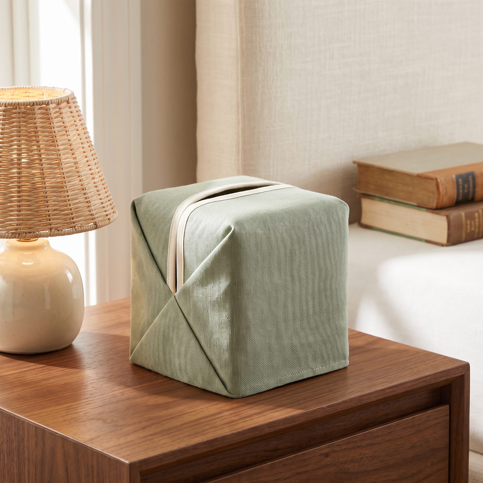
Nobody admits this, but a disposable cardboard box on your nicest nightstand is a small act of surrender. The fabric cover solves it, and the new ones have grown up. Skip the ruffled quilted versions your aunt had — look for tailored linen with mitered corners, a slim chintz pattern, or a slubby weave that reads like a cushion rather than a craft project.
They cost almost nothing to make, and they hide the one object in a well-styled room that always looks temporary.
45. Ornate Metal and Ceramic Switch Plates
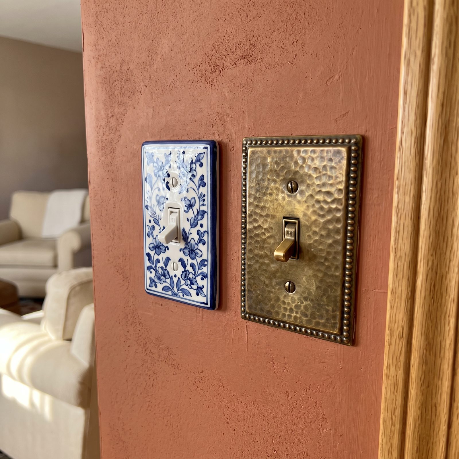
You redo the whole wall and leave the switch plate as a beige plastic rectangle screaming builder-grade. It’s the detail everyone’s eye snags on without knowing why.
The 1990s loved an ornate cover, and the good instinct is back: hammered brass, hand-glazed ceramic, pressed-tin patterns. A set runs a few dollars a plate and takes a screwdriver and five minutes. No cheaper upgrade exists in a house. Call it the earring on a plain outfit — the thing that signals someone chose it on purpose.
44. Narrow Wallpaper Borders Used as Architectural Trim
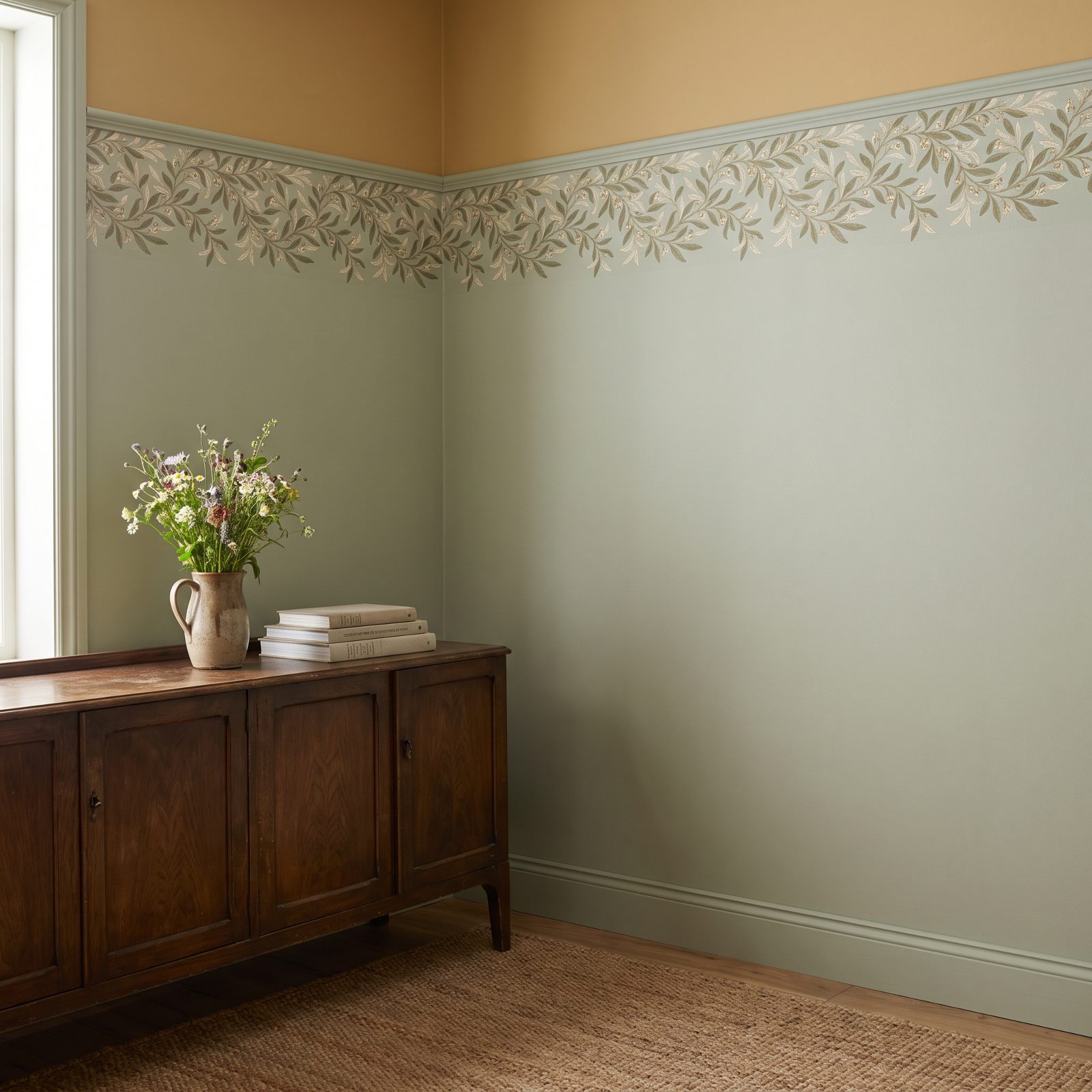
The 1990s border got a bad name because people ran it everywhere. Kitchen, bath, bedroom, all at once, usually with ivy. Used like that, it dated instantly.
The revival treats it as structure instead of decoration. A single band at picture-rail height to lower a too-tall ceiling. A clean horizon line where two paint colors meet. A frame around a doorway that has no real molding. Narrow geometric and botanical bands are now doing the job trim used to do in houses that never got any. One strip, placed with a reason — that restraint is the whole difference.
43. Hidden-TV Armoires Reborn as Screen Cabinets
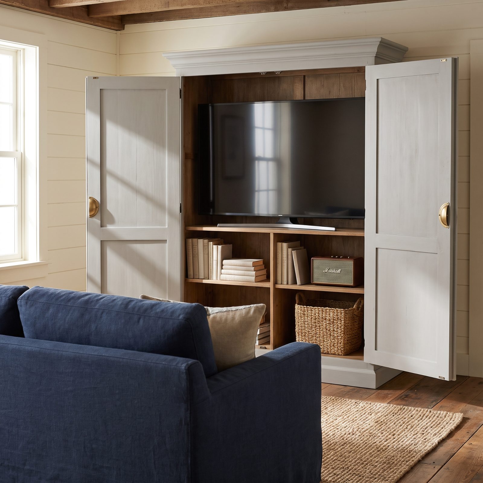
The old entertainment armoire was built for a tube TV the depth of a microwave, so most got hauled to the curb when flat screens arrived. Now the idea is useful again, because a 65-inch black rectangle dominates a room whether it’s on or off.
A modern version closes its doors and the screen vanishes, so the furniture becomes the focal point instead of the blank glass. Antique ones are cheap right now precisely because everybody dumped them, and a shallow retrofit for cords is an afternoon’s work.
42. Balloon Shades in Lighter, Less Fussy Fabrics
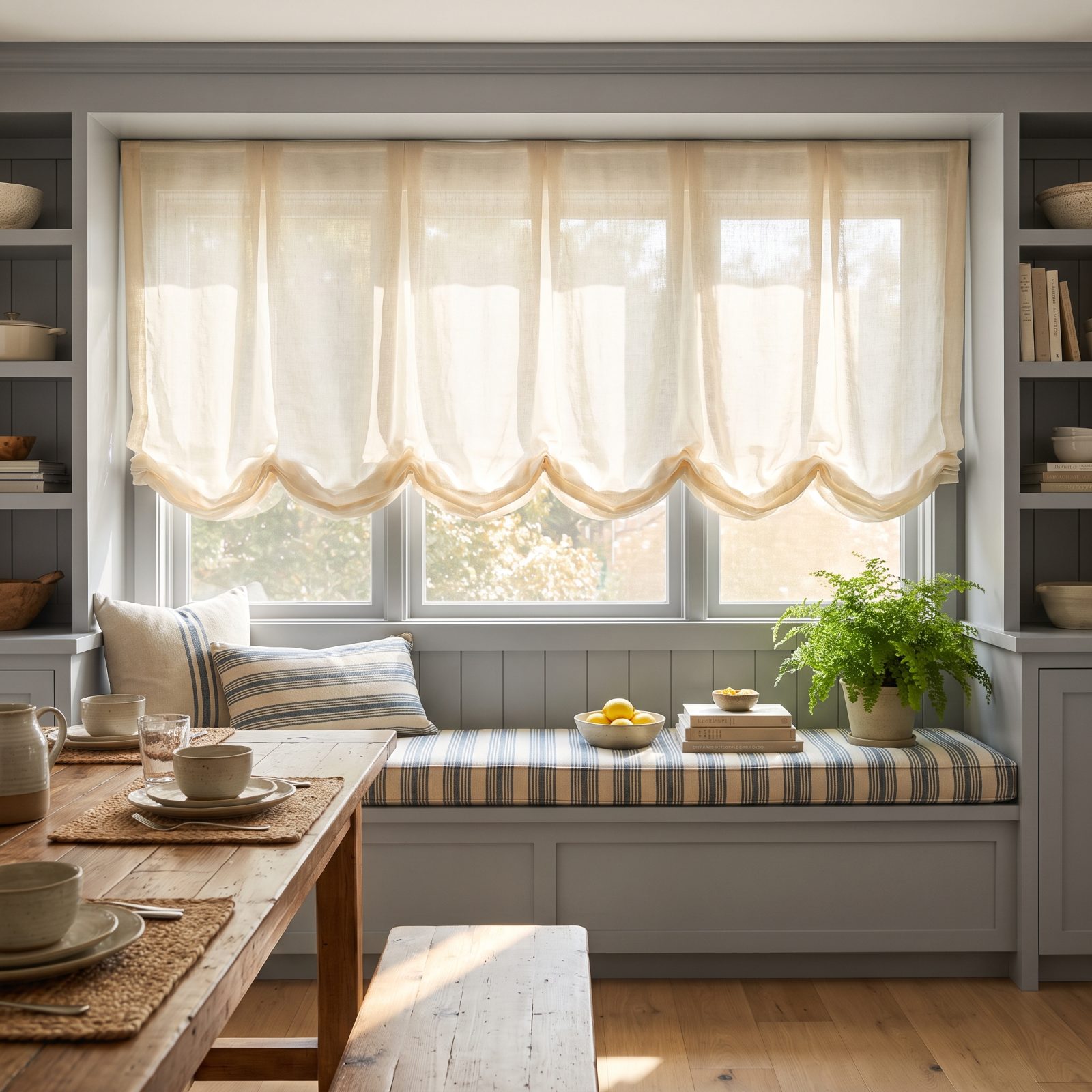
Balloon shades earned their reputation. The 1990s version was a swag of heavy glazed chintz, over-stuffed, cinched into cabbage-rose lumps that blocked half the light and collected every dust mote in the house.
The comeback keeps the soft gathered puff and throws out the volume. Sheer linen, airy cotton, a muslin that moves with the breeze and lets light glow through instead of smothering it. Fewer poufs, a shorter drop, no stiff lining. Same romantic silhouette, with its lungs back.
41. Wrought-Iron Baker’s Racks as Compact Kitchen Storage
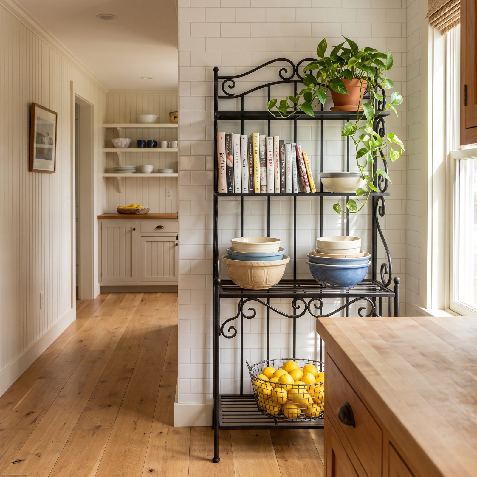
Small kitchens are back in vogue, mostly because rents forced the issue, and the baker’s rack is quietly perfect for one. Open iron shelving, a footprint the size of a doormat, vertical storage where there’s no cabinet to be had.
The 1990s staged these with fake grapevines and a watering can nobody used. Strip all that off. Stack real bowls, line up the cookbooks you actually cook from, let one plant trail off the top. Scrollwork that looked dated as decoration looks like good ironwork when it’s holding your dishes.
40. Skirted Side Tables That Hide Storage in Plain Sight
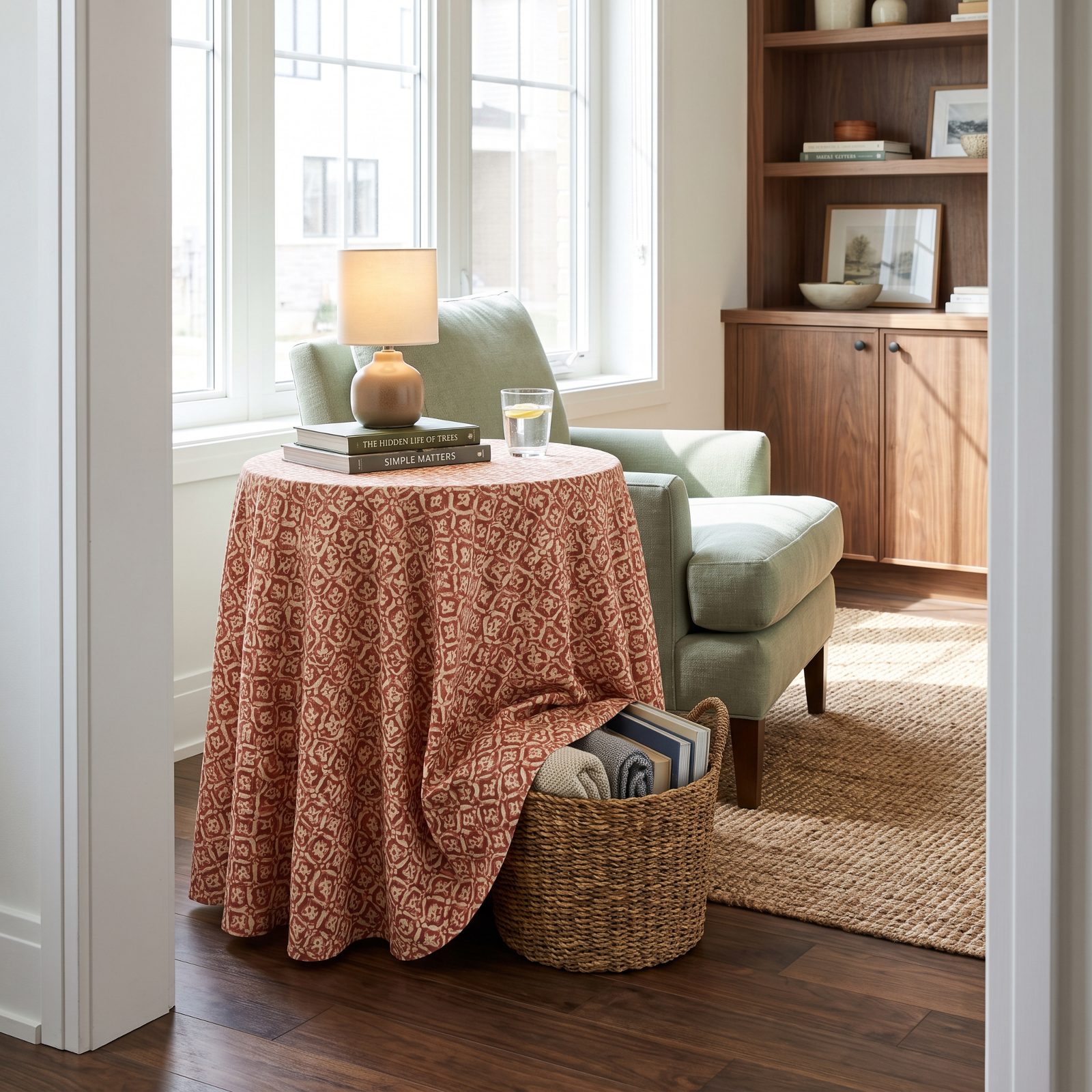
Two problems, one fix. You need a surface by the chair, and you have stuff with nowhere to live. A skirted table handles both, and almost nobody uses it anymore.
The full-length fabric drops to the floor and hides whatever lives under there — extra blankets, board games, the router, the mess. The 1990s did these in fringed florals that fought the sofa, while the updated version uses a calm block print or a solid textured weave, so the skirt adds softness without shouting. Round cardboard-drum tables cost almost nothing, and the whole thing is held together with a cloth.
39. Torchiere Floor Lamps for Broad Indirect Light
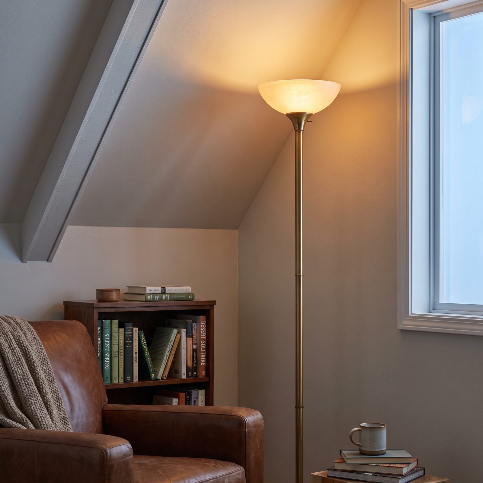
The torchiere fell out of favor partly because the old halogen ones ran hot enough to be a genuine fire hazard. Fair.
But the idea itself was always right. It throws light up at the ceiling, which bounces back down over the whole room with no glare and no shadows — the opposite of a single harsh overhead. LED heads fixed the heat problem. In a dim corner where there’s no overhead at all, one torchiere lights the entire space and steals maybe a square foot of floor. Renters, this is your friend.
38. Glass-Fronted Curio Cabinets for Collections Worth Showing
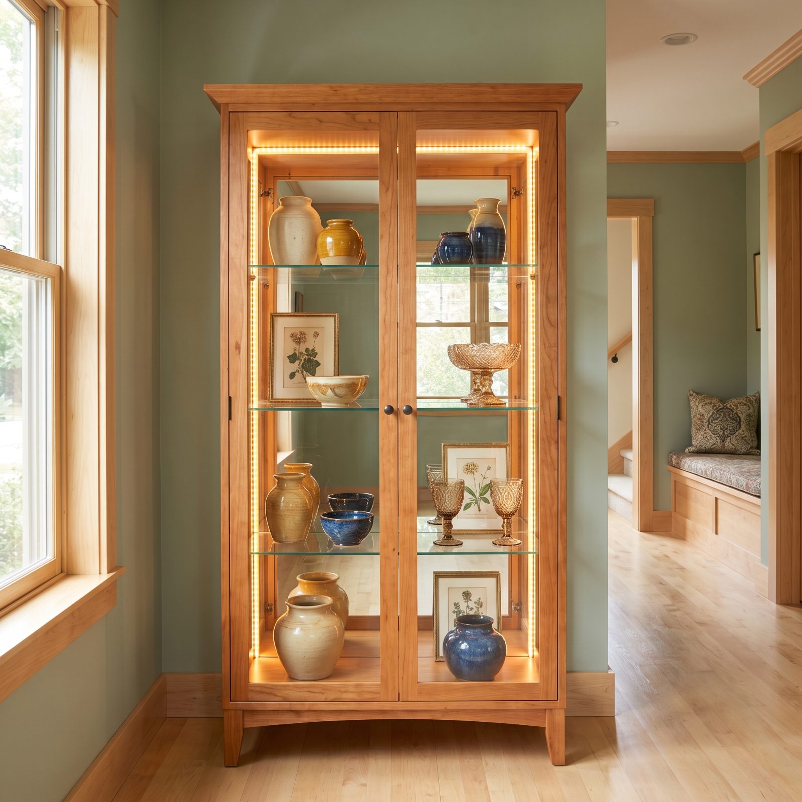
Minimalism told everyone to hide what they loved in a box in the attic. A lot of people are quietly done with that.
The curio cabinet is the rebuttal. Glass front, interior shelves, usually a mirrored back and a small light, built to actually show the things you’ve collected over a lifetime. Here’s the part the 1990s missed: edit hard. Fifteen objects with space around them look like a collection. Fifty crammed against the glass look like a yard sale behind a window. Give your treasures a stage, not a storage unit.
37. Pleated Patterned Lampshades in Small-Scale Prints
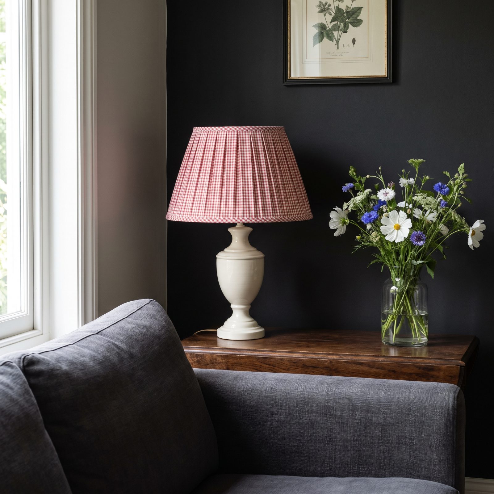
The plain drum shade was the beige rectangle of the lighting world: safe, forgettable, on every lamp in every rental. The pleated patterned shade is the correction, and it’s everywhere right now.
Knife-pleated fabric in a tiny gingham, a trailing ditsy floral, a thin stripe. The pattern reads as texture from across the room, and the pleats catch lamplight in a way flat fabric simply can’t. Take a lamp you already own and it becomes the most interesting object on the table. Of everything here, this is the one that turns the fastest for the least money.
36. Glass-Block Partitions That Borrow Light Instead of Blocking It
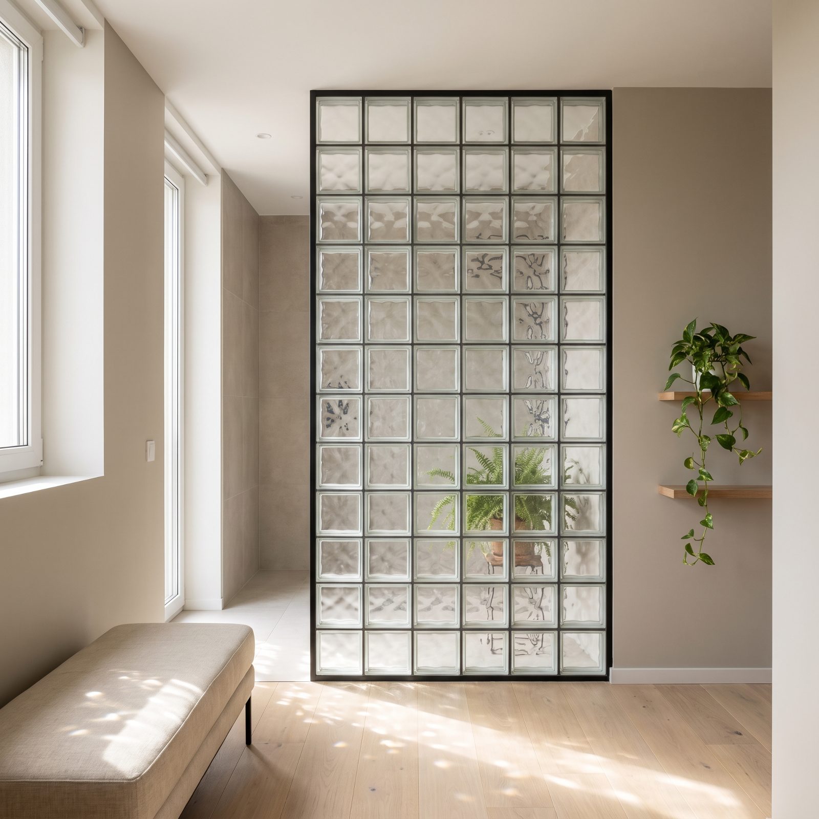
For a long time glass block meant one thing: a basement bathroom window the previous owner installed in 1994, and nobody wanted to touch it. The material picked up a bad reputation it never really earned.
The current version is skinnier and cleaner, framed in slim black steel instead of mortar lumps. It does one job better than almost anything else, which is splitting a room without stealing the light. Put a partition between a dark hall and a sunny kitchen and the hall stops feeling like a tunnel.
35. Folding Privacy Screens as Movable Walls for Open-Plan Rooms
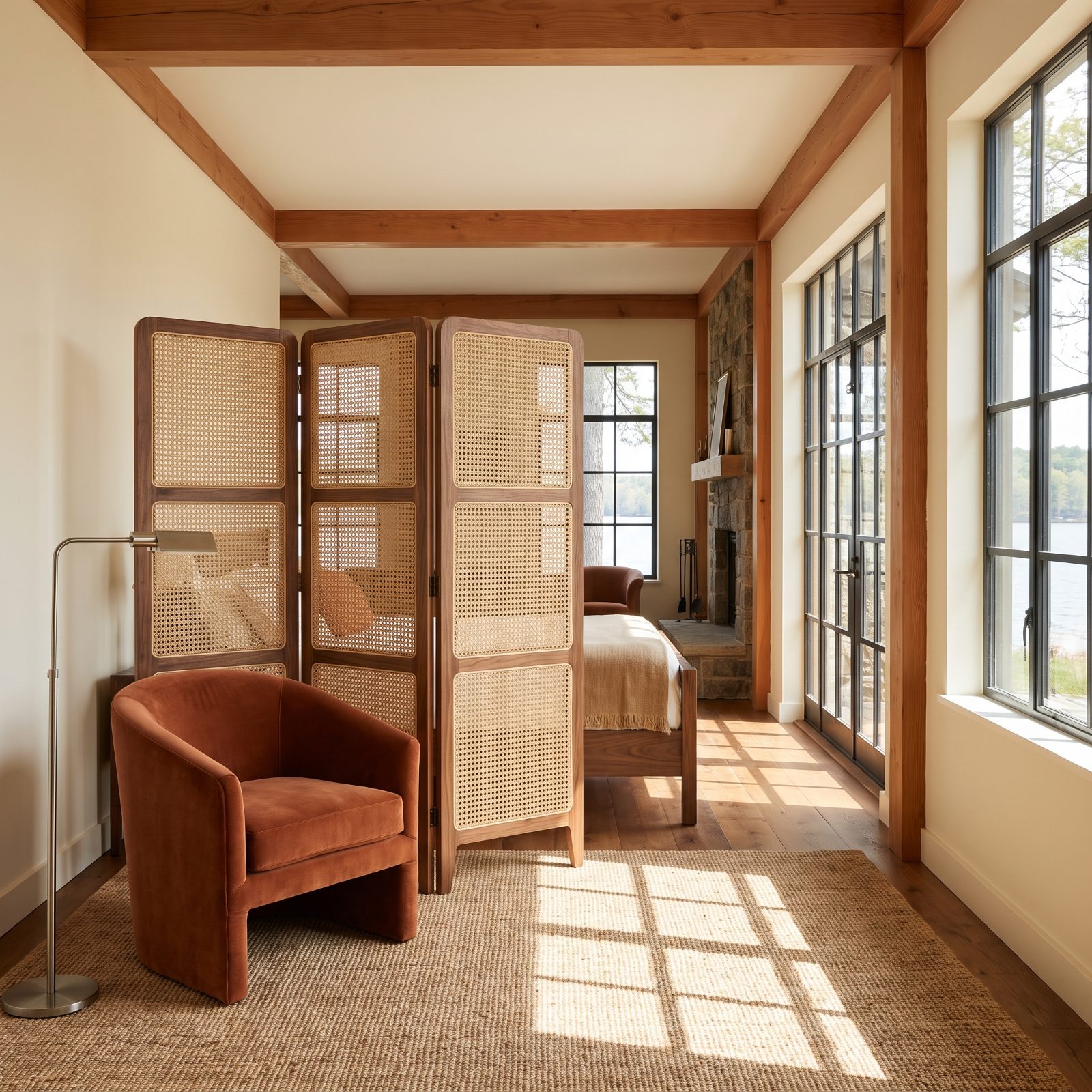
A screen is the least committed piece of furniture you can own. It carves out a zone one afternoon and folds flat against the wall the next, and that’s exactly why they’re worth recommending.
Where the 1990s leaned on painted canvas and flimsy MDF, the ones worth buying now use real wood frames with rattan cane, pierced metal, or linen panels. A single screen hides a home-office mess during a video call, then disappears by dinner. In a studio apartment it does the work of a wall you’re not allowed to build.
34. Slim Track Lighting That Finally Shed the Bulk
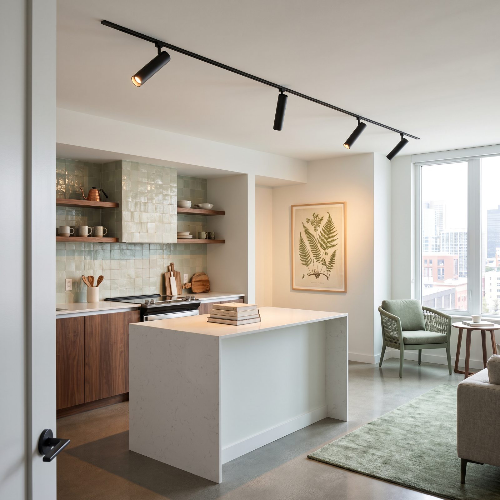
Track lighting got a reputation as the lighting your dentist had. Those fat silver cans on a chunky rail, all pointing nowhere useful. Understandable. The old stuff was ugly.
Now it comes pencil-thin, usually in matte black or brass, with heads small enough that you forget they’re there. The idea was always sound. You aim light where you actually need it, then re-aim it when you shove the furniture around. Renters love the stuff because one fixture replaces the single sad ceiling box, and it leaves with you when the lease ends.
33. Patterned Sheet Vinyl That Looks Nothing Like the Kitchen You Remember
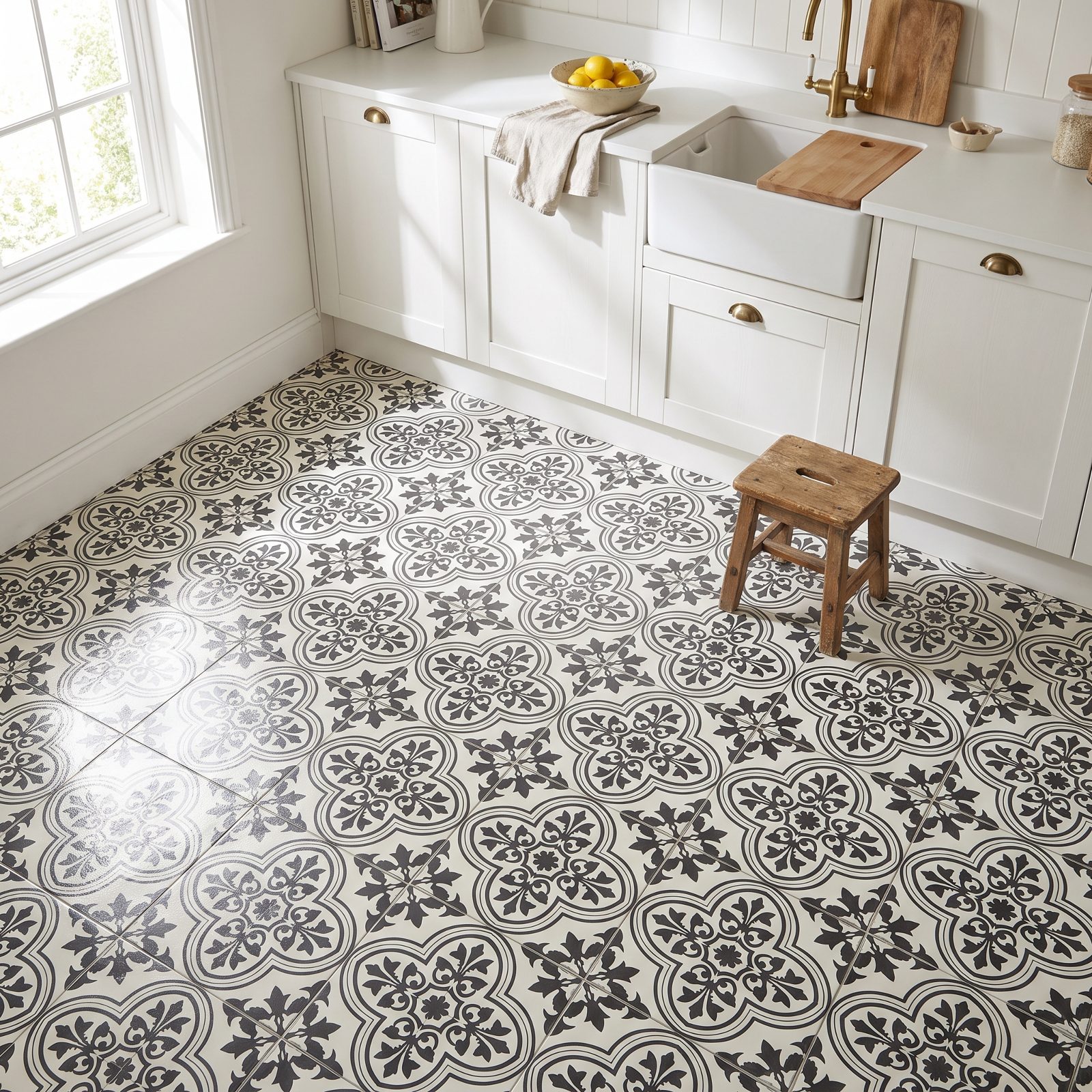
Snobbery about vinyl flooring runs deep, and honestly some of it is earned. That peeling fake-brick stuff from forty years ago gave the whole category a black eye.
Today’s sheet vinyl prints convincing encaustic-style tile looks, plus terrazzo and parquet patterns, and it arrives in wide rolls with almost no seams for water to sneak under. That matters in a kitchen or mudroom where a spilled pot of pasta water is a Tuesday. Soft underfoot, warm in winter, and you can mop it without a second thought.
32. Color-Washed Walls With Depth a Flat Coat Can’t Fake
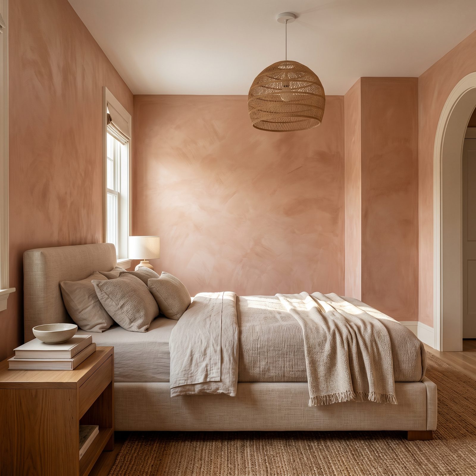
A flat wall of beige is the paint equivalent of elevator music. Color-washing fixes that by layering thinned, translucent coats, so the color shifts a little as light crosses it through the day.
The 1990s version often went too far. Sponged pinks, heavy ragging, the kind of thing that read as dated within a season. The restrained approach now keeps the tones close together, so what you notice is depth rather than technique. Clay, soft ochre, muted sage, all come alive this way.
31. Hand-Stenciled Motifs, the Thinking Person’s Wallpaper
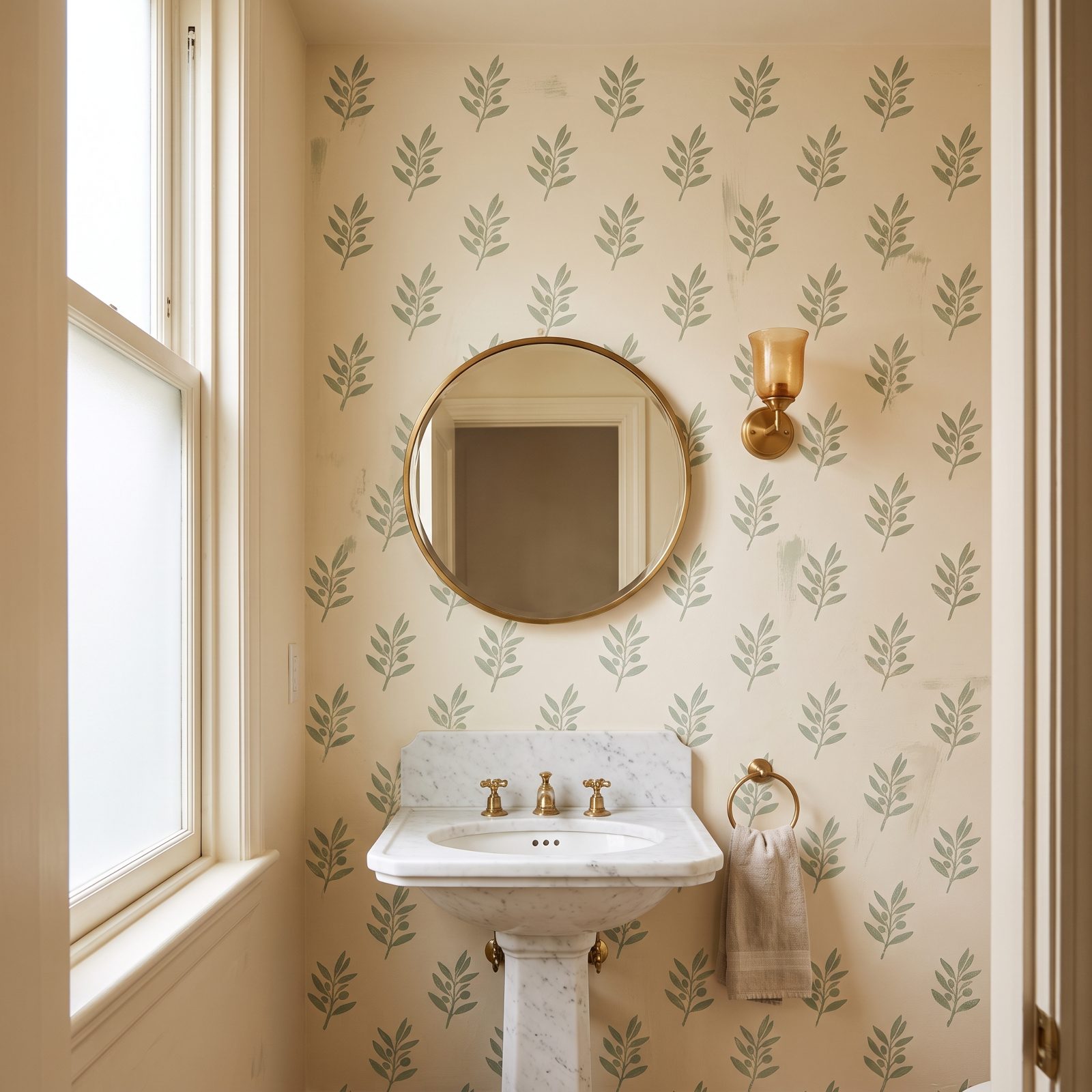
Stenciling carries a whiff of a craft-store weekend gone wrong. Ivy borders marching around a kitchen ceiling, that sort of thing. Fair enough. But the technique itself is older than wallpaper and far gentler on the wallet.
Done with restraint, a repeated botanical or small geometric gives a room the pattern wallpaper offers without the paste, the seams, or the commitment. The tiny imperfections are the point. A machine-printed repeat is flawless and a little cold, while a hand-stenciled one has a pulse. And when you scuff it, you patch the spot with the same stencil and a dab of paint.
30. Loose Slipcovers That Save the Sofa You Already Own
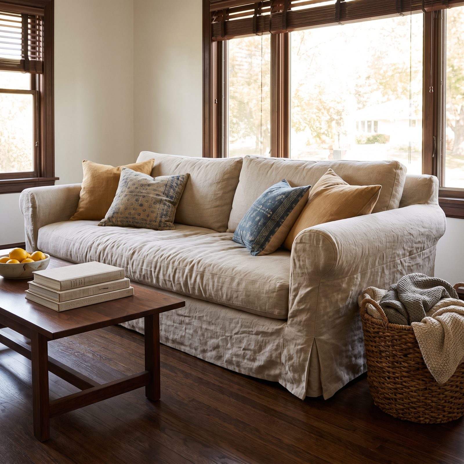
A slipcover is permission to stop babying your furniture. Red wine, a muddy dog, a kid with a marker, whatever the disaster, you unzip the cover and run it through the wash.
That slouchy fitted look is the opposite of the tight, tailored upholstery that dominates showrooms. Linen and washed cotton covers slump a little at the arms and settle into their creases, which reads as comfortable rather than sloppy. Bored of the color? A fresh cover costs a fraction of a new sofa.
29. Honey-Oak Cabinetry Minus the Matchy-Matchy Overload
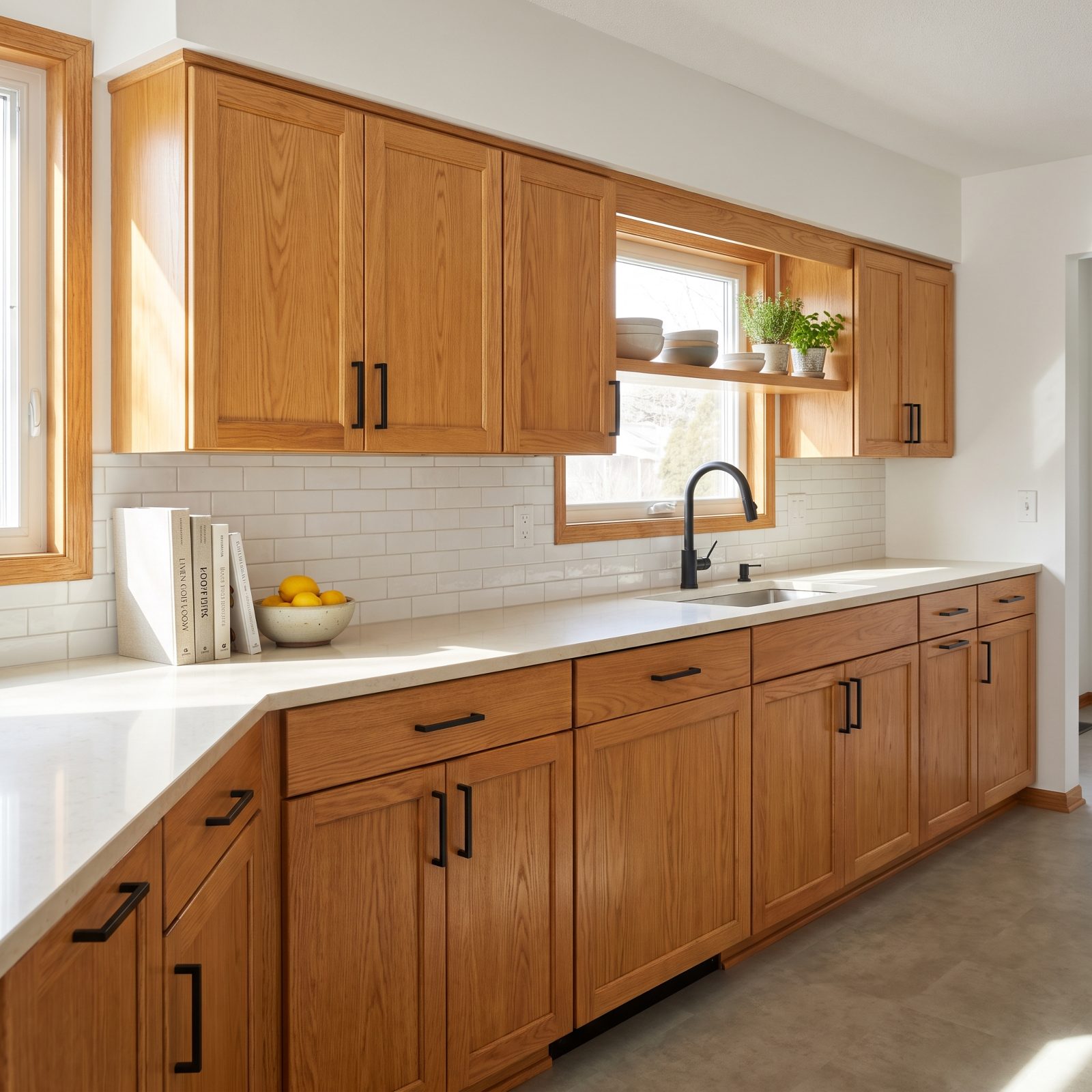
Honey oak is coming back, and the people who ripped it all out in 2015 are entitled to feel a little betrayed.
What killed the original wasn’t the wood. It was the total commitment. Oak cabinets, oak trim, oak floors, oak furniture, everything the same orange-gold, no contrast anywhere, and the eye had nowhere to rest.
So let oak be the only warm note in the room. Pair it with white counters, black hardware, and a cool backsplash, and the grain reads as warm and genuine instead of overwhelming. Real wood grain ages better than any painted finish, too, which chips and shows every scuff.
28. Dark Cherry Furniture, the Antidote to the All-White Room
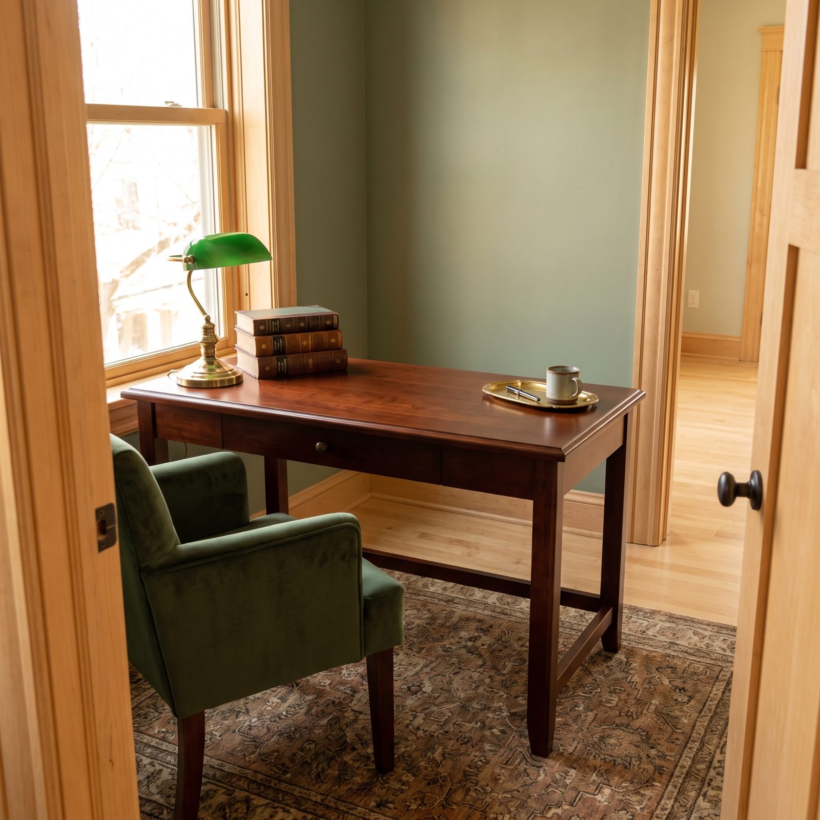
After a decade of white-on-white rooms, a lot of homes feel like dentist waiting rooms with better plants. Dark cherry is the correction.
The reddish wood brings genuine weight and warmth that pale oak and lacquered white simply can’t. A single cherry piece anchors a light room and keeps it from floating away into blandness, whether that’s a dining table, a tall bookcase, or a desk. Restraint, again, is what the old look missed. One or two cherry pieces against neutral walls, not a matched bedroom suite staring back from every angle.
27. Chrome-and-Frosted-Glass Furniture From the End of the Decade
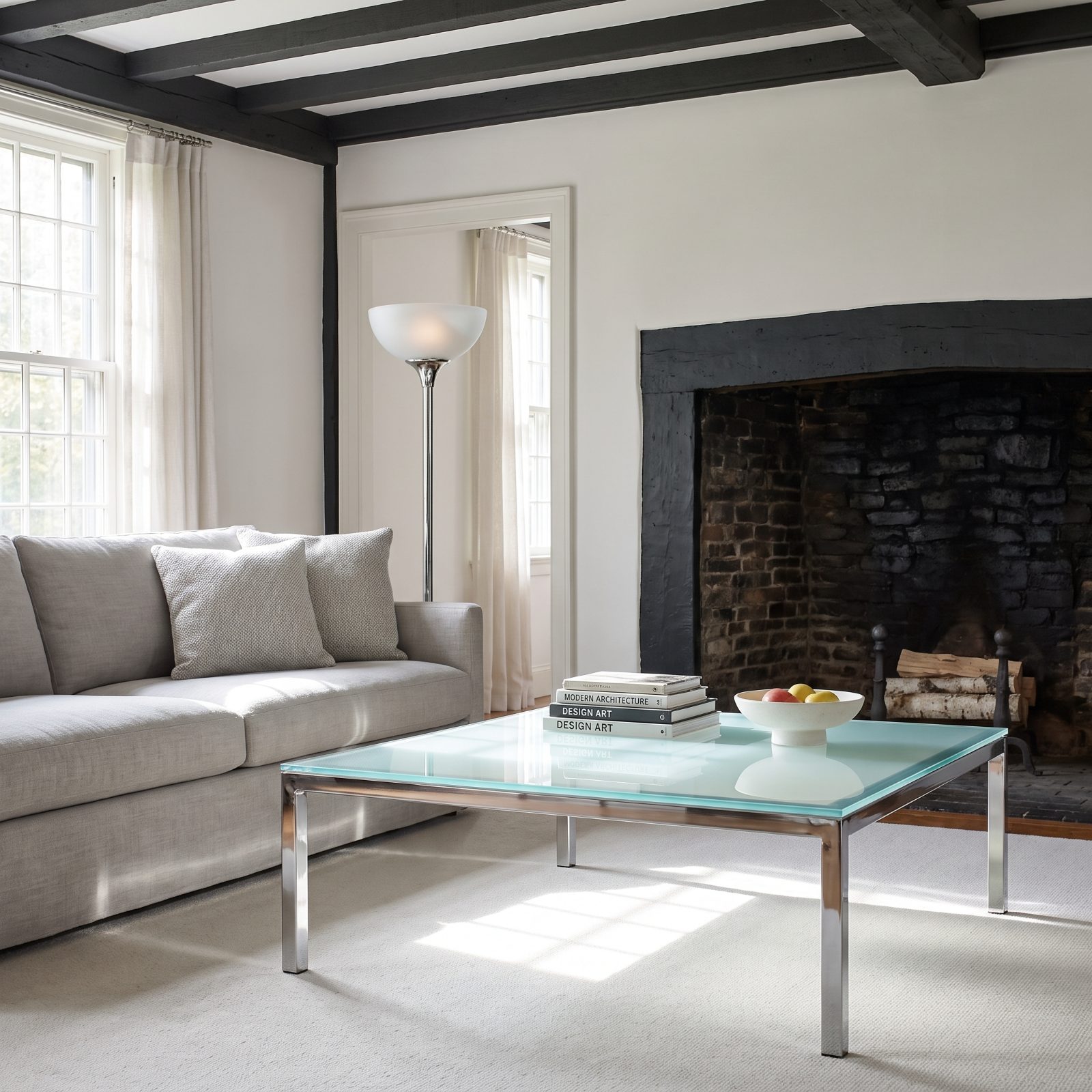
Late-1990s design had a brief love affair with chrome and frosted glass, the kind of pieces that looked like props from a music video. Then it all vanished.
It’s back because it solves a real problem in small rooms. A frosted-glass table takes up visual space without blocking light, so a cramped apartment breathes, and the chrome bounces daylight around instead of absorbing it. The milky glass hides fingerprints far better than the clear glass everyone eventually got sick of wiping.
26. Wall-to-Wall Carpet Makes a Case for the Fully Soft Bedroom
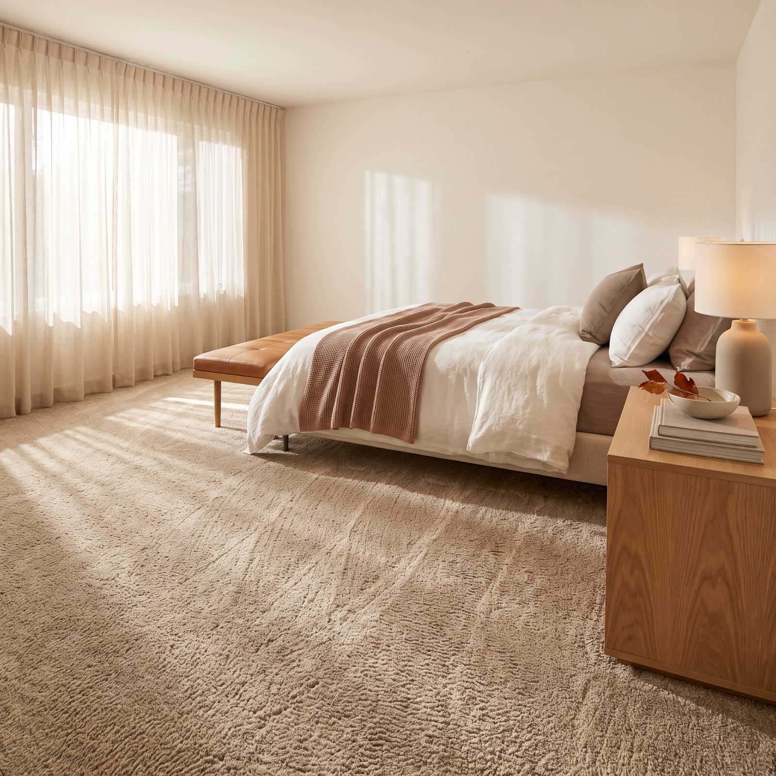
Hardwood won the last two decades and then everyone’s feet got cold. Full carpet is creeping back into bedrooms, and the reason is refreshingly dumb: nobody wants a bare floor at 6am in January.
What’s changed is the fiber. That scratchy loop stuff from back then has been swapped for dense wool blends and softer nylons that don’t flatten into sad gray trails by the dresser. Stick to a warm neutral and keep the pile tight, not shag, and the look reads intentional rather than builder-grade leftover.
25. Black Iron Bed Frames Draw a Clean Line Around the Bed
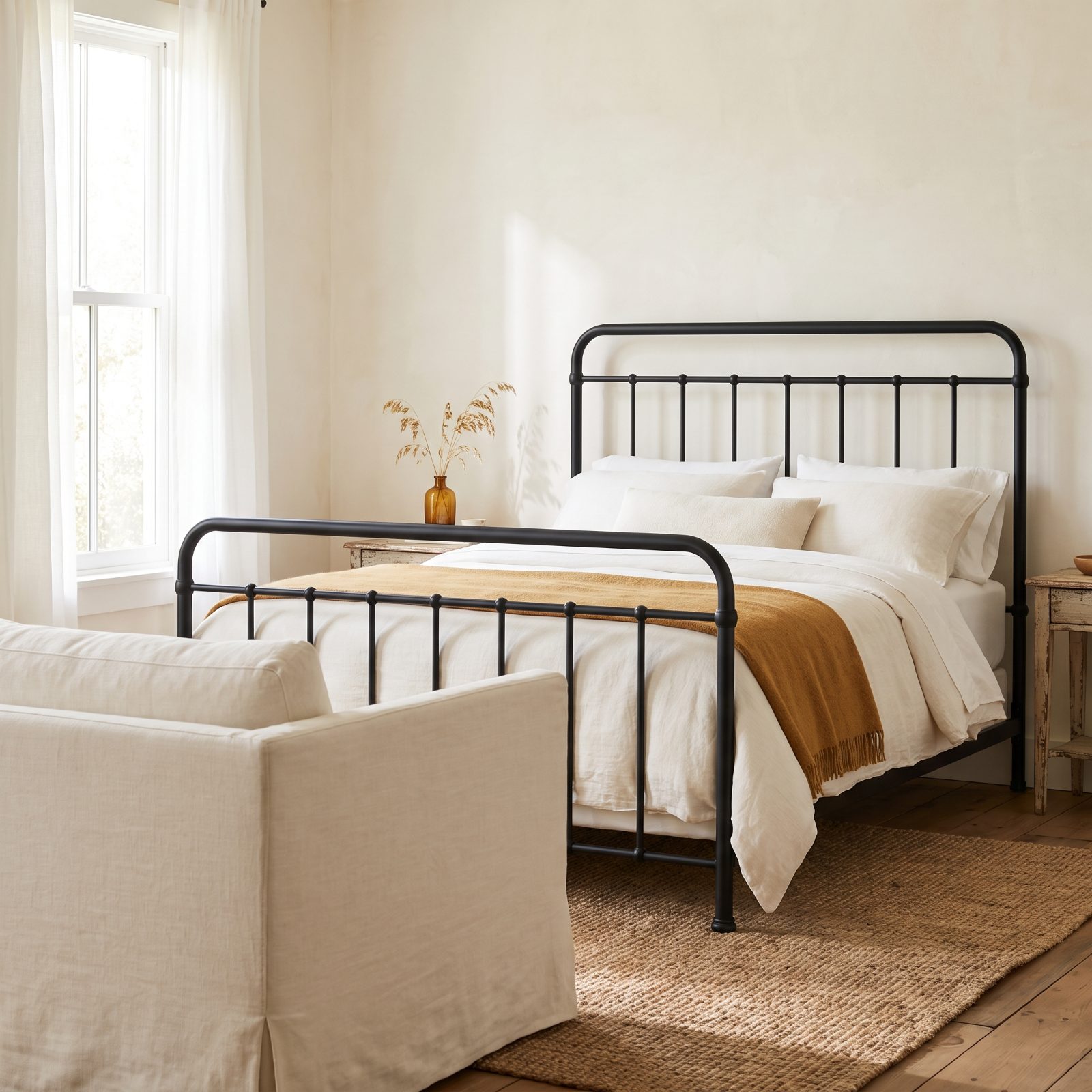
A black metal frame is the cheapest way to give a soft bedroom a spine. After years of upholstered headboards swallowing every wall, people want graphic structure again.
The updated versions ditch the fussy scrollwork and loud brass finials. Slim matte-black tubing, clean verticals, maybe a gentle curve at the top rail — that’s the whole vocabulary now. It draws a crisp outline against pale walls and lets everything else stay soft. It photographs beautifully too, which, let’s face it, is half of why anyone buys furniture anymore.
24. Beaded Curtains Return as a Doorway That Moves
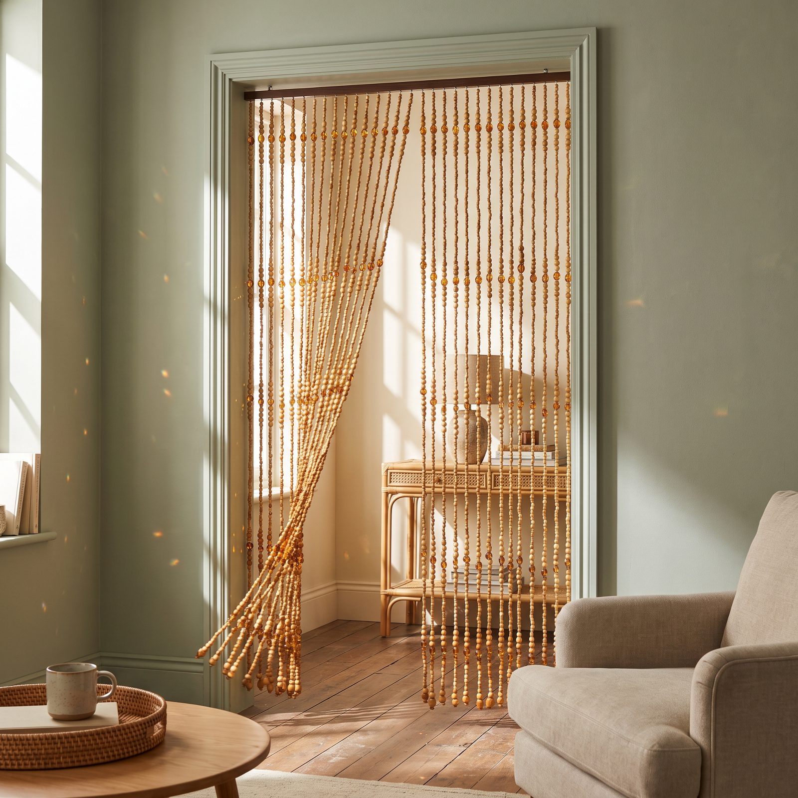
Mention beaded curtains and half the room pictures a college dorm or a basement circa the Clinton years. Fair. But the material changed everything.
The new ones lean into real wood rounds, hand-strung glass, and faceted acrylic that scatters light like a chandelier when the sun hits. They solve a genuine problem too: you want to soften a doorway or screen off a nook without hanging an actual door nobody will ever close. And they move. A threshold that shifts when you walk through it does something a flat doorway never could.
23. Cobalt-Blue Glass Delivers Concentrated Color on a Shelf
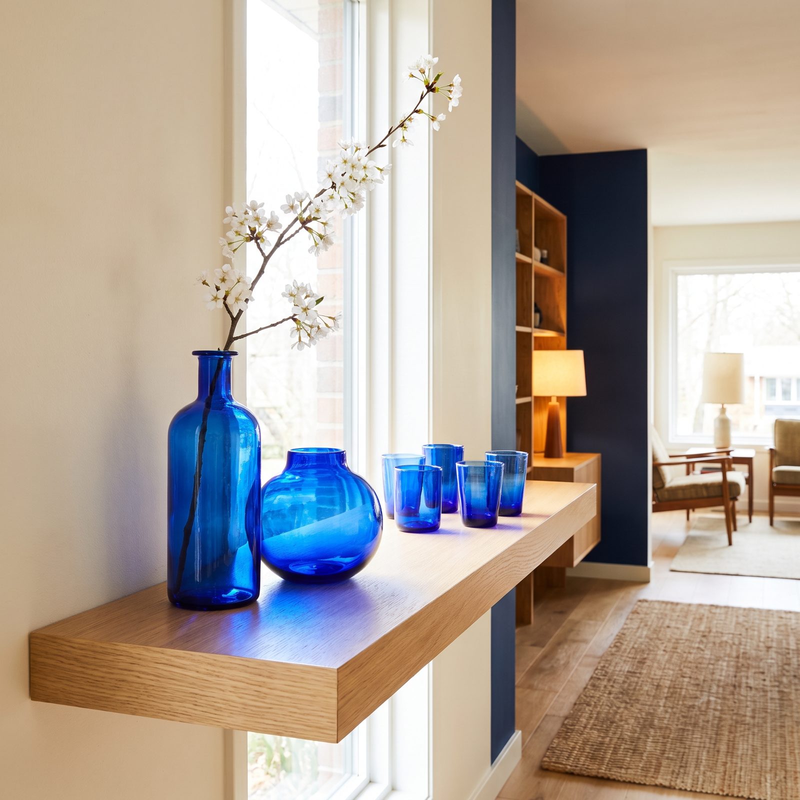
One deep cobalt bottle on a white shelf outworks ten beige objects. That’s the appeal.
Cobalt glass is pigment you can pick up and move around. Group a few vases and bottles on a sunny ledge and the light handles the rest, pouring blue shadows across the counter by late afternoon. It reads vintage without trying, especially the old seltzer bottles and apothecary shapes. Thrift shelves are crammed with the stuff for a few dollars a piece — a better deal than almost any paint can gives you.
22. Basket Walls Add Texture You Can Actually Rearrange
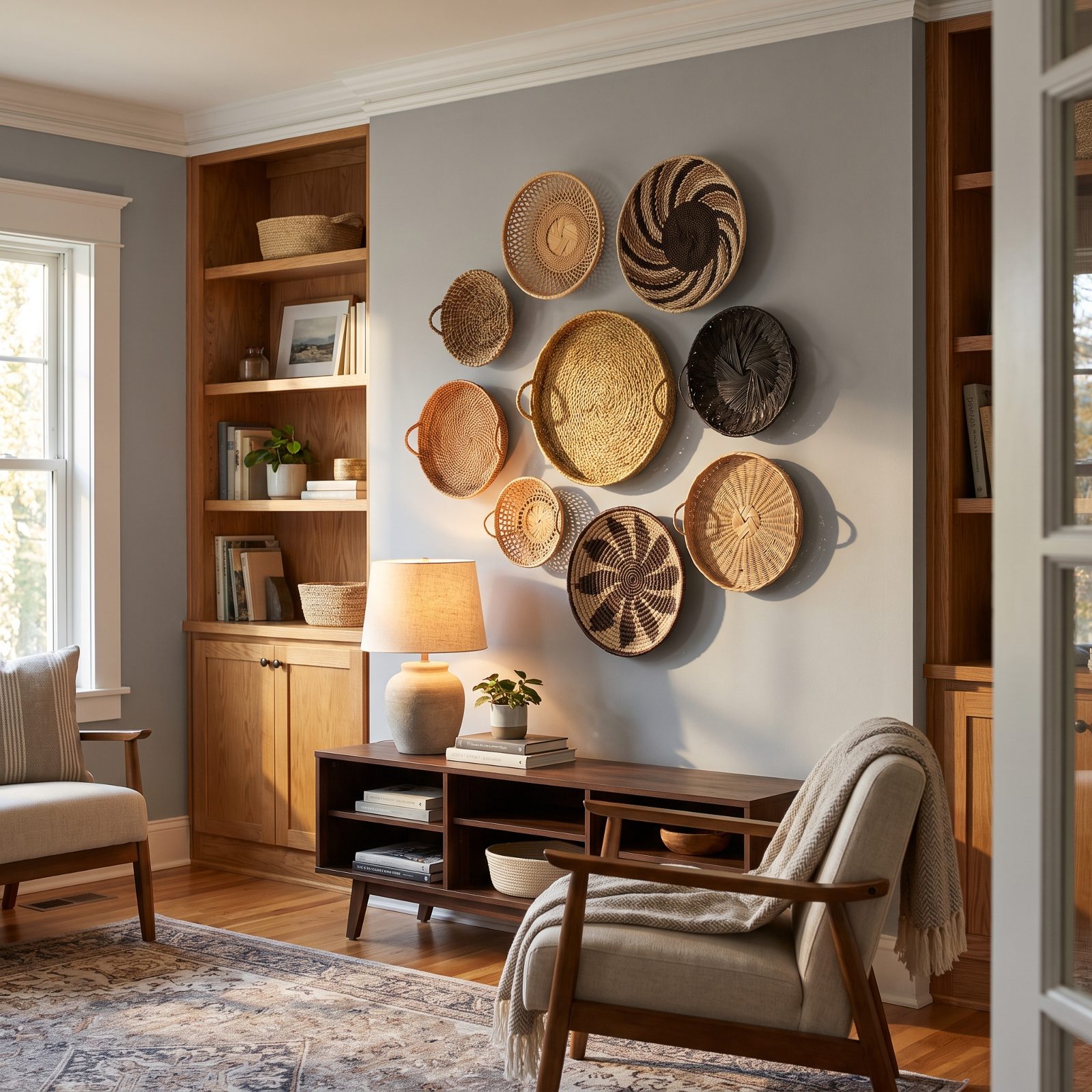
A basket wall is a gallery wall for people who are done with framed prints. Woven trays and flat baskets go up like art, cluster loosely, and bring a texture no flat object can match.
Mixing weaves is what sells it. Pale rattan next to dark palm, a tight coil beside an open lattice. All one tone and it reads like a craft store endcap. Vary the color and scale and suddenly it looks collected, like you gathered them over years instead of in one frantic cart.
21. Dried Florals Trade Fresh Blooms for Sculptural Stems
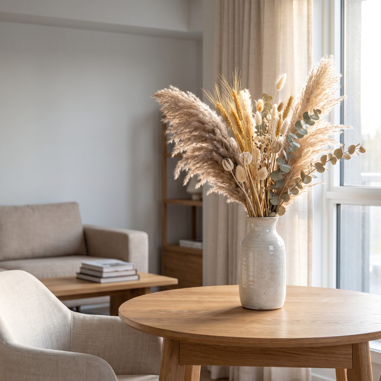
Dried flowers used to mean a dusty bundle of lavender nobody touched. The current version is bolder and sparer — tall grasses, bleached seed heads, spiky preserved stems arranged like a sculpture rather than a bouquet.
They last for months, and honestly that’s why anyone bothers. No water, no wilting, no guilt about the ten dollars you spent on cut stems that browned by Thursday. Keep the palette tight, mostly wheat and pale neutrals with one deeper tone, and the whole thing reads sculptural instead of grandmotherly.
20. Blue-and-White Toile Leaves the Formal Dining Room Behind
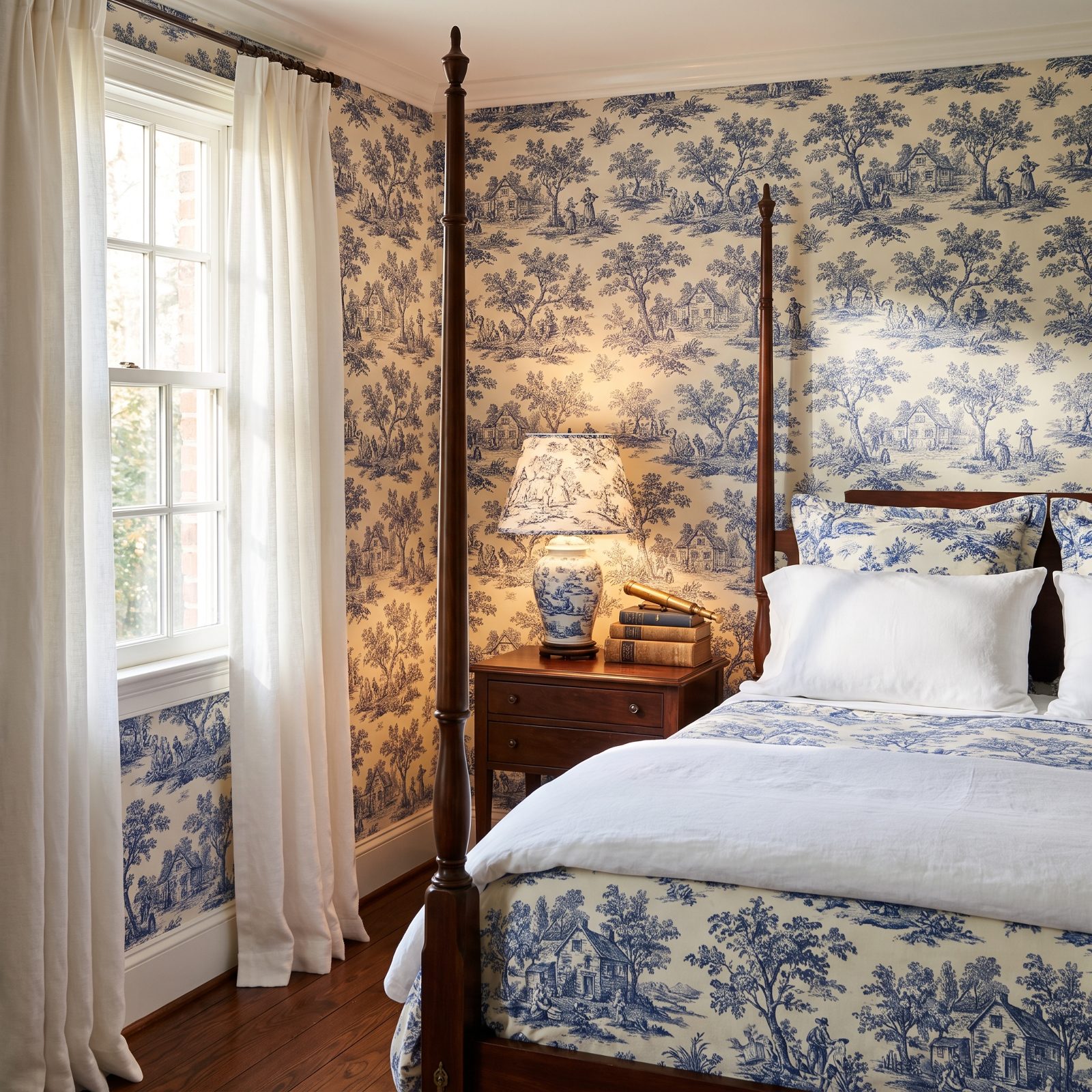
Toile spent decades trapped in stiff dining rooms with matching chair pads. It’s finally escaping.
Those blue scenic pastorals — the little figures, trees, cottages — now turn up on bedding, a single papered wall, a lampshade here and there. The scale got bolder too. Oversized repeats feel modern where the tiny tight prints read fusty. Pair it with plain linen and raw wood so the pattern carries the room without tipping the whole thing into costume drama.
19. Floral Chintz Upholstery Anchors the New Maximalist Sofa
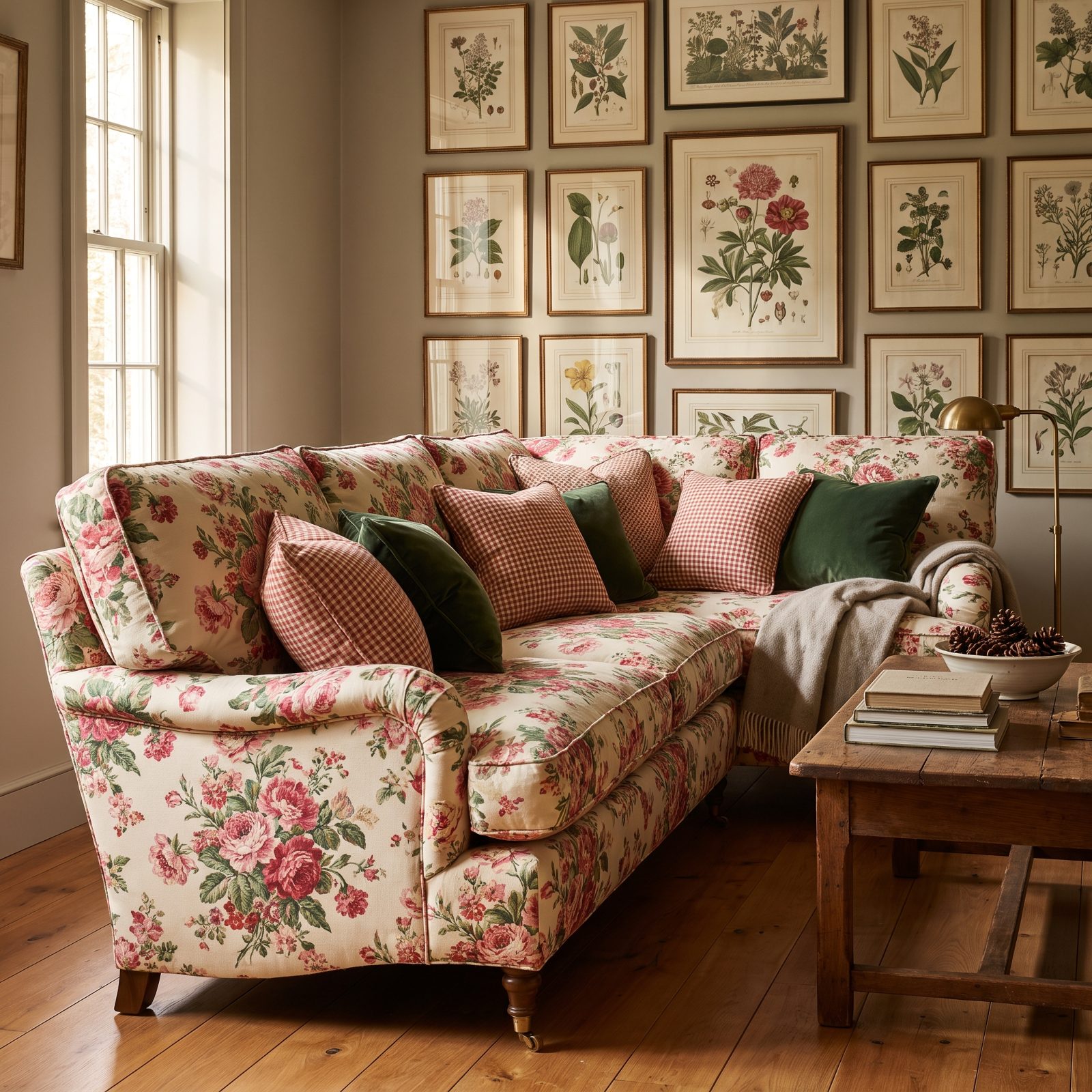
Chintz is back, and it is not apologizing. For years a flowered sofa meant “inherited from an aunt.” Now it anchors rooms built on layers and pattern-on-pattern nerve.
That glazed cotton with the big blown-out blooms hands a room instant history, even a brand-new one. What makes it work today is restraint everywhere else. One loud floral sofa against plain walls and simple wood furniture looks deliberate. Three competing prints plus the chintz sofa looks like the room lost a bar fight.
18. Tartan and Plaid Bring Structure to Soft Rooms
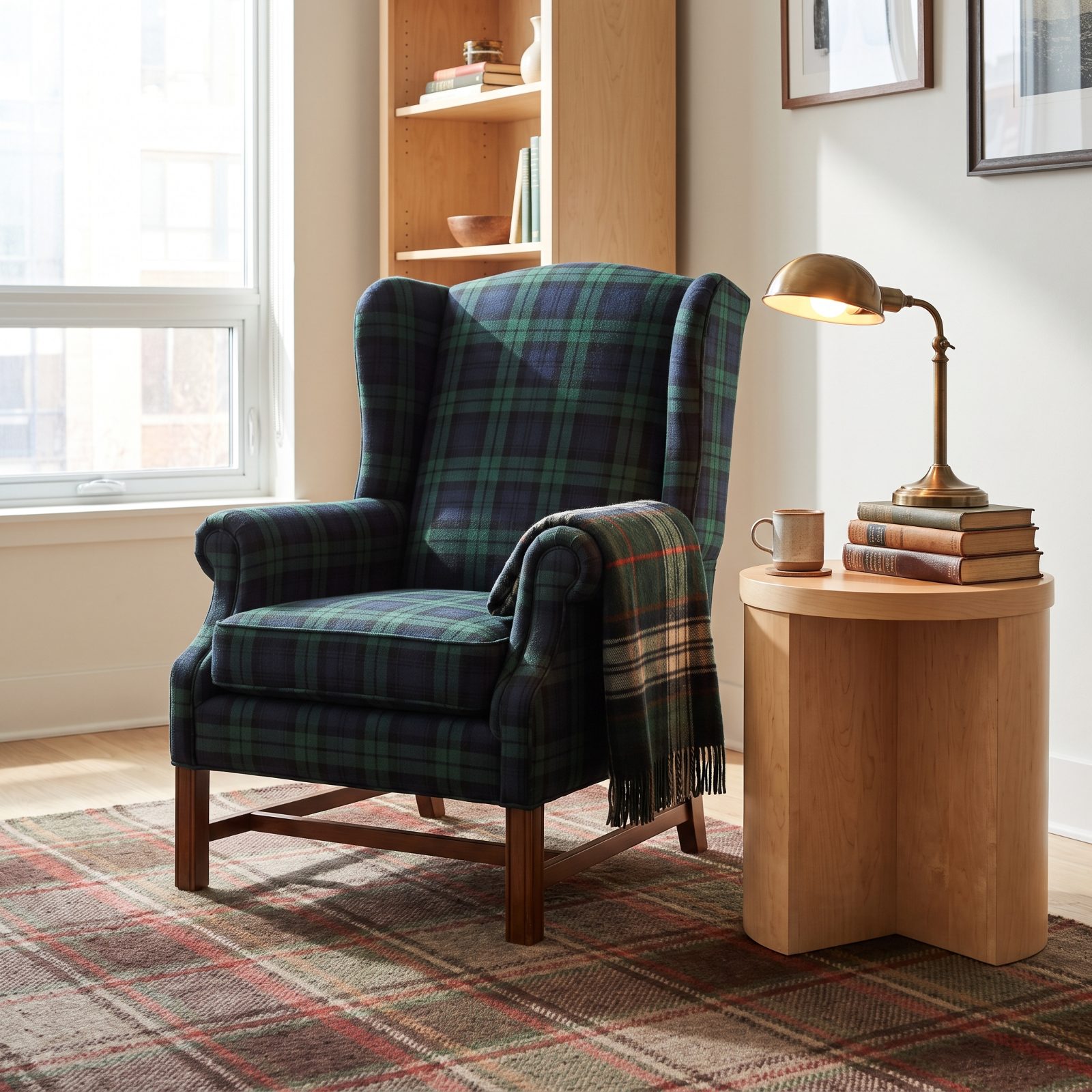
Plaid does something no solid can. It drops a grid into a room full of curves, and all those crossing lines hand the eye something to hold onto.
The checks showing up now skew richer and moodier than the primary-color flannel of years past. Deep green and navy, muted ox-blood, the kind of woven wool that looks pricey even when it wasn’t. Start with one anchor piece — a wingback chair, say — then layer in a plaid throw and a plaid rug in related tones, and let the walls and wood stay plain. Three tartans in one corner sounds like a lot, but varying the scale of the checks keeps them from fighting.
17. Southwestern Geometric Rugs Warm Up Wood and Clay
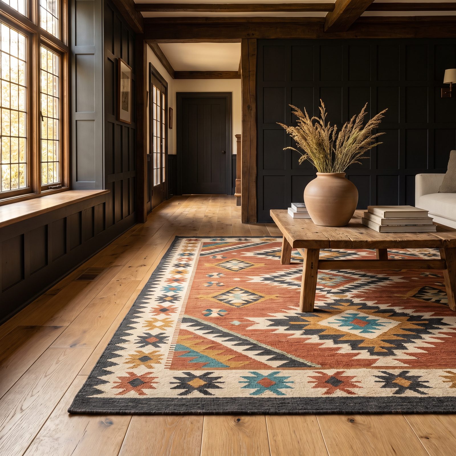
The angular diamonds and stepped lines of Southwestern weaving are back, and they finally have the right room to live in. All that warm wood and clay-toned surfacing trending now gives these rugs somewhere to belong.
The desert palette carries most of the weight: terracotta, ochre, cream, a hit of charcoal, maybe one thin line of turquoise. Flat-woven versions hold up to traffic and lie flat under furniture, which matters if the room actually gets used. Chase down handwoven wool over the printed lookalikes if you can swing it. The real weave has a depth the printed versions never manage, and you’ll feel it under your feet every single day.
16. Leopard-Print Accents in Small, Confident Doses
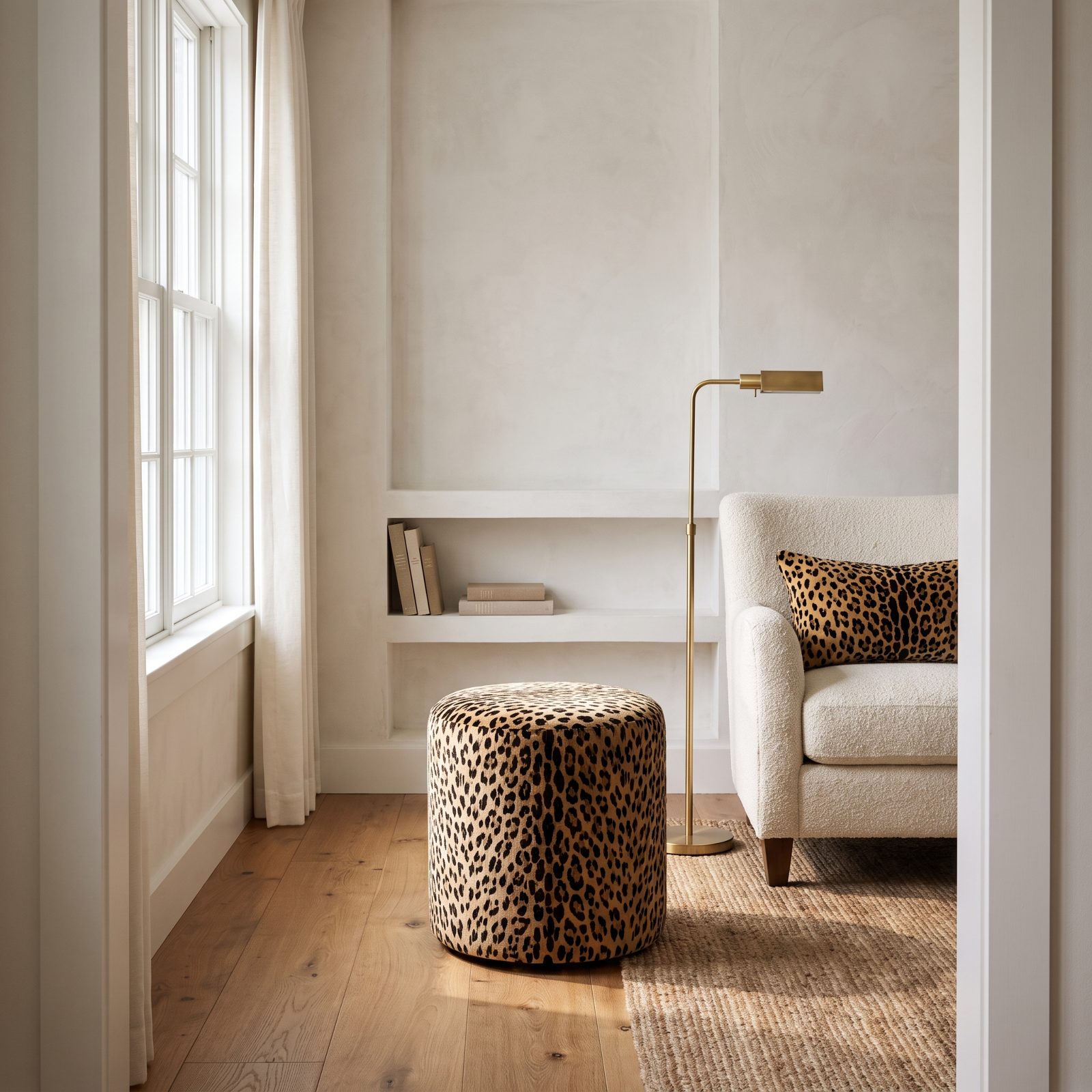
Leopard-print earned a bad reputation in the 1990s because people treated it like a wall-to-wall commitment. The updated version knows better: one stool, one lumbar cushion, maybe a runner on the stairs, and that’s the whole move.
The print works now because, kept small, it reads as texture rather than pattern. Against plaster walls and oak floors, a tawny spotted velvet stool brings a warmth no solid neutral can match. It’s the nearest thing a room has to a loud laugh.
15. Celestial Sun-and-Moon Motifs on Mirrors and Ceramics
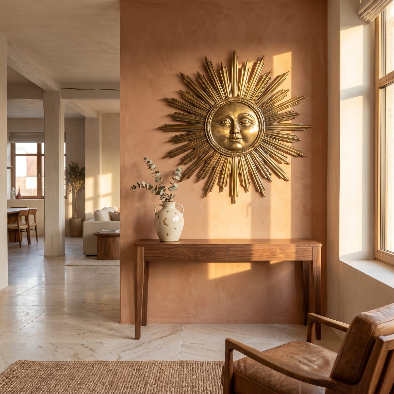
Suns with faces. Crescent moons tucked into gold frames. Little scattered stars on everything. The 1990s loved celestial motifs with a sincerity that feels almost innocent now.
The revival trims the cosmic mysticism and keeps the shapes. A single antiqued brass sunburst mirror over a console does more than any patterned wallpaper ever managed, and the motifs now read as folk-art, hand-carved rather than mass-produced. That’s exactly why they land in a grown-up room.
14. Butterfly Wall Sculptures and Printed Fabrics
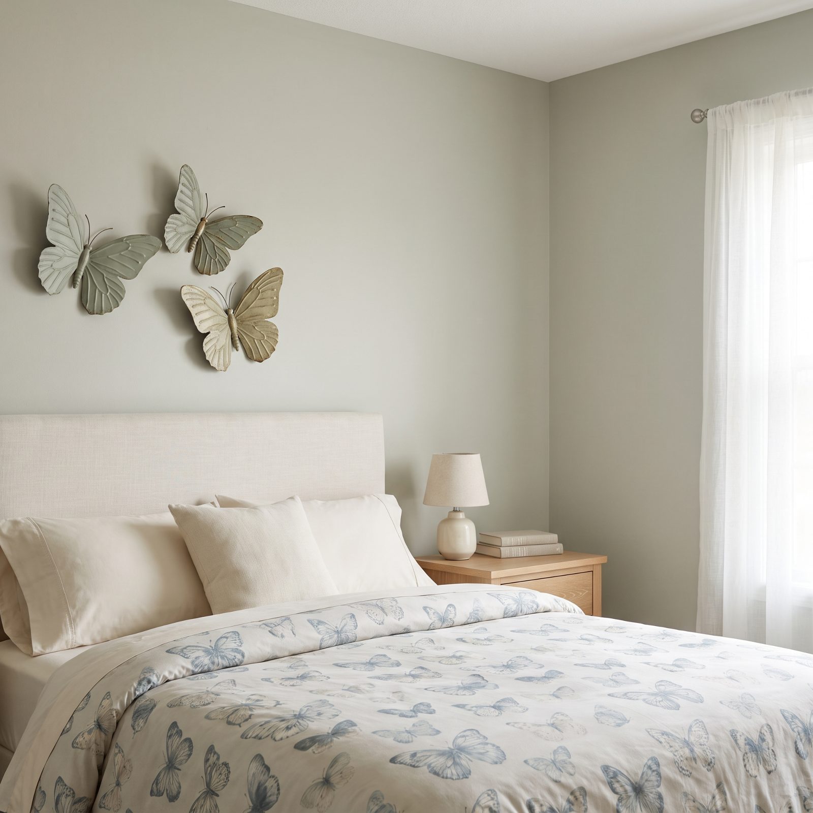
Butterflies covered half the bedrooms of the mid-nineties. Appliqué on duvets, decals on walls, little ceramic ones glued to picture frames until the whole thing went saccharine fast.
The current take goes sculptural. A cluster of metal butterfly wall pieces in sage or brass reads as nature study rather than nursery decor, and on fabrics the print has gone subtler too, scattered and loose instead of marching in neat rows. Honestly? The metal versions are the ones worth hunting for. Flat paper decals still look like paper decals, no matter the decade.
13. High-Contrast Checkerboard Floors
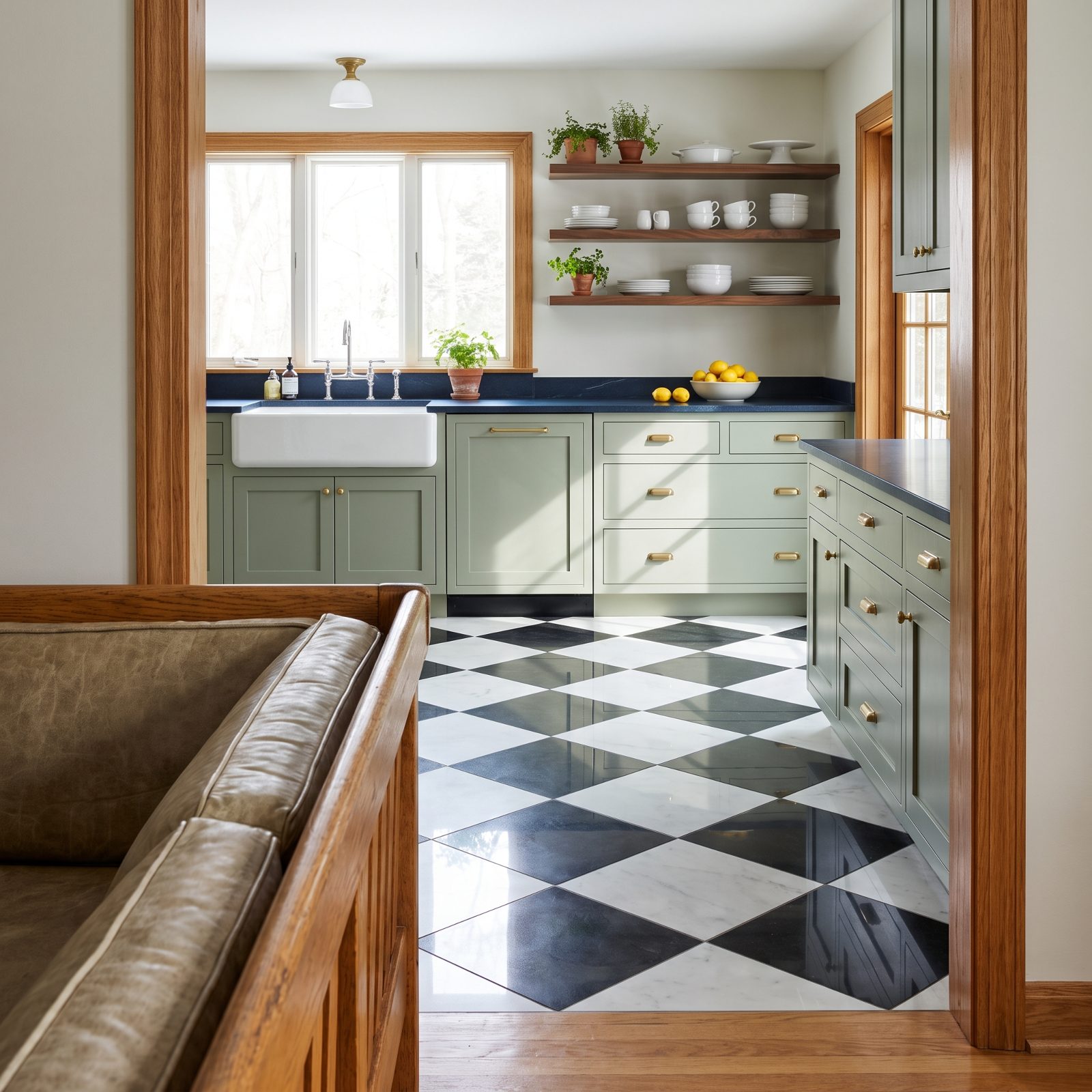
Nothing commits to a room like a checkerboard floor. It was everywhere in nineties kitchens and diners, then it vanished the moment everyone switched to beige travertine.
It’s back, and it’s better, because the surroundings finally calmed down. Black-and-white squares under sage cabinetry and brass hardware look graphic and deliberate now, not frantic. The trick is contrast and scale: big squares in true black and warm white, laid on the diagonal. Small fussy tiles in gray and off-white just look tired.
12. Speckled Terrazzo Surfaces, Scaled Up and Down
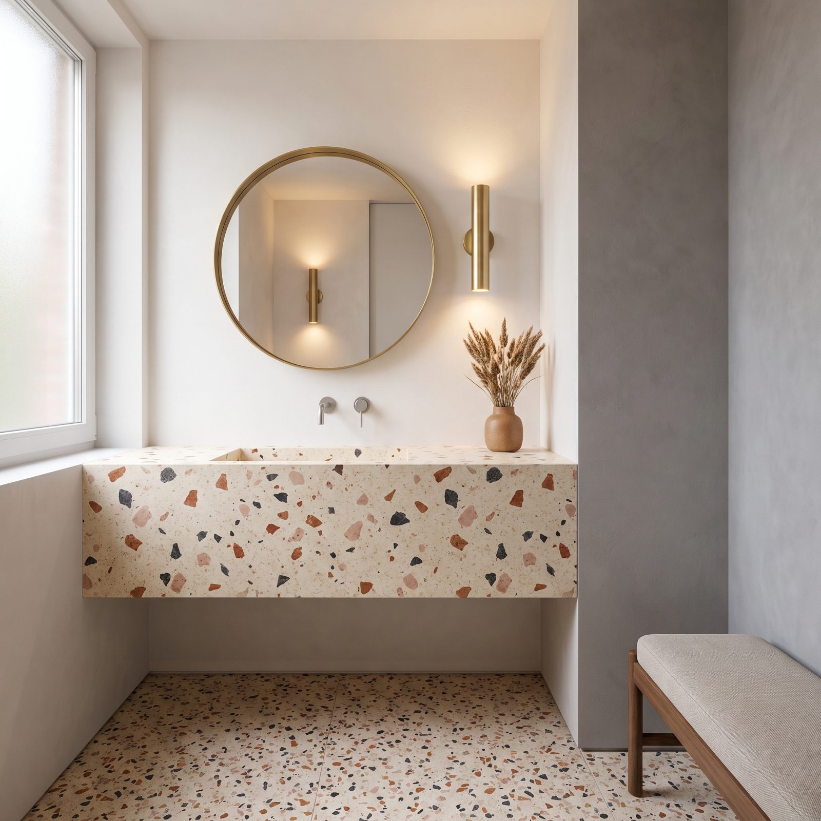
Terrazzo had a big moment in the 1990s as flooring in malls and bathrooms, all gray chips in a gray base. Dull stuff.
The comeback brought color and range. Now the chips are bigger, warmer, flecked with rust and pink and charcoal against a cream base, and it shows up everywhere from vanity tops to tiny coasters and planters. Most people start with the small accessories, which makes sense. A full terrazzo floor is a commitment and a cost. A terrazzo tray is a Tuesday.
11. Butter-Yellow Walls That Warm Without Shouting
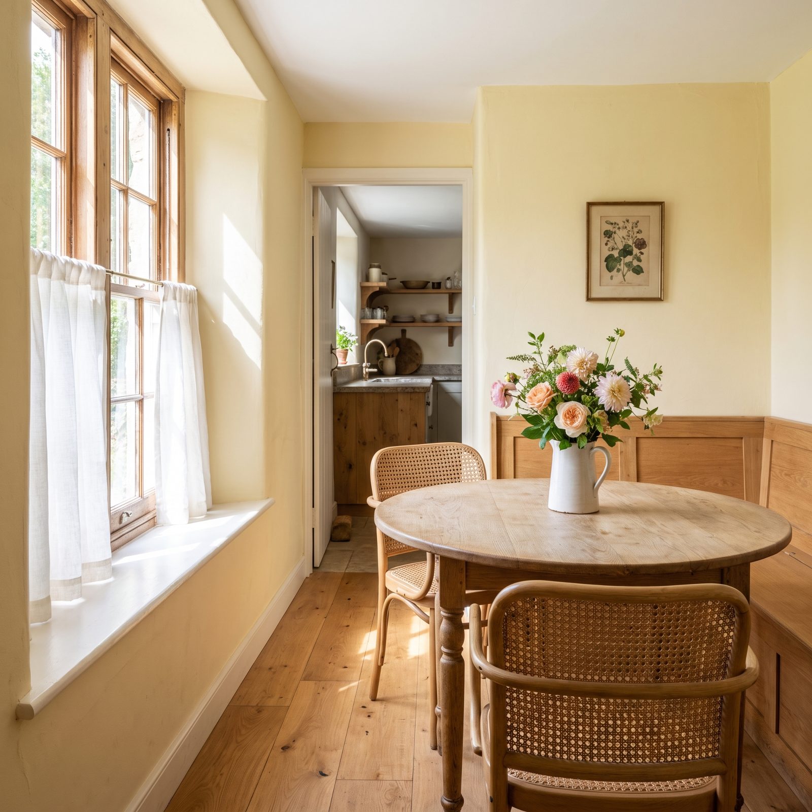
The 1990s loved yellow, but it was often the aggressive kind, that primary-crayon shade that made a kitchen feel like a fast-food booth.
Butter yellow is the apology. Soft, almost creamy, closer to a stick of butter than a lemon. On walls it does what a warm neutral does, but with a pulse of cheer running underneath. South-facing rooms glow with it. North-facing ones get the warmth they’re starved for.
10. Mauve and Dusty-Rose Palettes in Plaster and Tile
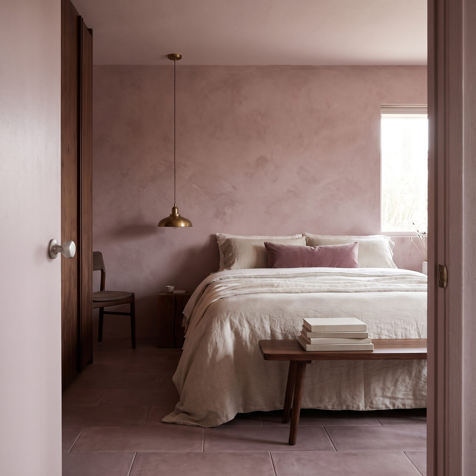
Dusty rose was the color of 1993, and then everyone decided it belonged in a grandmother’s spare room. Harsh, and not entirely fair.
The redo gives it depth. Instead of flat paint you get mauve limewash and plaster finishes that shift with the light, pink in the morning, grayer by dusk. Paired with oatmeal linen and brass, it reads sophisticated rather than sweet. Worth a look at the tile too: matte mauve zellige in a bathroom is genuinely lovely.
9. Burgundy on Cabinetry, Upholstery and Painted Walls
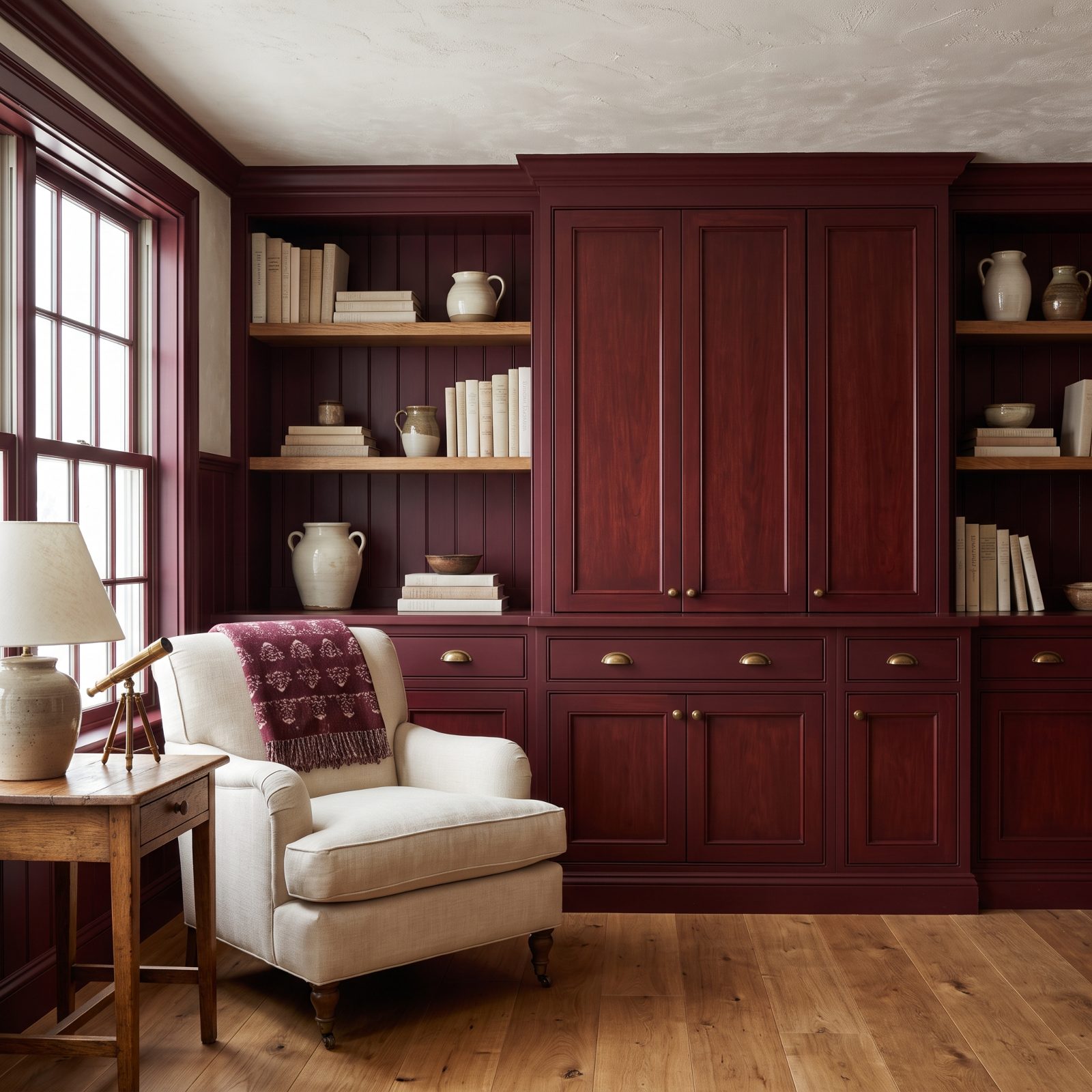
Burgundy was the sophisticated choice in the 1990s, and it kept getting dragged into dark, heavy rooms with hunter-green trim and a lot of mahogany. Stuffy, frankly.
Now it’s used with a lighter hand. Oxblood cabinets against cream walls. A burgundy velvet chair as the single rich note in a pale room. Given space to breathe, the deep red turns warm and grown-up. One wall, one cabinet, one sofa, let it be the main event and give it room.
8. Forest-Green Rooms Warmed by Timber and Brass
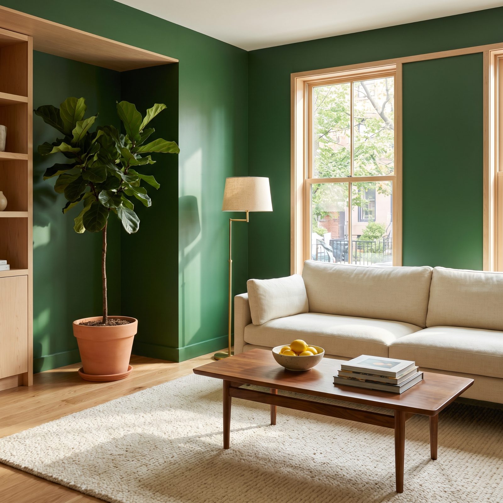
Forest green was a nineties staple, usually sitting beside burgundy and oak in a combination that screamed country club.
Cut it loose from that pairing and it comes alive. Deep pine-green walls with cream linen, walnut and brass feel current and calm, more botanical garden than boardroom. It’s the one bold wall color that functions as a near-neutral, because the eye already associates green with the outdoors.
7. A Single Saturated Accent Wall
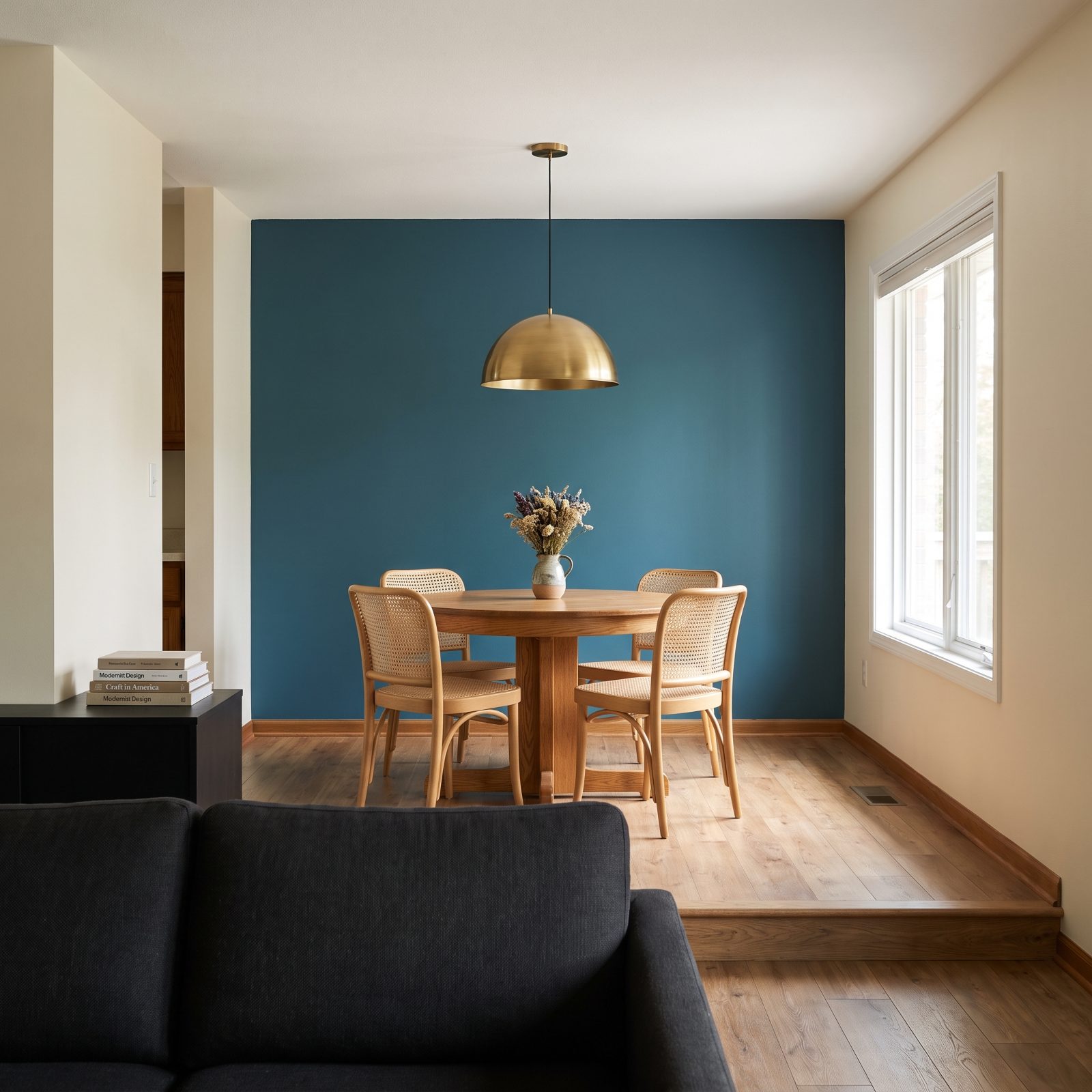
The accent wall picked up a reputation as the lazy decorator’s shortcut, usually a slab of terracotta or sponge-painted rust against three white walls. People mocked it, then abandoned it.
It’s back with intention. One saturated wall in teal, deep green or oxblood, used to frame a bed, a fireplace or a dining table. What changed is placement. The old accent wall landed wherever; the new one defines a zone and gives a room an anchor.
6. Rounded Black Leather Sofas, Now Warmed Up Instead of Chrome-Plated
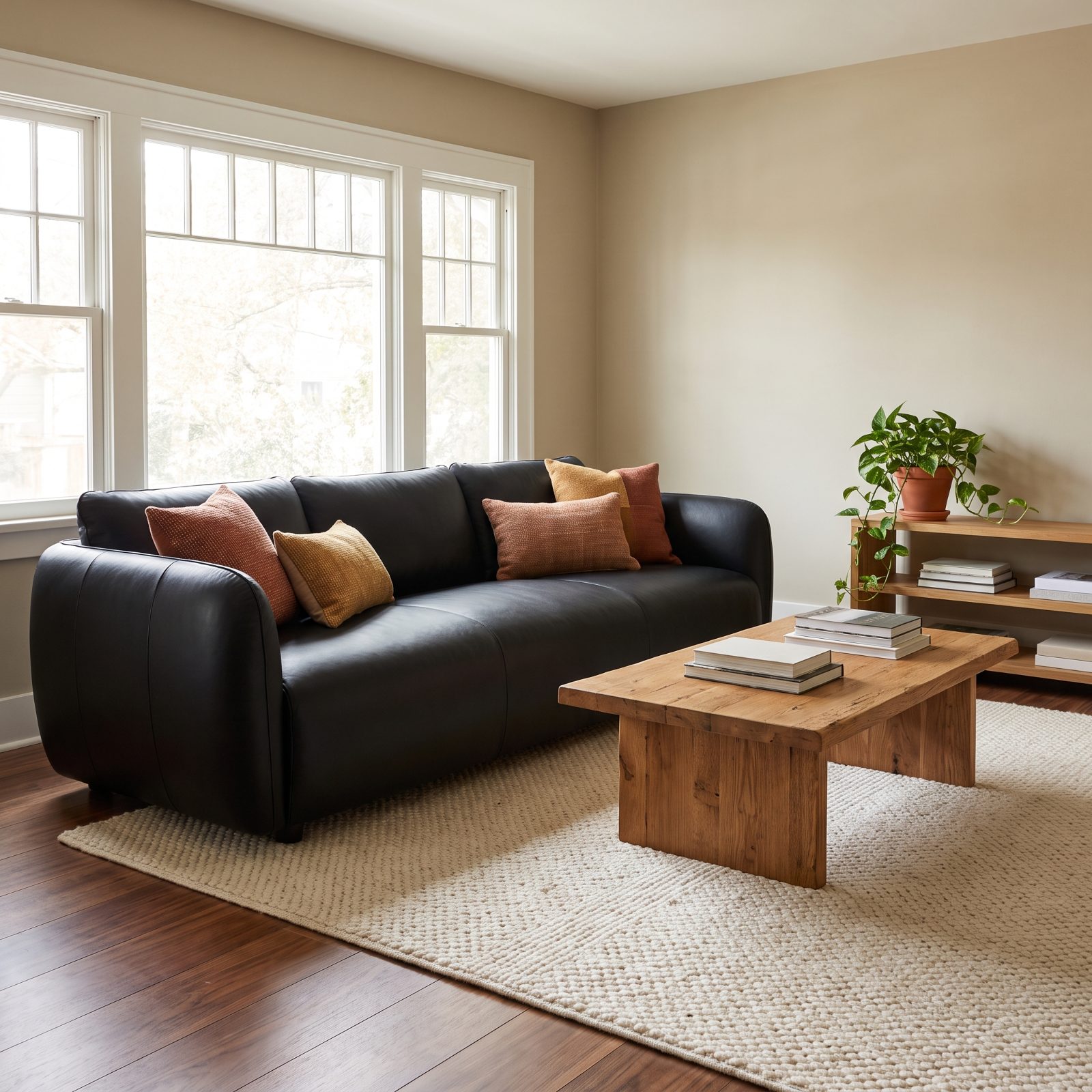
Black leather used to arrive with a chrome frame and a whiff of law-office waiting room. That version is gone. The one coming back has rounded arms and a low pillowed back, and it gets set against warm walnut and honey oak instead of cold metal.
The swap matters more than it sounds. On its own, leather reads expensive and a little severe. Pair it with woven textiles in rust and ochre, a clay pot, a nubby wool rug, and the whole thing softens into something you actually want to sink into. The leather does the heavy lifting while the textiles keep it human.
5. Deep Sectional Sofas Built for Sprawling, Not Posing
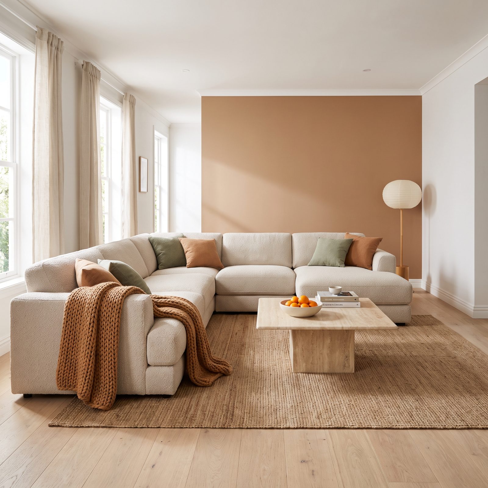
The sprawling sectional never fully left. It just spent years getting squeezed into tight-armed, show-ready shapes that nobody wanted to lie down on. Now the deep, forgiving version is back, and rooms are being designed around it on purpose.
Here is the honest part. These things eat square footage. A full wraparound can swallow a small room and leave you with a walkway, so measure before you fall in love — there is nothing sadder than a gorgeous sectional you have to shimmy past sideways.
The upholstery is where the real shift happened. Oatmeal bouclé and washed linen have shoved out the overstuffed microfiber, so the scale reads cozy rather than bulky.
4. Papasan Chairs Reborn in Reading Corners With Grown-Up Cushions
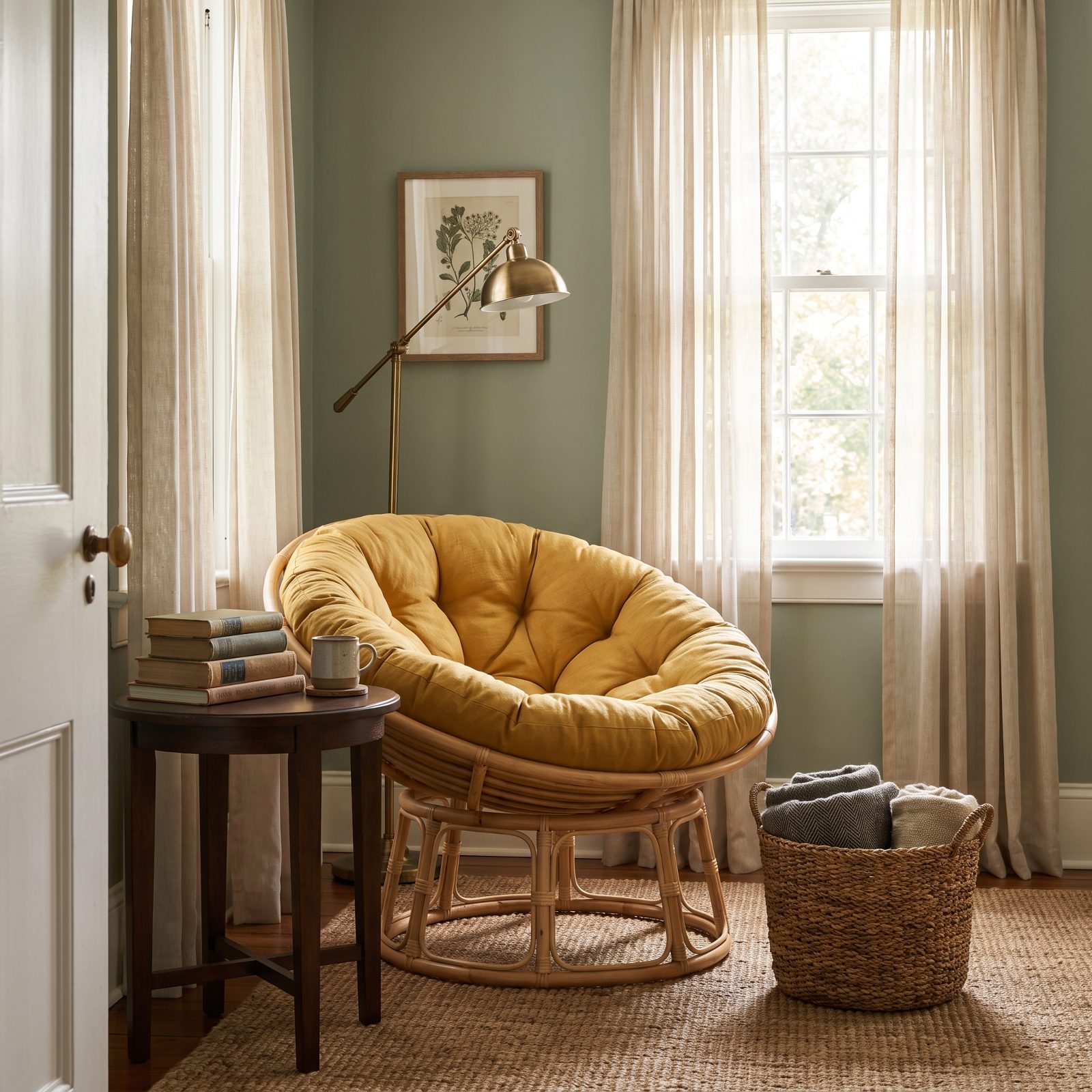
That giant round bowl chair from a college apartment? It grew up.
The reborn papasan keeps the deep saucer seat and the sink-right-in geometry, but it trades the sad flattened pad for a plush linen cushion and swaps the flimsy frames for solid rattan or natural wood. You’ll find it tucked into reading corners next to a window and a stack of books.
It works for the same reason it did the first time around: you climb in and the chair cradles you. What’s different now is that it looks intentional instead of improvised, which is a polite way of saying it no longer announces that you just moved out of a dorm.
3. Beanbags With Spine, Thanks to Structured Fabric and Smarter Fill
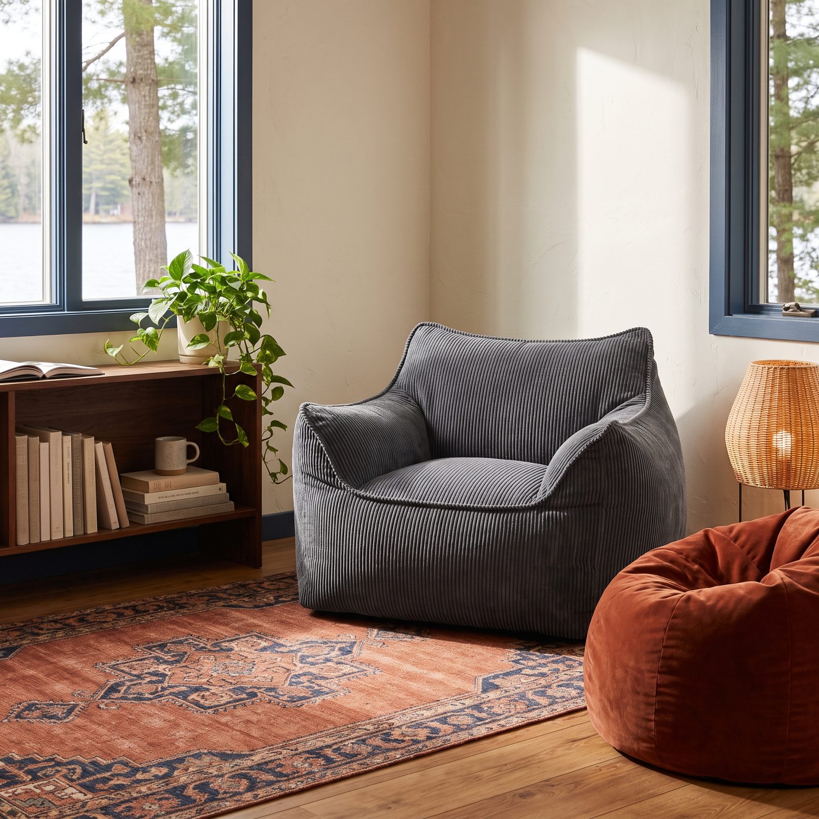
The original beanbag had two settings: a shapeless lump on the floor, and a shapeless lump that had leaked tiny foam pellets into every corner of the house. Not a flattering legacy.
The update fixes both. Structured corduroy and velvet shells hold an actual shape, and shredded memory-foam fill gives real back support instead of swallowing you whole. The result lands somewhere between a lounge chair and a floor cushion, and — crucially — it keeps its form when you stand up.
2. Inflatable Chairs as Portable, See-Through Party Furniture
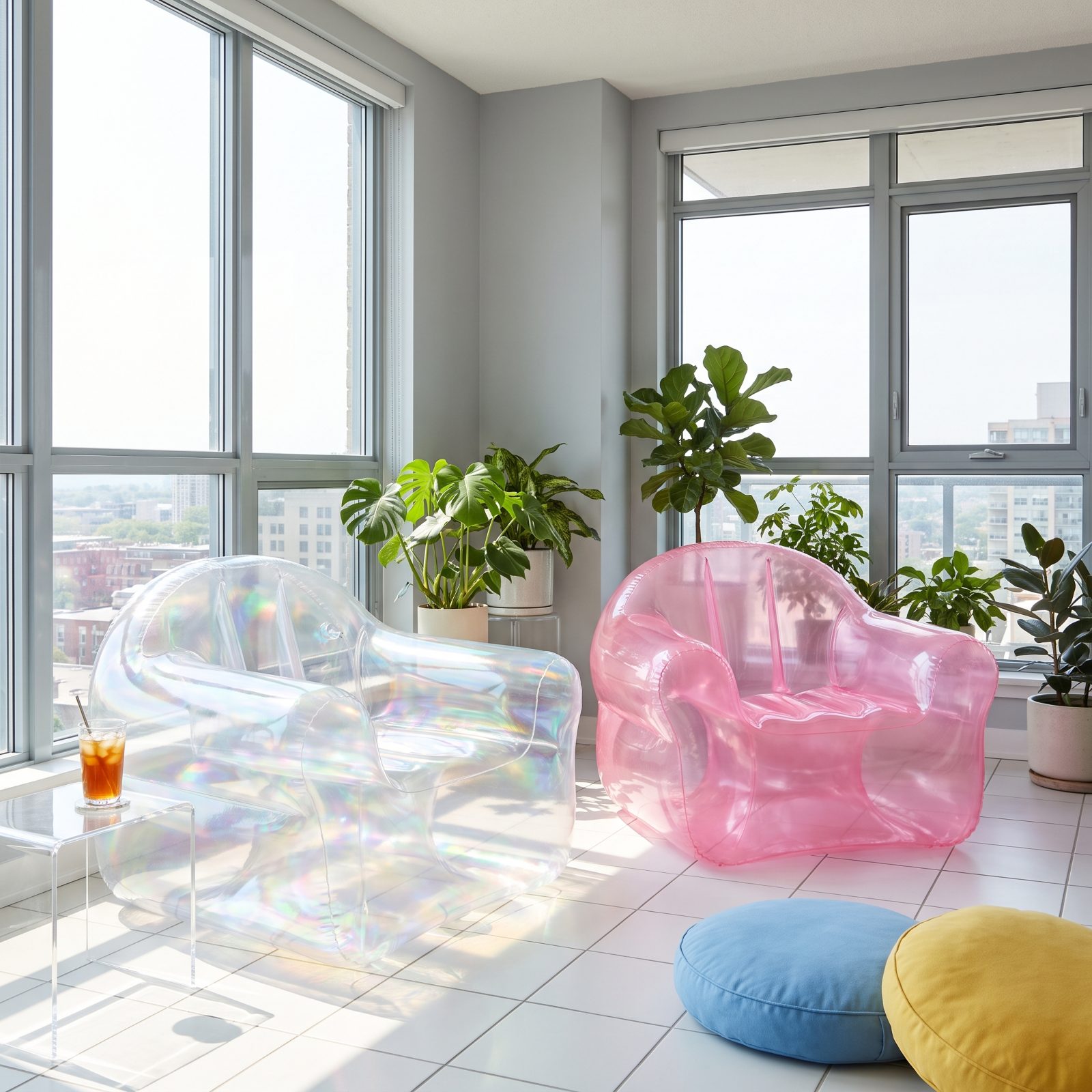
Nobody is pretending the inflatable chair is serious furniture. That is exactly the point.
It has come back the way it first arrived: cheap, see-through or candy-colored, and completely unbothered with being tasteful. The modern ones use thicker, less squeaky PVC, so they outlast a single sweaty summer afternoon. They deflate flat, stash in a drawer, and reappear whenever a room needs extra seats and a sense of humor.
Sunroom, playroom, dorm, patio — they go anywhere. Just keep them clear of anything with a point, because the one thing time has not fixed is the unmistakable hiss of a slow leak.
1. Lava Lamps Working as Sculptural Color, Not Just Nostalgia
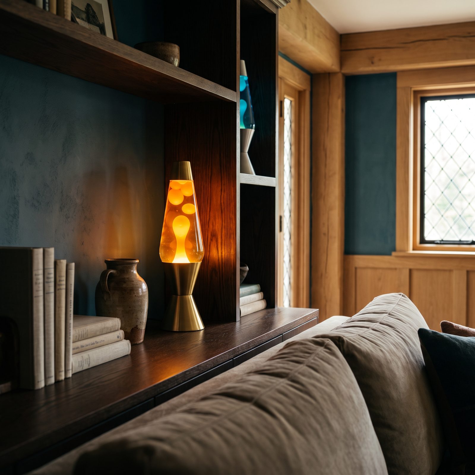
The lava lamp was never really about light. It’s about watching a blob of wax decide, very slowly, to float. That still accounts for the whole appeal.
Where it sits has changed. Instead of glowing in a teenager’s bedroom, it now earns a spot as a sculptural accent on a bookshelf or console, often in grown-up colorways: amber wax in deep orange liquid, white wax in teal, housed in a brushed brass base. Switch it on in a dim room and it throws a warm, shifting pool of color that no other lamp quite matches.