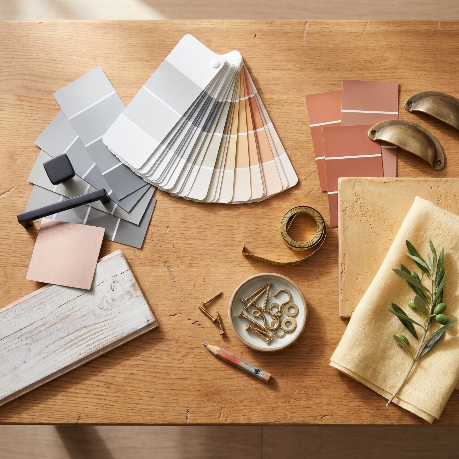
Gray walls aged faster than anyone expected. Not slowly, the way avocado appliances faded through the 1970s, but in a handful of years the look that dominated real estate listings and paint chips suddenly started signaling one thing: nobody updated this since 2018. Decor doesn’t retire on a schedule. It gets outrun. A trend saturates showrooms, flips in a thousand kitchens, then tips into cliché the moment everyone can name the year it peaked. So we walked through the looks heading that direction, the ones that still feel current but won’t for long, and the warmer, quieter choices designers are reaching for instead.
Please note that some of the images in this article were created with the assistance of AI.
50. All-Gray Rooms From Floor to Ceiling
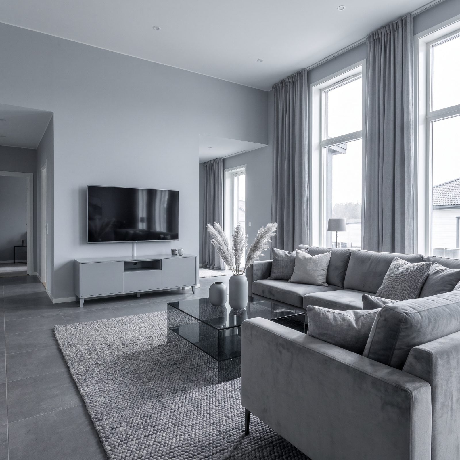
Gray promised to be safe. It became a warning label. When a room goes gray from the baseboards to the crown molding, it reads like a builder who wanted to offend nobody and ended up committing to nothing. The color isn’t the villain here — the total surrender to it is.
What’s moving in: warm neutrals with actual temperature. Greige, clay, mushroom, soft putty, the tones that borrow a little brown and a little yellow so light has something to warm up against. Rooms built on these feel lived-in at 4pm instead of embalmed.
49. Shiplap Accent Walls
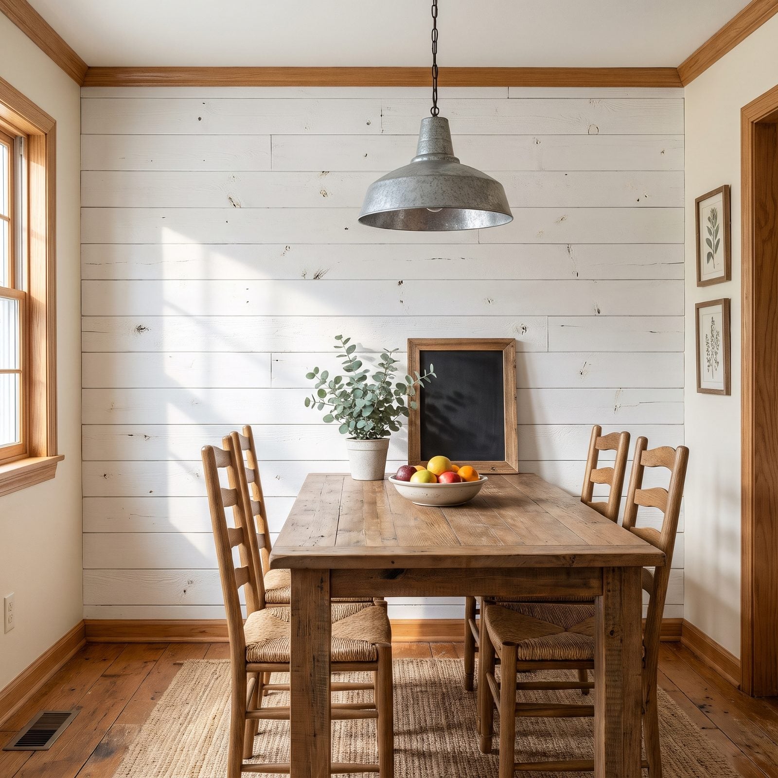
Shiplap had a good run. We can thank a very famous home-renovation show for putting those white horizontal planks on roughly every accent wall in America between about 2014 and 2020.
Here’s the trouble. Shiplap was never structural — it was a wall treatment pretending to be bones. Designers are swapping it for finishes with real depth: limewash and plaster walls that shift with the light, tonal wall moldings, or vertical board-and-batten done subtly in a color rather than screaming white. The texture stays, and the dated farmhouse signature goes.
48. Stark All-White Minimalist Interiors
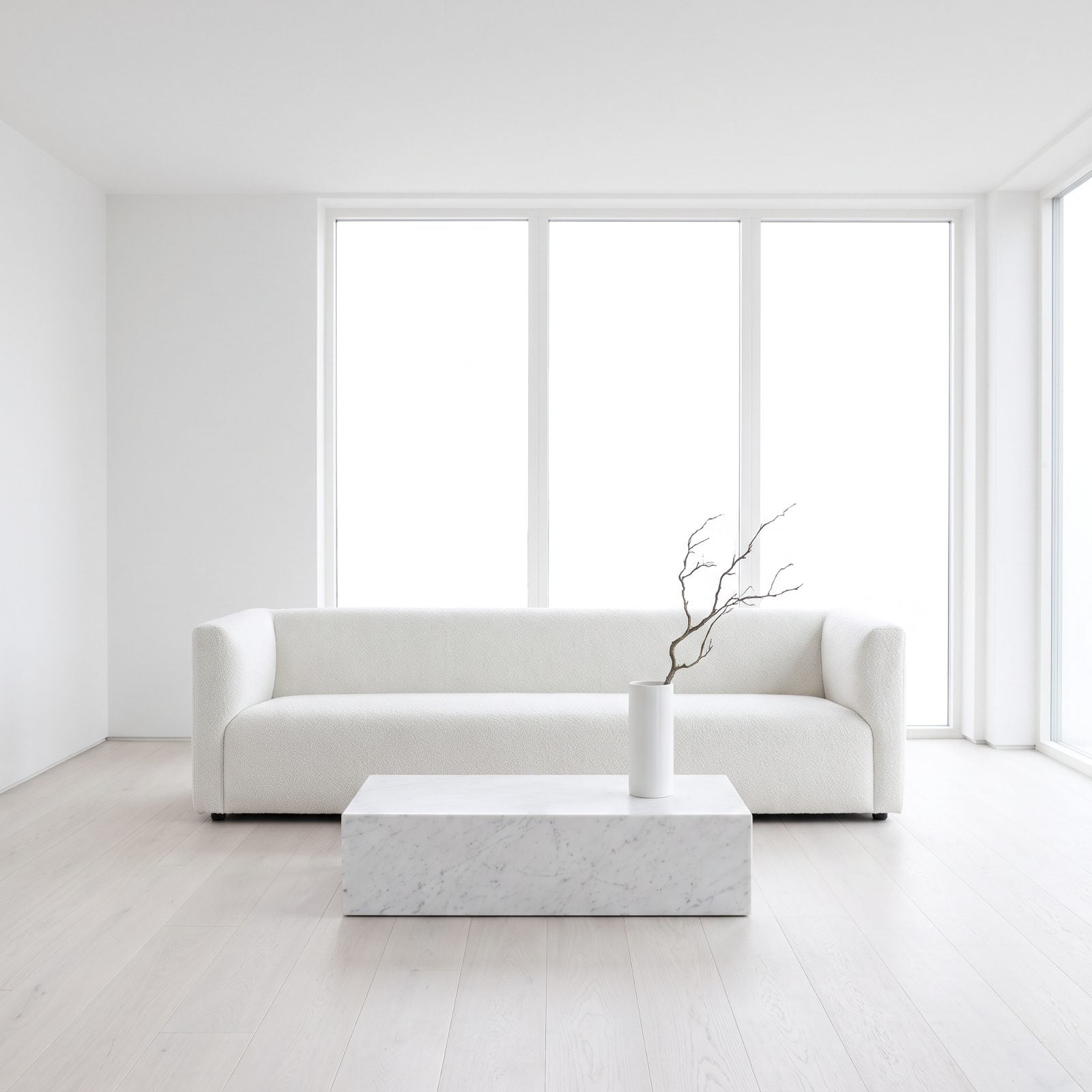
The sterile white box sold a fantasy of control. Nobody actually lives like that. We’ve stood in all-white show homes and wanted to leave a coffee ring somewhere just to prove a human was present.
The pushback is comfort you can feel: butter yellows, soft creams, warm whites with a drop of pigment in them, layered against natural wood and a little texture so the eye has somewhere to rest. The new minimalism keeps the restraint and drops the operating-room chill.
A room that fears a single fingerprint isn’t minimalist. It’s just anxious.
47. Millennial Pink as the Default Accent Color
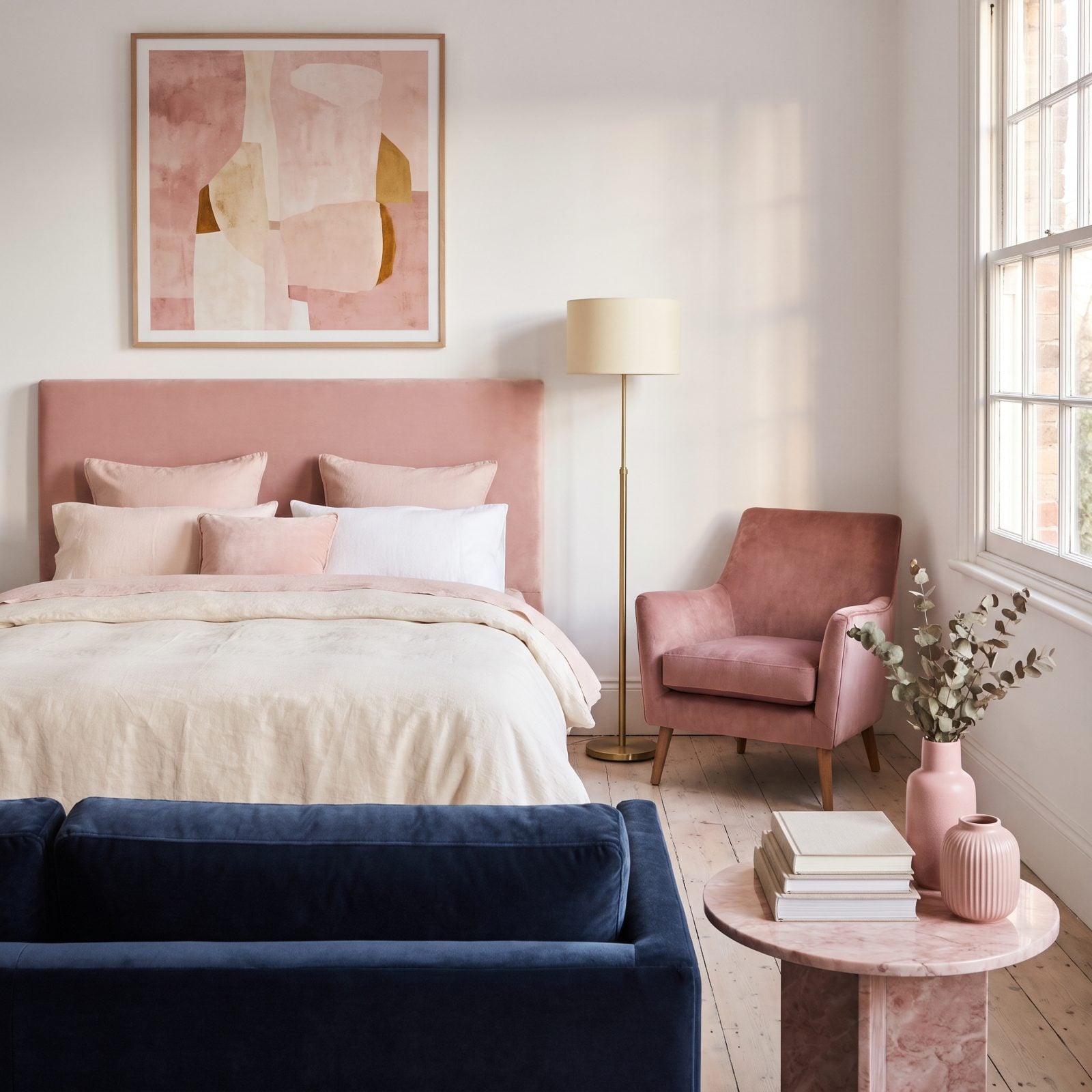
Everyone painted a wall this color around 2016. Cafés, boutiques, nurseries, the inside of a thousand phone cases. That dusty blush-rose became shorthand for a whole design era, and that’s exactly the problem now. It doesn’t read as pink anymore. It reads as 2016.
What’s replacing it runs warmer and gutsier: terracotta, clay, burnt sienna, and a resurgent peachy-apricot that flatters skin and candlelight both. These earth-leaning warm tones carry personality without carrying a timestamp.
46. Rose Gold Accessories and Finishes
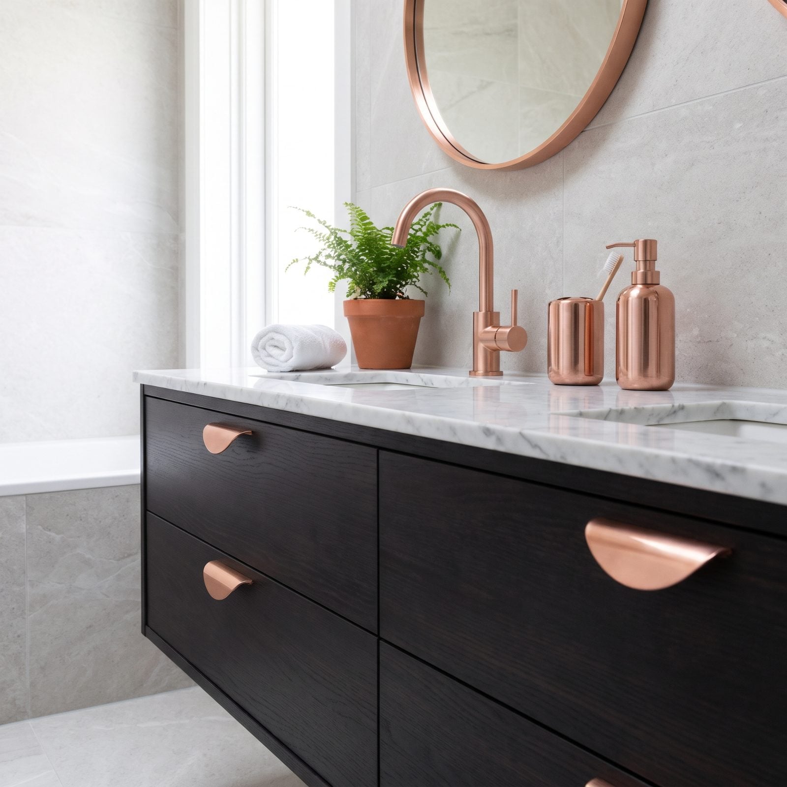
For a stretch there, rose gold was on everything — faucets, drawer pulls, mirror frames, the legs of the coffee table, your phone. That pinkish copper shine felt fresh in 2015 and now it coordinates a little too neatly, the way a matching luggage set gives away that someone bought it all at once.
Unlacquered brass is eating its lunch. Not the shiny polished kind, but the warm living finish that darkens and patinas with your fingerprints over years. It ages instead of dating. That’s the draw.
45. Matte Black on Every Fixture and Fitting
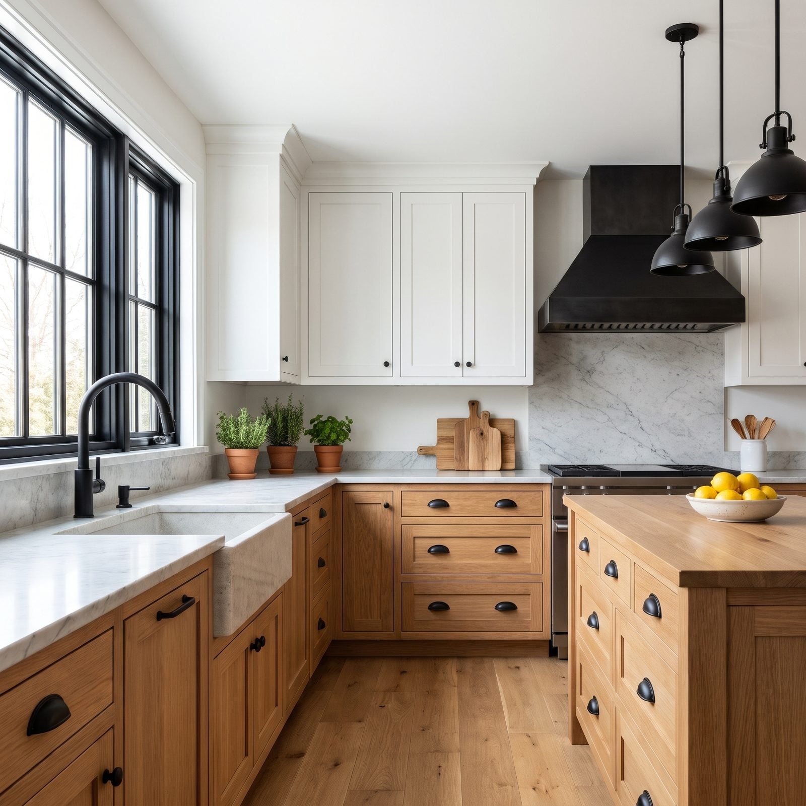
Matte black started as a hit of edge. One black faucet against white cabinets, sharp and confident. Then it spread like a rash. Black hardware, black light fixtures, black window frames, black everything, until the contrast that made it interesting flattened into a rule.
We’ll admit we loved it at first. We were wrong about how fast it would tip. When every fitting is matte black, nothing is the accent anymore.
The move now is mixed metals done with a light hand: warm brass as the lead, a little aged bronze, maybe one black element left for tension instead of twenty. Rooms get their depth back when the finishes stop marching in lockstep.
Weighing whether matte black hardware still works, one interior designer notes that “What typically tends to feel out of place in these lived-in aesthetics is modern matte black, which can seem stark, harsh, and too new in contrast.”
44. Heavily Distressed Whitewashed Furniture
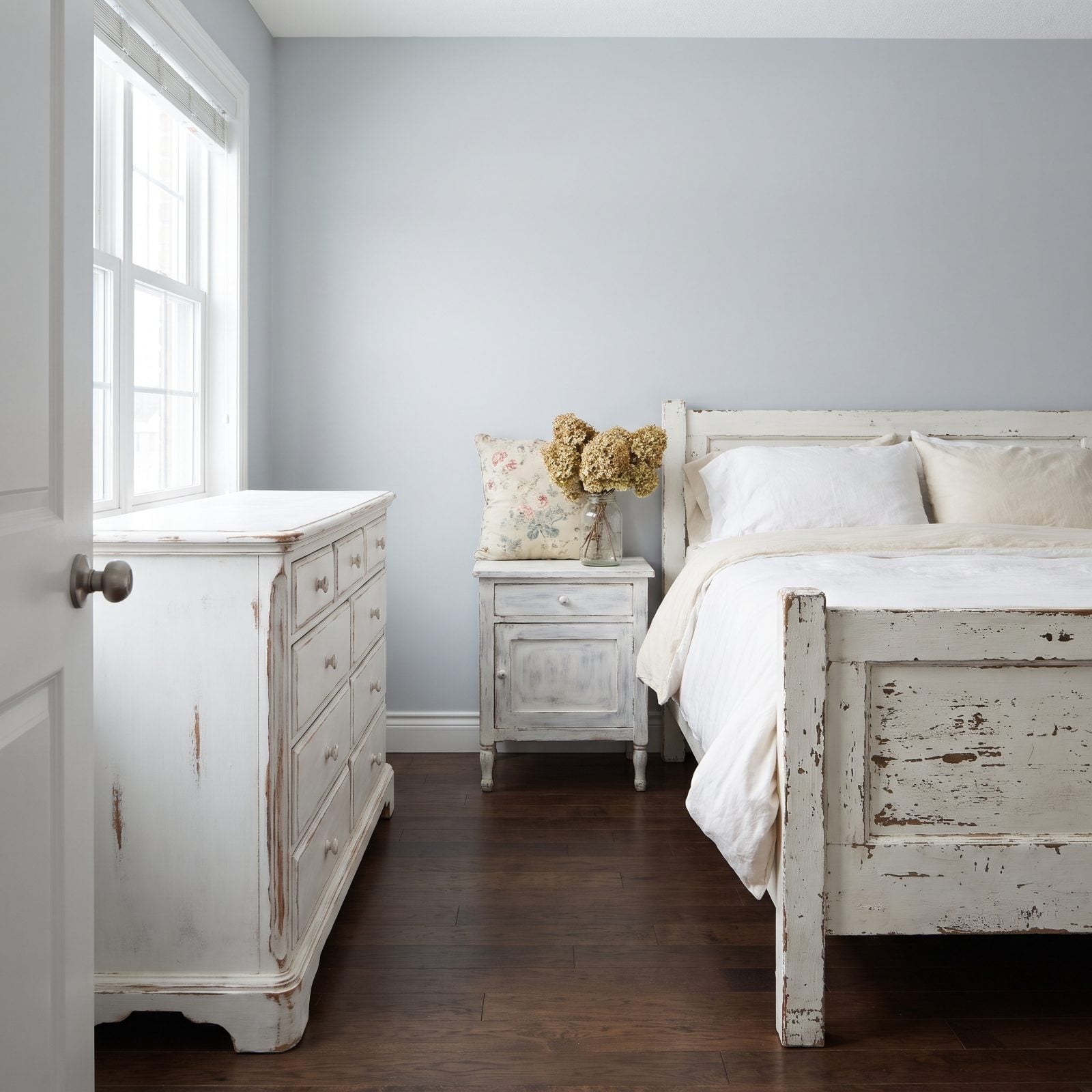
Chalk paint and a sanding block turned a generation of thrift-store dressers into cottage treasures. The look peaked, then kept going, until the deliberately chipped edges started reading as a costume rather than character.
Real patina beats fake wear every time, and buyers can tell the difference. The replacement is honest wood: warm walnut, cherry, oak with visible grain, finished to show what it actually is. Vintage pieces with genuine age are back too. Turns out a dresser that earned its scuffs looks nothing like one that got them with sandpaper on a Saturday afternoon.
43. Reclaimed Pallet-Wood Feature Walls
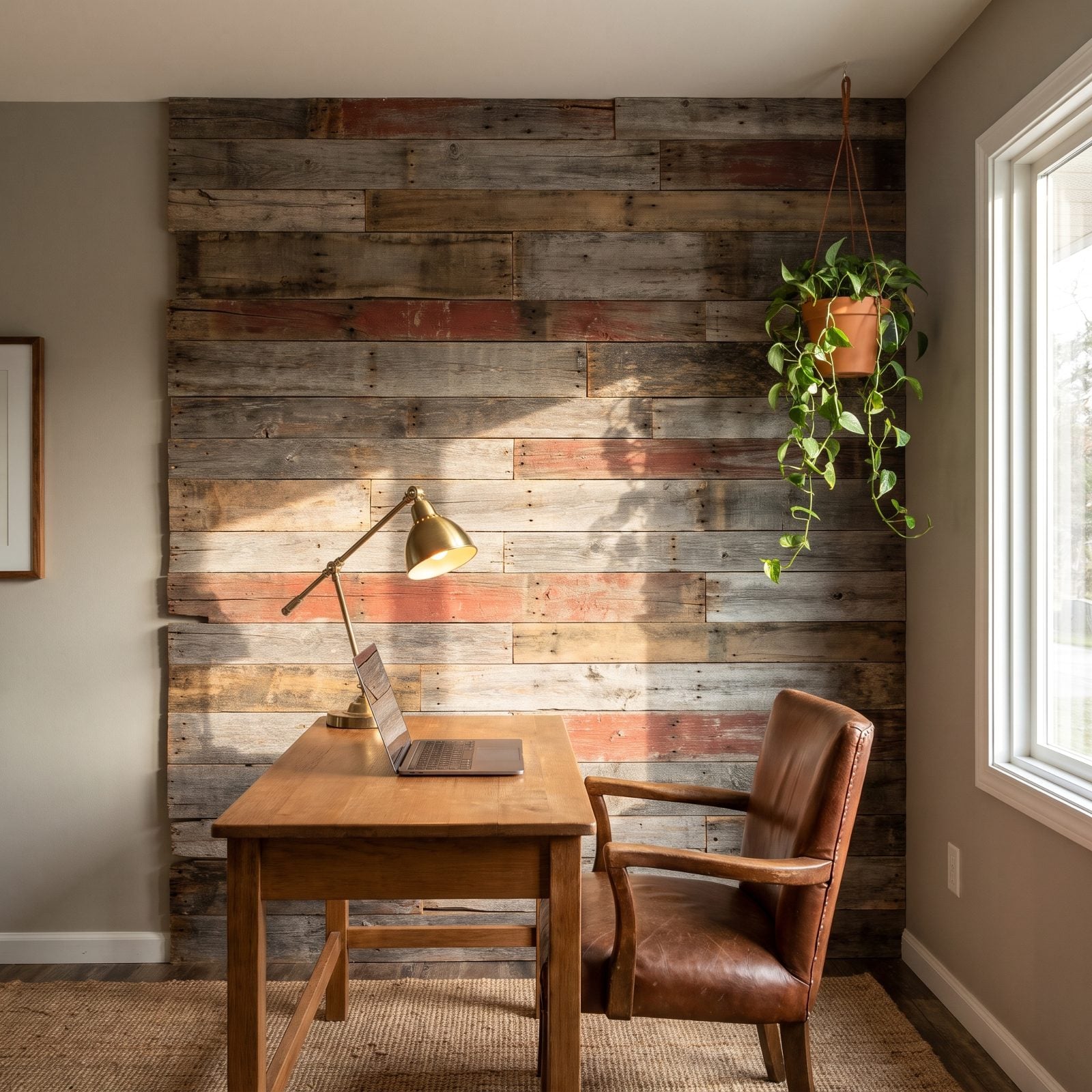
You remember the weekend everybody tore apart shipping pallets. The reclaimed-wood feature wall was the ultimate DIY badge, a patchwork of weathered planks nailed up behind the couch or the bed. It said resourceful. Now it mostly says 2015.
What’s taking its place is quieter woodwork: floor-to-ceiling tongue-and-groove in a single warm tone or a wall of built-in cabinetry in oak. The warmth of wood stays central. The splintery patchwork of mismatched salvage, with its faint whiff of whatever the pallet used to carry, is on its way out.
42. Vertical Wood-Slat Feature Walls
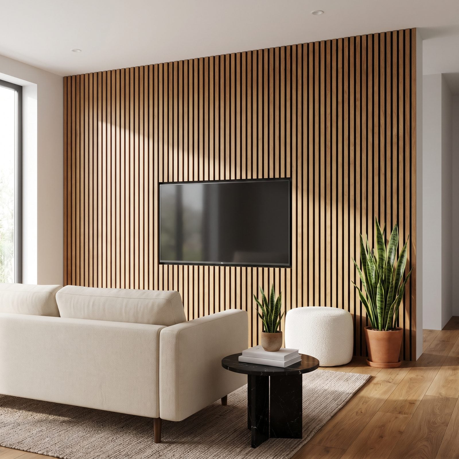
These are the newest arrival on this list, which is exactly why they’ll date fastest. Those evenly spaced vertical oak slats running behind the TV exploded across social feeds and flip accounts almost overnight, and anything that saturates that quickly burns out just as fast.
Their weakness is sameness. Most are identical manufactured panels, so every room wearing one looks like every other room wearing one. Designers are moving toward custom millwork with variation built in, plaster relief, or simply a single well-chosen piece of art on a plain warm wall. Restraint is the correction.
41. Painted Arches Behind Furniture
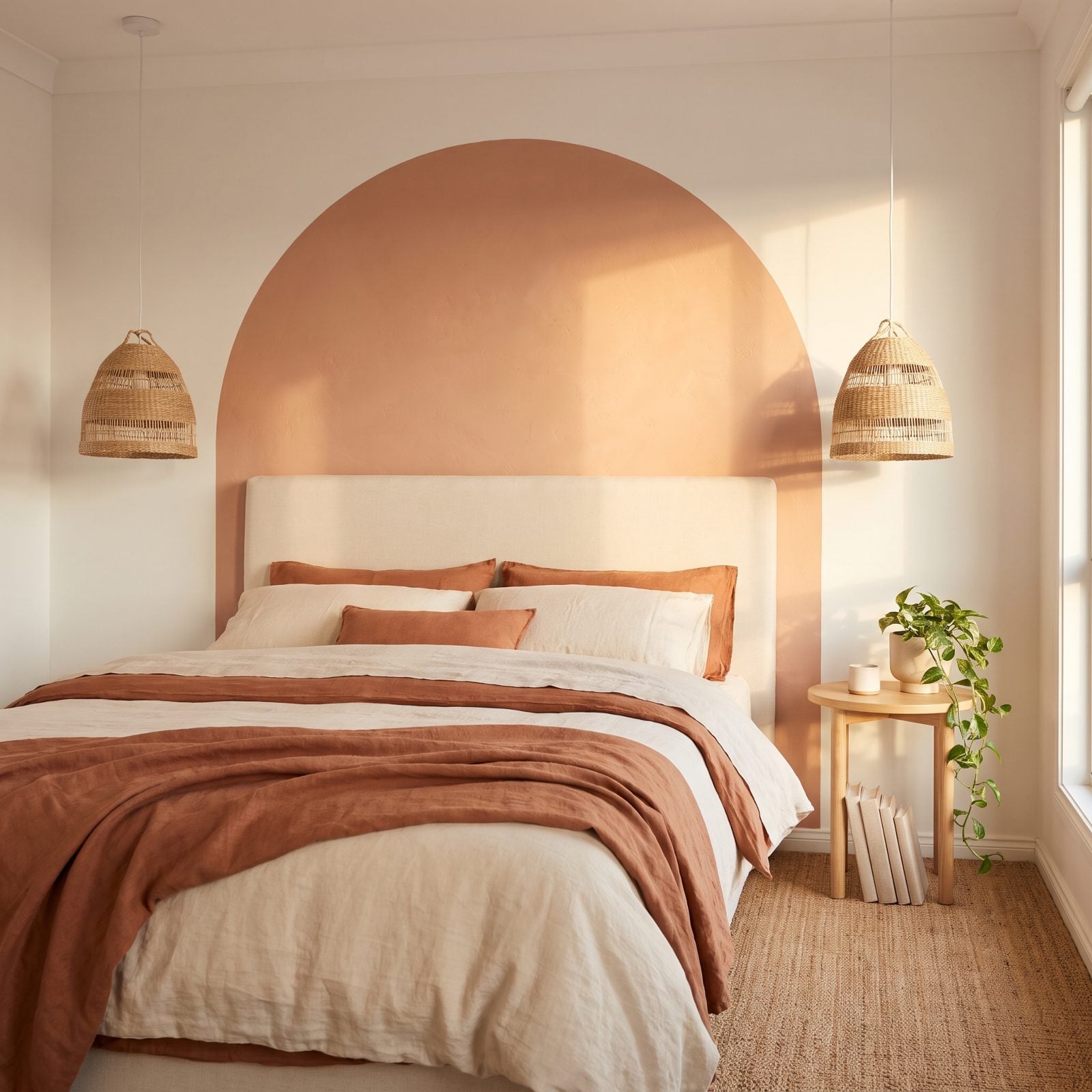
A half-circle of color painted onto the wall to frame a headboard or a plant. It was clever the first thousand times. The painted arch became the signature DIY flex of the last few years, the thing you did instead of buying a real headboard.
Trouble is, a painted shape is still flat. It mimics structure without adding any. The shift now goes toward the real thing: actual arched doorways, curved niches, rounded plaster edges, or sculptural furniture that brings genuine curve into a room. A painted arch is a photograph of a building. People are ready for the building itself.
40. Chalkboard-Paint Walls That Peaked Around 2014
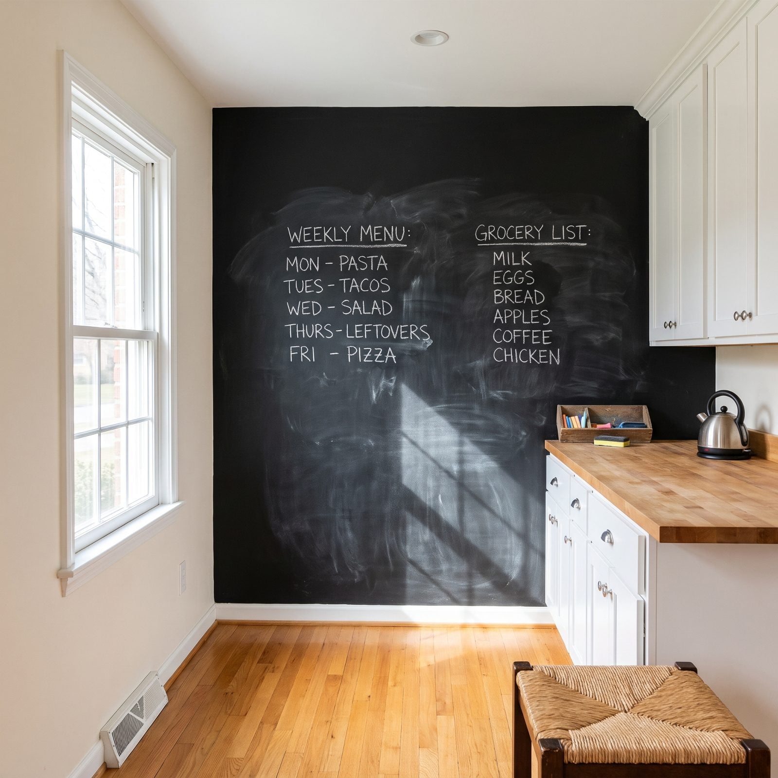
The dream was a wall you could rewrite every morning. The reality? A gray film on your fingers and chalk dust burrowing into every nearby crevice. Those menu-board walls and pantry-door scribbles read as Pinterest-circa-2013 almost the moment you look at them now.
Here’s what’s taking over instead: a framed magnetic steel panel, or a slim fluted wood message board — something you can wipe clean that doesn’t swallow the light in the room. Flat black chalkboard paint drinks daylight like a sponge. The replacements bounce it back, and that matters more than anyone was willing to admit back then.
39. Oversized Tropical-Leaf Wallpaper Gone Flat
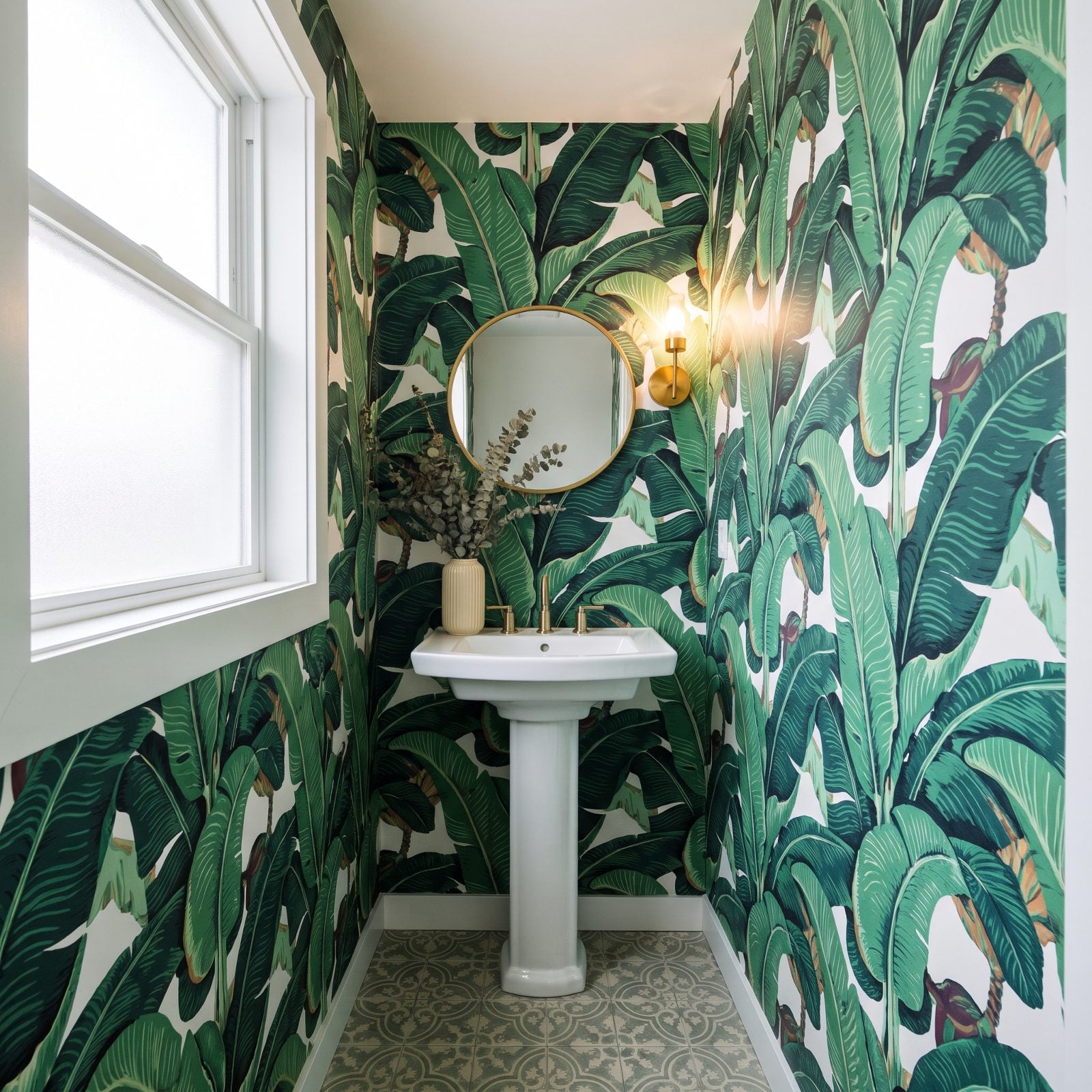
Every boutique hotel lobby and half the powder rooms in America went full banana leaf for a stretch there. The print was fun. The trouble is it never really evolved, so it now stamps a room with a very specific window of years.
What people reach for now runs quieter — textured grasscloth, a hand-blocked botanical in muted tones, a plaster-look wall that adds depth without yelling a single motif at you. Still love the drama? A real framed botanical print trio does the job without conscripting four walls into the same loud leaf.
38. Faux Brick Wall Panels Pretending to Be a Loft
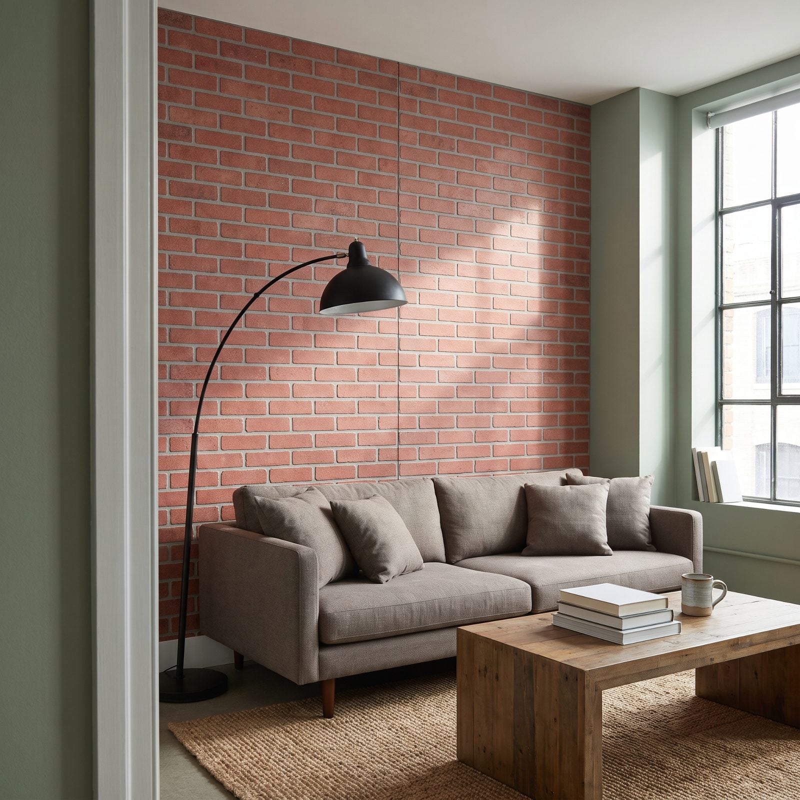
Real brick has weight. The panel kind gives itself up in seconds. Up close the mortar lines repeat, the corners curl, and that telltale seam where two sheets meet catches the light wrong. It fooled nobody at a party, and it won’t be fooling anyone by 2027 either.
What’s winning instead is honesty about the surface you actually have — limewashed plaster, a warm clay paint, or Venetian plaster for real texture and shadow. Craving the industrial look? Exposed real masonry or a tadelakt finish carries the mood without the plastic giveaway. Faux brick was always cosplay for a building that was never a factory.
37. White Subway Tile With Aggressive Dark Grout
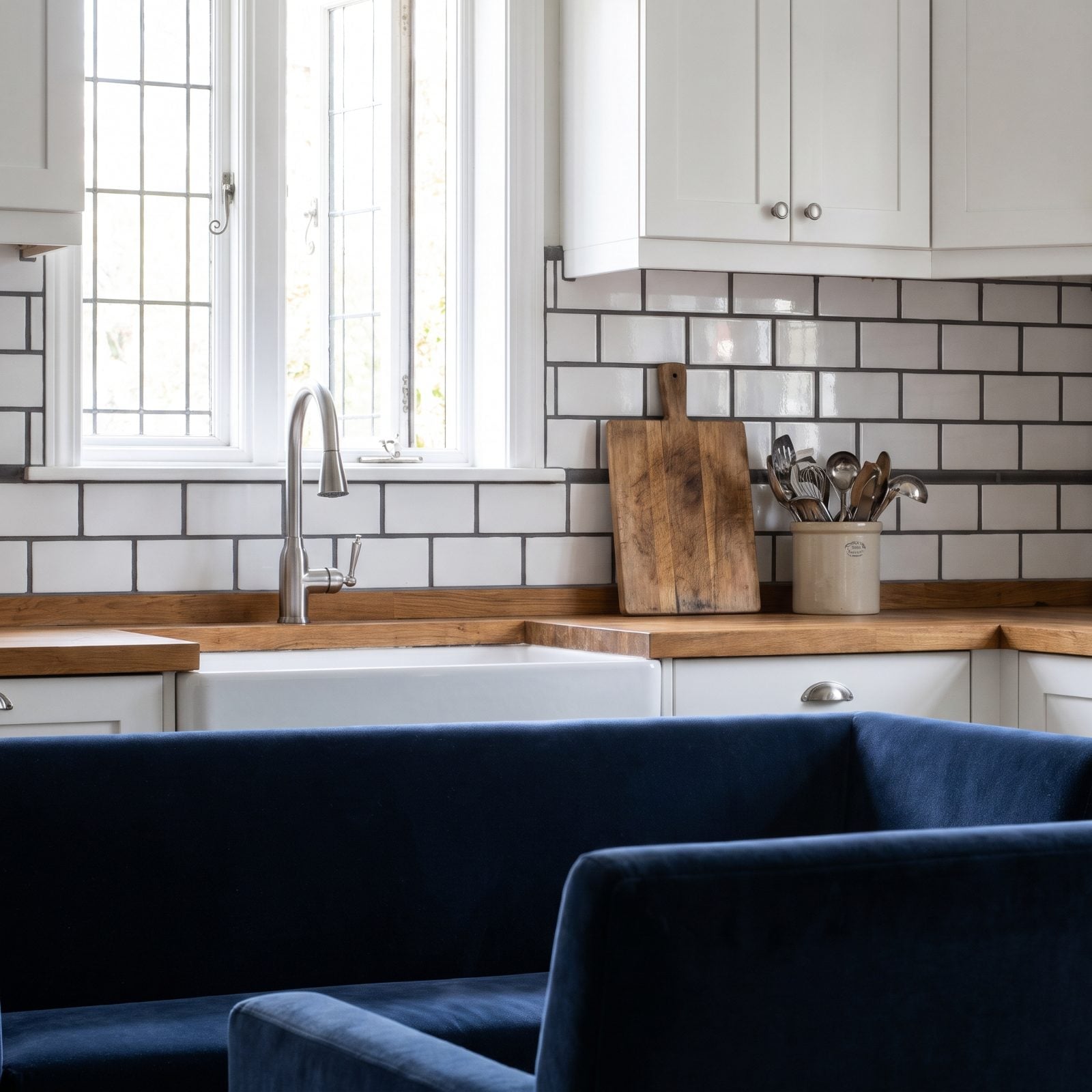
Classic tile, loud grout. That dark-line grid was the house-flip signature of the 2010s — the fastest possible way to announce I watched a lot of renovation shows. The tile itself survives. It’s the high-contrast charcoal grout, the stuff that turns a backsplash into a math worksheet, that’s aging out.
Matching or barely-there grey grout reads calmer and lets the tile breathe. Hand-glazed zellige, vertical stacked tile, a warm-toned ceramic with tonal grout — any of them feel current without being quite so loud. The grid was never neutral. It was a declaration, and the declaration got old.
Rather than the high-contrast grid, an interior designer who calls contrasting grout very busy advises: “If you’re going to use subway tile, stick with a classic look, a similar grout color, or a soft tone.”
36. Terrazzo-Print Surfaces Everywhere at Once
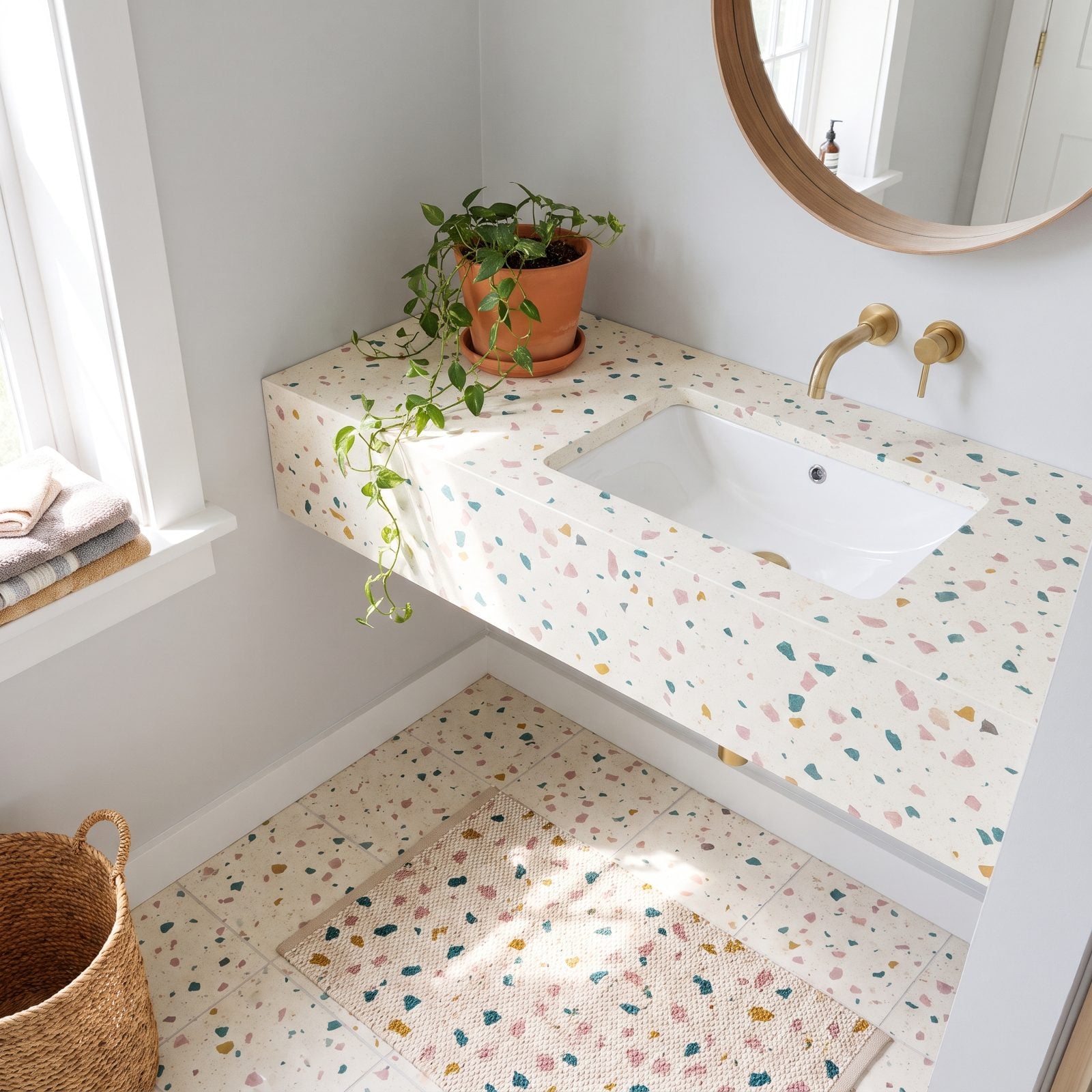
For a few years terrazzo colonized everything. Counters, floors, planters, phone cases, dog bowls — I’m not exaggerating. The confetti look is cheerful, and that cheer is precisely what got it overexposed. When a pattern turns up on your trivet and your tile and your tote bag, it stops reading as design and starts reading as a date stamp.
Real terrazzo, used once and sparingly, still holds up. Stone is stone, and stone doesn’t expire. It’s the printed version smeared across six different surfaces that pins a room to its year. The fix is restraint: one honed stone surface, solid colors around it, and nothing else elbowing for your attention.
35. Faux Marble Contact Paper Peeling at the Corners
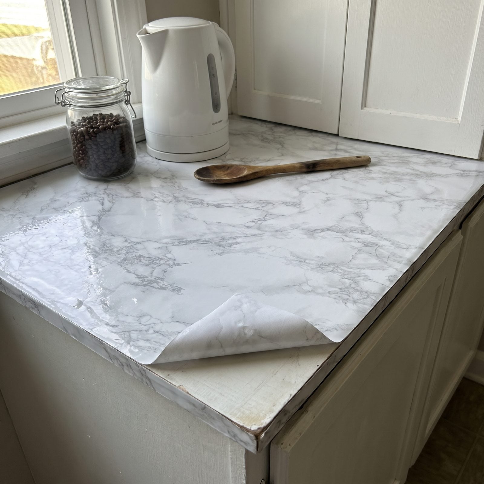
Honestly? We completely get the appeal. Peel, stick, pretend you own Carrara. But vinyl marble carries a shine real stone never has, the veins repeat the second you stare, and it starts lifting at the corners the minute a hot pan gets anywhere near it.
The shift is toward real-but-affordable — a honed soapstone remnant, butcher block, a solid matte quartz in a plain color. Even a painted counter in a warm neutral reads more honest than printed stone does. Fake marble was a stopgap, and deep down we all knew it was a stopgap.
34. Chevron Zigzags Racing Across Rugs and Walls
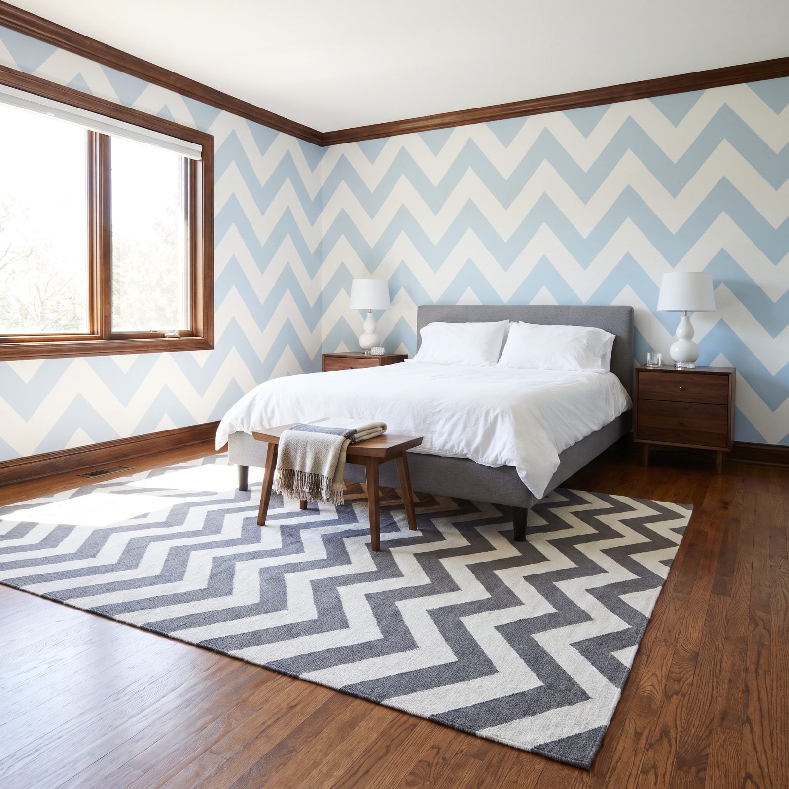
The zigzag had its moment, and what a loud moment it was. Rugs, pillows, accent walls, baby nurseries — all of them marching in that restless V shape. The trouble with chevron is you can’t relax near it. Your eye keeps racing along the points instead of settling down anywhere.
Softer geometrics are moving in: a quiet herringbone, an irregular hand-knotted pattern, or a plain textured rug that lets the furniture do the talking for once. Herringbone, chevron’s calmer cousin, offsets each row so the lines never snap into those sharp peaks — and it has centuries of flooring history behind it rather than a single frantic decade.
33. Quatrefoil Prints and Cutouts Borrowed From a Showroom
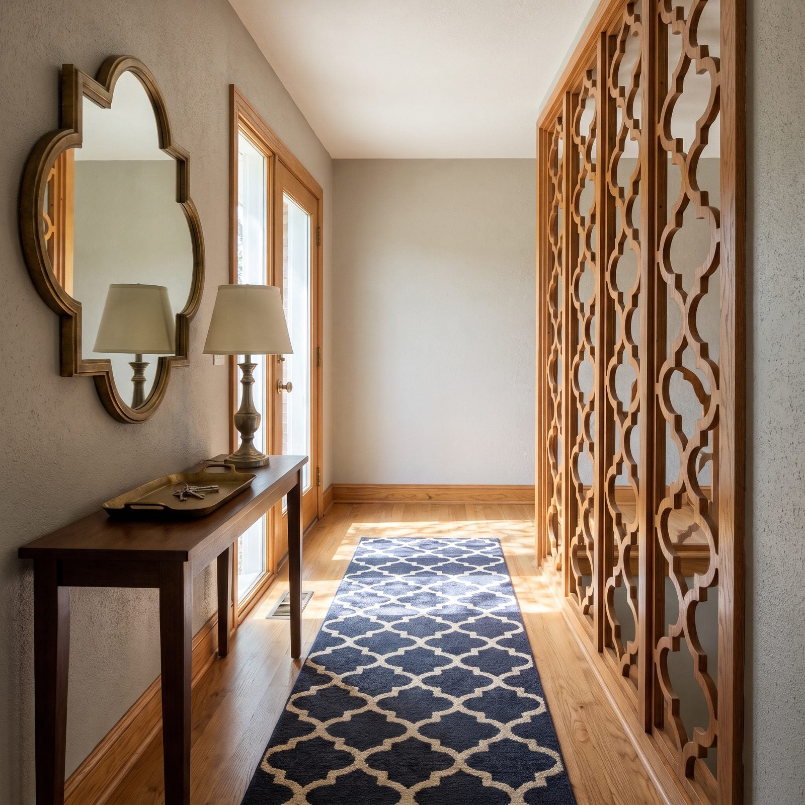
That four-leaf-clover lattice shape ran wild through the transitional-glam era. Mirror frames, rug borders, metal garden screens, cutout bench backs — it was everywhere. The thing signaled a safe, model-home kind of sophistication, which is exactly why it now feels like a 2012 catalog you forgot to recycle.
Rooms are drifting toward organic, less symmetrical shapes now. Arches. Soft curves. A single sculptural object rather than a motif stamped on repeat. And if you want pattern with actual history, a real Moroccan or Turkish geometric earns its spot. Nobody ever inherited a quatrefoil from their grandmother. It was a showroom shortcut to looking expensive, and the shortcut always shows.
32. Black-and-White Buffalo Check on Repeat
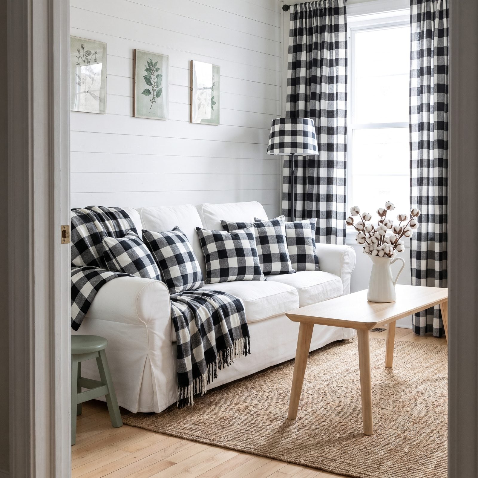
One buffalo-check pillow is cozy. Six of them plus the curtains and the lampshade is a theme park. The pattern rode the modern-farmhouse wave hard, and like shiplap and barn doors before it, it’s become shorthand for a very specific few years of decor.
Warmer, softer textures are stepping in — a nubby oatmeal linen, a small-scale gingham in some muted color, a vintage-feel plaid gone faded rather than stark. It’s the high contrast that tires the eye out. Pull the check back to a single accent and it survives just fine. Carpet-bomb the room with it, though, and you’ve basically date-stamped the place.
31. Checkerboard on the Floor, the Rug, the Mug, Everything
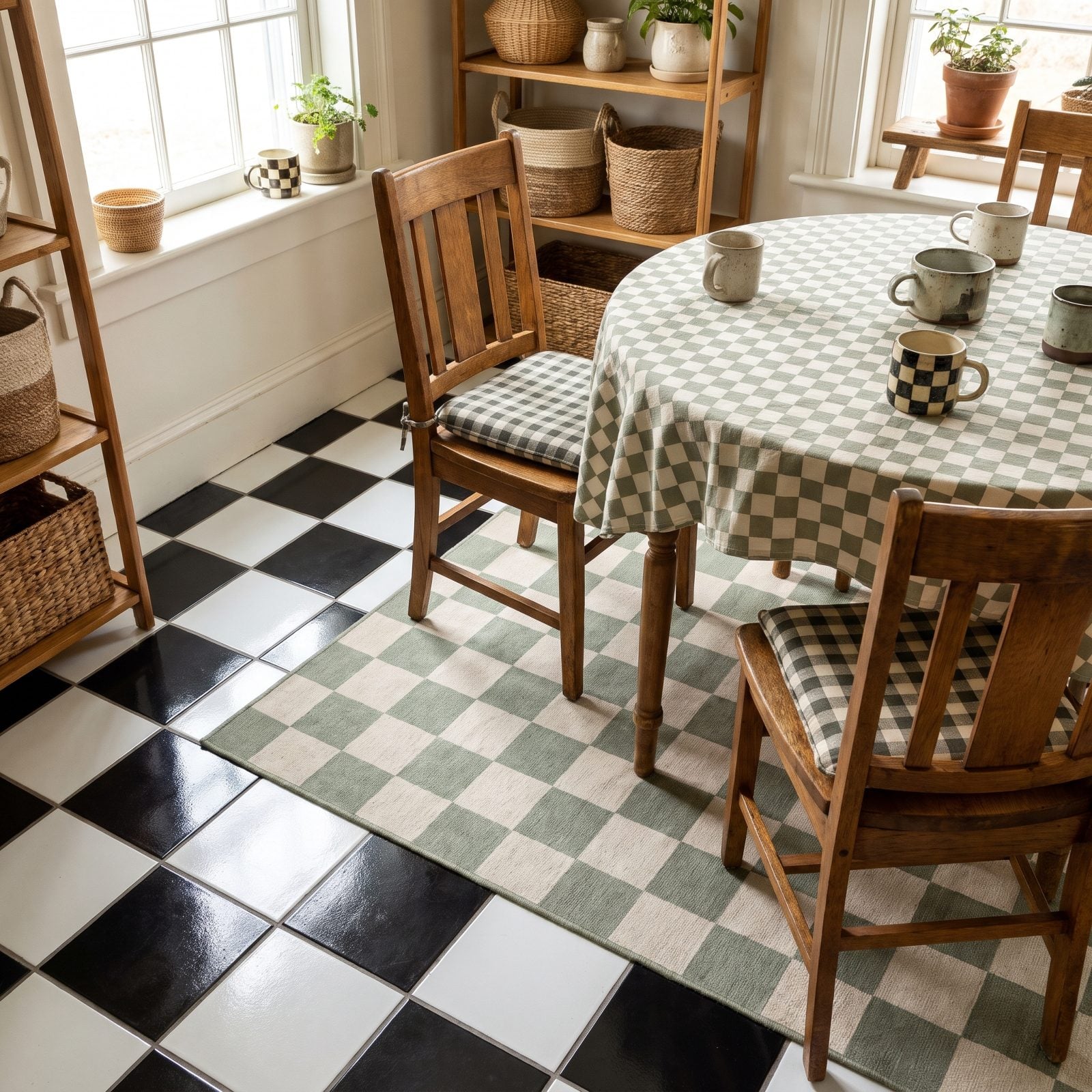
Checkerboard came roaring back and promptly landed on everything — floors, rugs, mugs, wavy wall art, tote bags, throw pillows with wobbly little squares. For a while it was genuinely fun. Then came the overexposure, and fast, because a pattern that’s cheap to print and easy to love saturates a market in no time.
A real checkerboard marble or terracotta floor, laid to stay, will outlive the whole craze. It’s built into the house, not stapled on top of it. The printed-everything version is what’s set to date hard. By 2027 I’d bet solid colors and organic shapes feel like a cool glass of water after years of squares shouting from every surface. Pick one checkerboard moment per room. Let that one win.
30. Abstract Rainbow Motifs Painted on Every Spare Wall
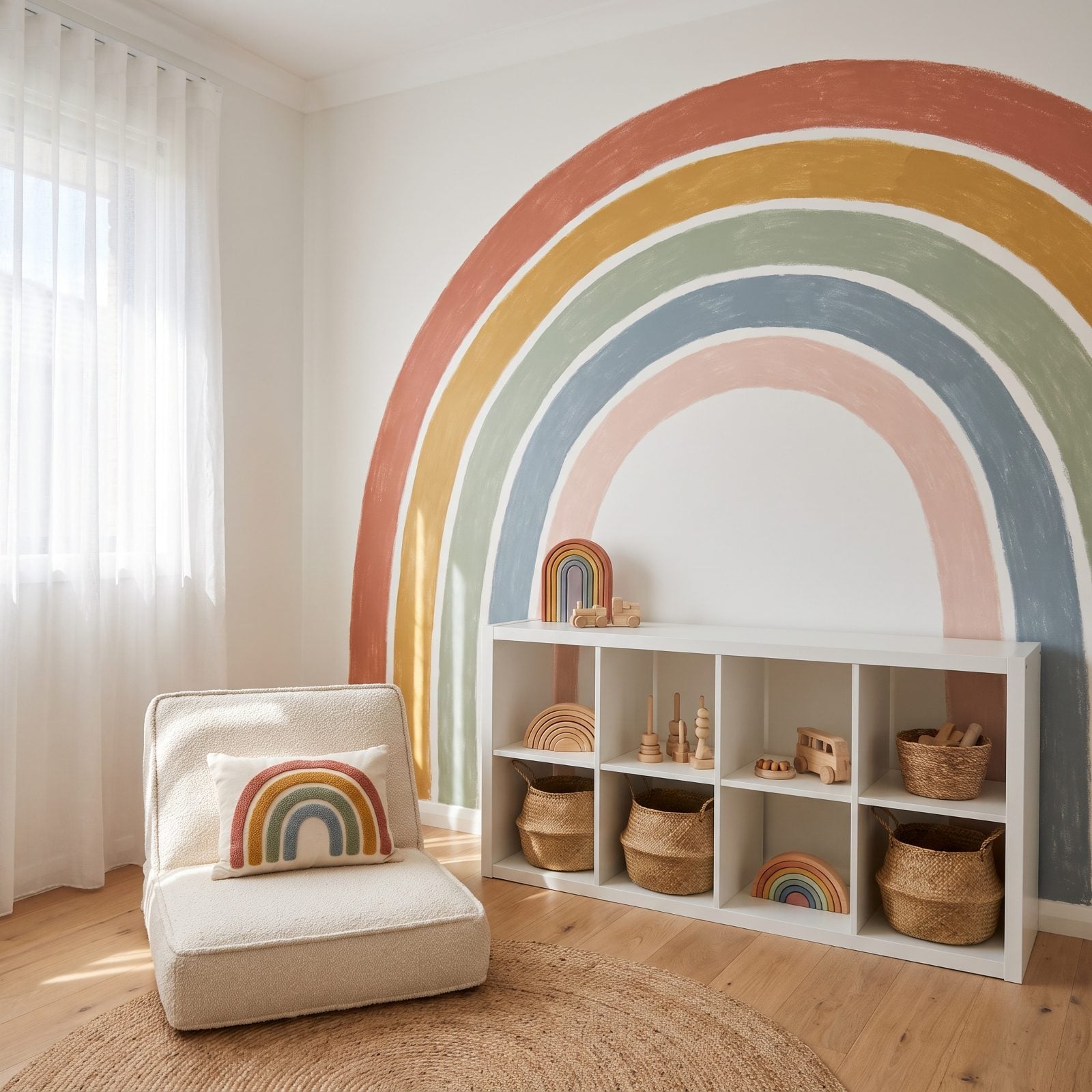
The muted terracotta-and-sage rainbow arch showed up on nursery walls around 2019 and never left. You know the one: that hand-painted curve above a Montessori shelf, usually echoed on the pillow and the night light too, until the whole room hums the same note.
What’s coming next is quieter. Designers now reach for a single curved shape, a soft hill or a half-moon, in one color instead of seven. Same gentle feeling. Far less visual sugar.
The rainbow isn’t offensive. It’s just everywhere, and everywhere is the fastest way for anything to start feeling like a date stamp.
29. Squiggles and Wavy-Line Patterns on Mirrors, Rugs and Cushions
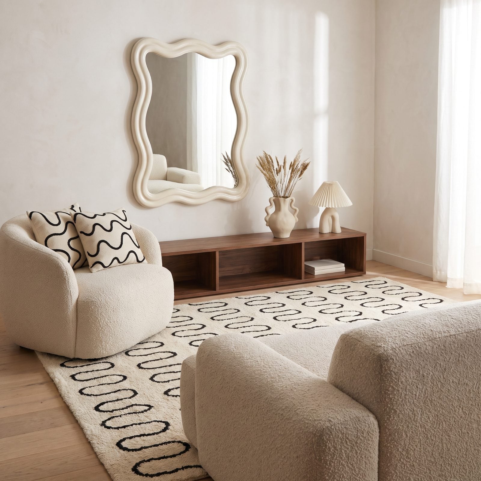
The squiggle was the 2021 shortcut to looking playful. It landed on mirrors, rug edges, candle holders, the rim of every ceramic vase, and for a while a wavy line was the whole personality of a room.
The trouble is it never meant anything. It was decoration about being decorative. Rooms are shifting back toward shapes that have a reason to exist: a genuine curve in the furniture itself rather than a doodle applied on top.
Keep one squiggle piece if you love it. A whole room of them ages like a font that was briefly cool.
28. Single-Line Face Drawings Framed Above the Sofa
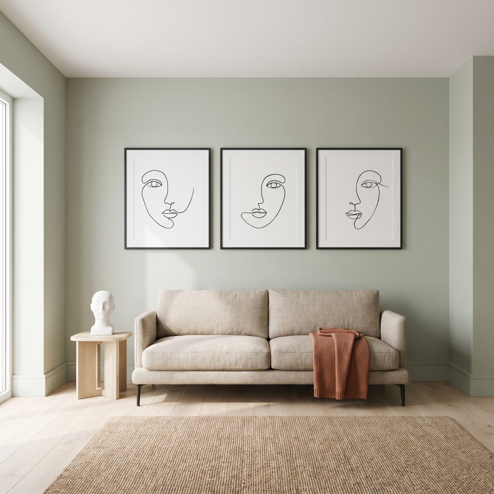
Picture the print that’s hung in every rental and coffee shop you’ve ever waited in: a face drawn in one unbroken black line, one eye, a swoop for a nose. Cheap. Matisse-adjacent. Printed by the million.
That ubiquity is the whole problem. Walking into a room with line-art faces tells you more about the year it was decorated than about the person who lives there. Real art is replacing it now: a small original, a thrifted oil, a framed botanical pressing, anything with a hand and a history behind it.
27. Rustic Word Signs and Motivational Quote Art
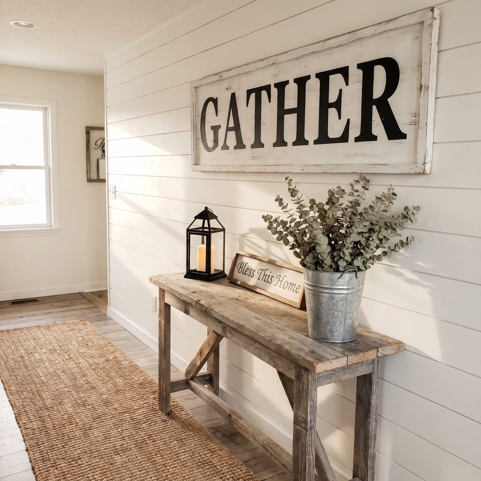
GATHER. LIVE LAUGH LOVE. BLESS THIS HOME. The distressed wooden sign had a good decade, and there’s no kind way to put this: your room shouldn’t need a caption to explain what it’s for.
Designers are swapping literal words for texture and material. A plaster relief, an old framed map, a woven textile, the kind of thing that creates a mood instead of spelling one out. The warmth you wanted from GATHER comes through better from a real wood bowl and a lit candle than from a sign ordering you to feel cozy.
26. Neon Script Signs Glowing in the Corner
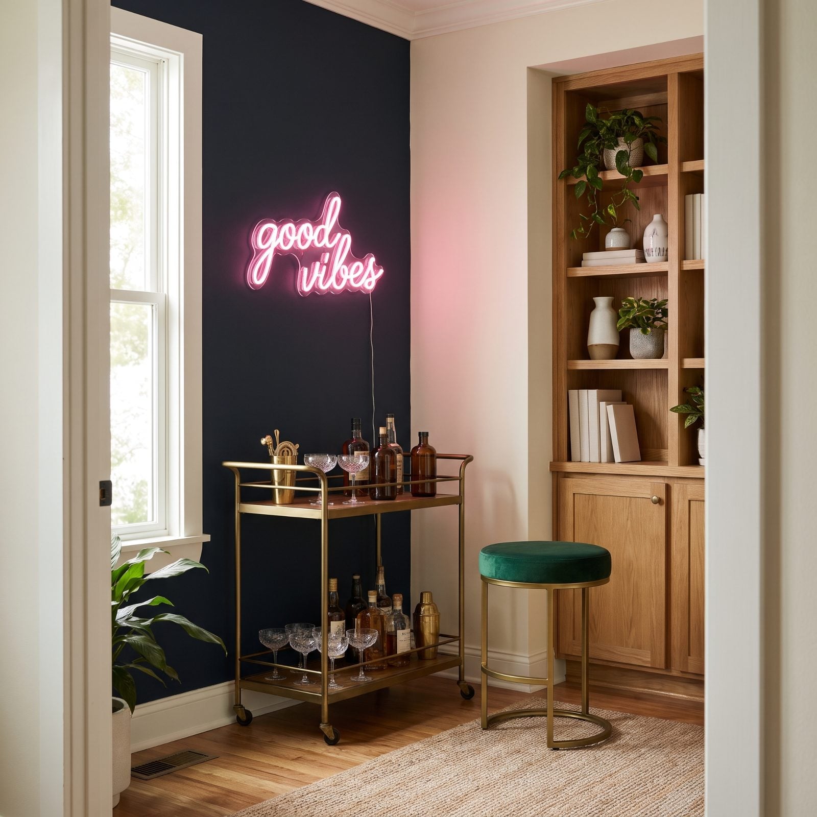
The pink cursive neon reading ‘good vibes’ or ‘but first, coffee’ felt like nightlife brought home around 2018. For a wedding backdrop or an actual bar, it still has a job to do.
In a living room it increasingly reads like a prop. What’s replacing it is warmer and quieter: a sculptural table lamp, a dimmable paper lantern, a wall sconce that casts a real glow instead of spelling out a slogan.
Nobody needs their wall to announce its mood in handwriting. Good light does the vibe without the vocabulary.
25. Felt Letter Boards Propped on the Mantel
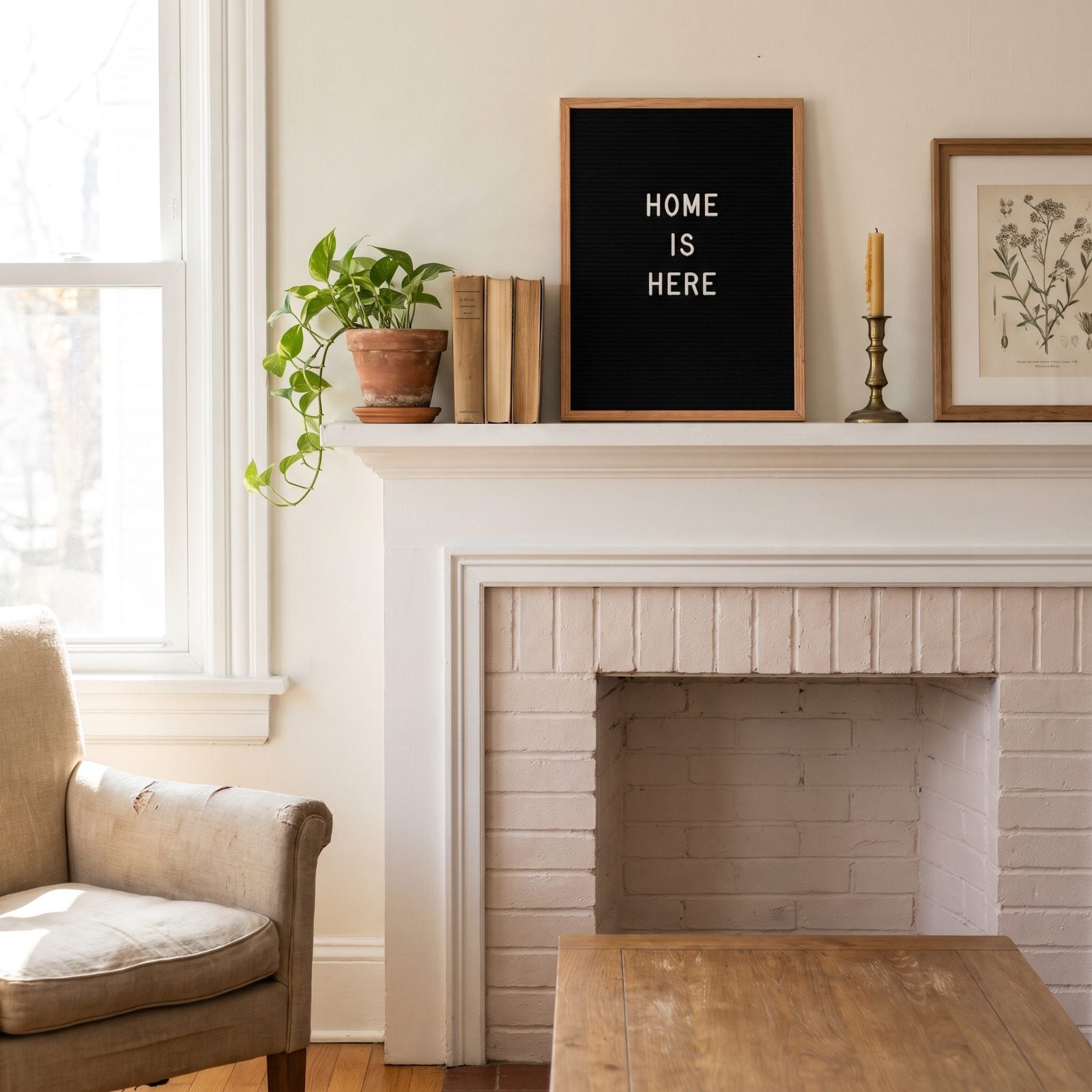
The felt letter board was the physical version of a caption. Clever on day one, a chore to rearrange by day ten, and quietly gathering dust by month three once you’d run out of witty things to say.
What’s taking its place isn’t another gadget. It’s an almost-empty surface that breathes: a single good object, a stack of books you actually read, a bowl, a bud vase. The mantel doesn’t owe anyone a punchline.
24. Books Shelved Backward for the Beige Spine Look
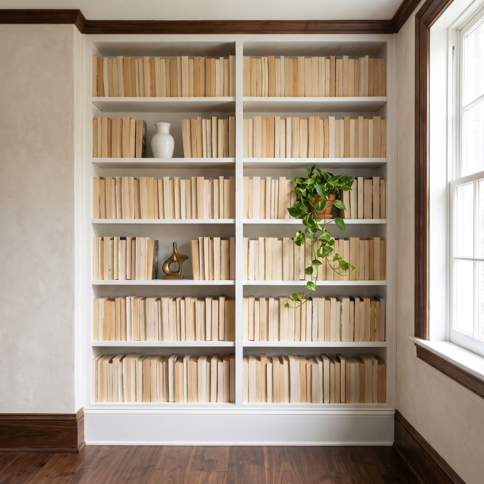
Turning books backward so the beige page edges face out gave you a tidy neutral wall and no way to find anything. It was styling that fought the entire purpose of owning books.
The shift is toward shelves that look lived in. Spines out, colors and heights a little uneven, a few objects tucked between, the odd book laid flat with something resting on it. A real reader’s shelf tells you who they are; a wall of hidden titles just tells you someone watched a staging video.
23. The Decorative Blanket Ladder Leaning in Every Corner
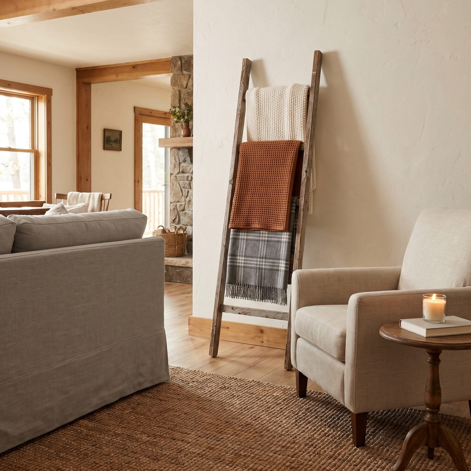
A ladder you can’t climb, holding blankets you never reach for. The decorative blanket ladder promised rustic warmth and mostly delivered a dust magnet in the corner.
Storage is going back to being storage, which is a relief. A low basket by the sofa, a lidded bench, a closed cabinet, the places blankets actually live and get used. The throw you grab on a cold night beats the one artfully draped and permanently off-limits.
If you love the wood, fine. Just let it hold something you touch.
22. The Overstyled Three-Tier Tray Vignette
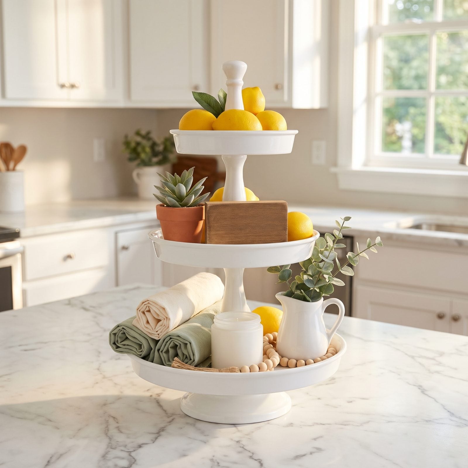
Faux lemons, a mini succulent, a tiny sign, rolled napkins, beads, a candle, all crammed onto a three-tier stand like a diorama of a farmhouse that doesn’t exist. The tiered tray vignette turned counters into museum displays of nothing in particular.
Simplicity is winning. One good tray with the two or three things you actually use: salt, a bottle of oil, a bowl of real fruit. Counters are for living on, not for curating into a shrine to seasonal micro-decor.
21. The Towering Vase of Bleached Pampas Grass
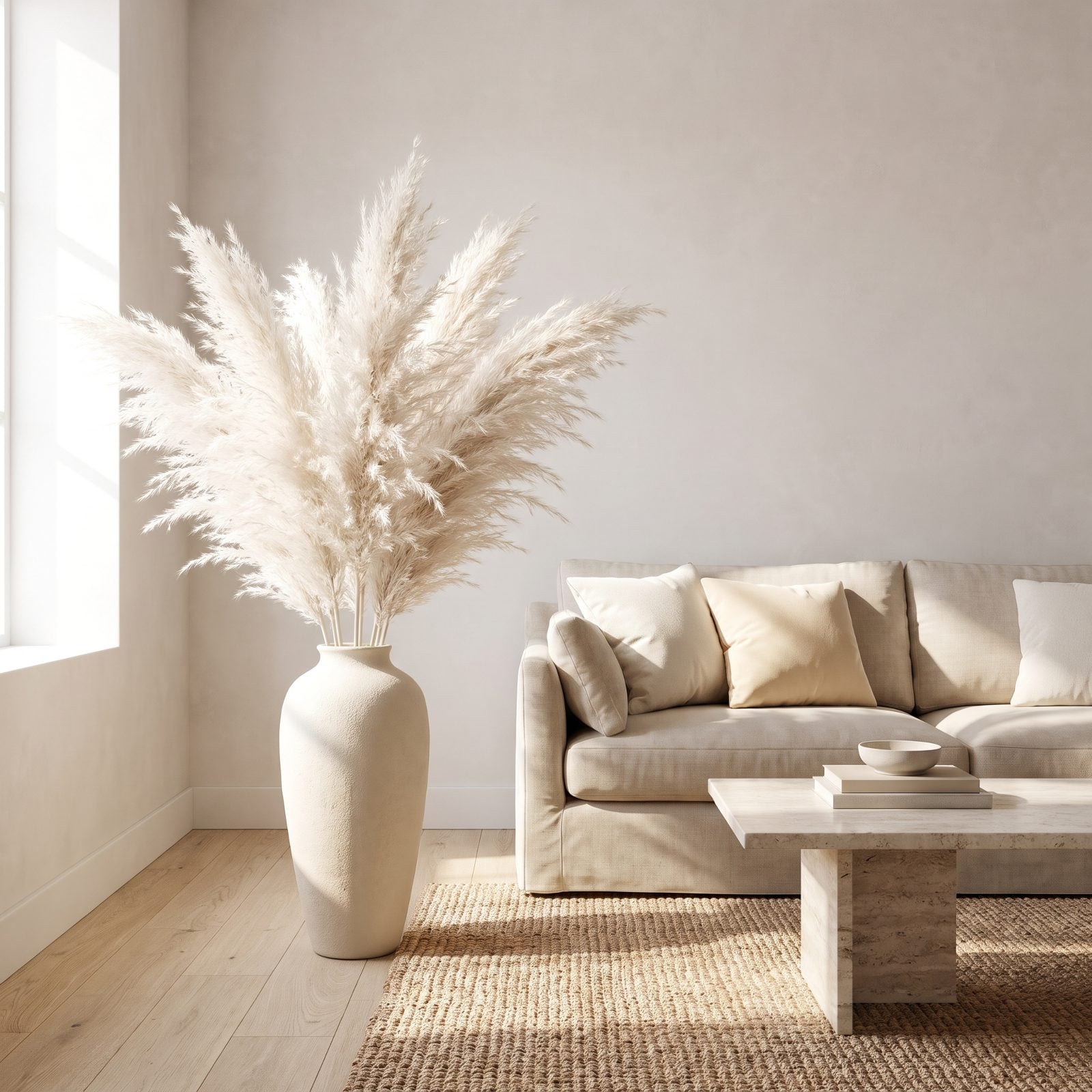
Bleached pampas grass was the dried-floral darling of the late 2010s, fanning out of floor vases in every neutral apartment on the internet. It also sheds like a shaggy dog and gathers dust in places you can’t quite reach.
Greenery with a pulse is replacing it. A real olive tree, a trailing pothos, branches cut from the yard, stems that change with the season. Live plants clean the air and quietly announce that somebody actually tends this room. Pampas just announces the year it was bought.
Shake a plume out over a dark floor sometime. You’ll understand why it’s on its way out.
20. Clusters of Tiny Potted Succulents on Every Shelf
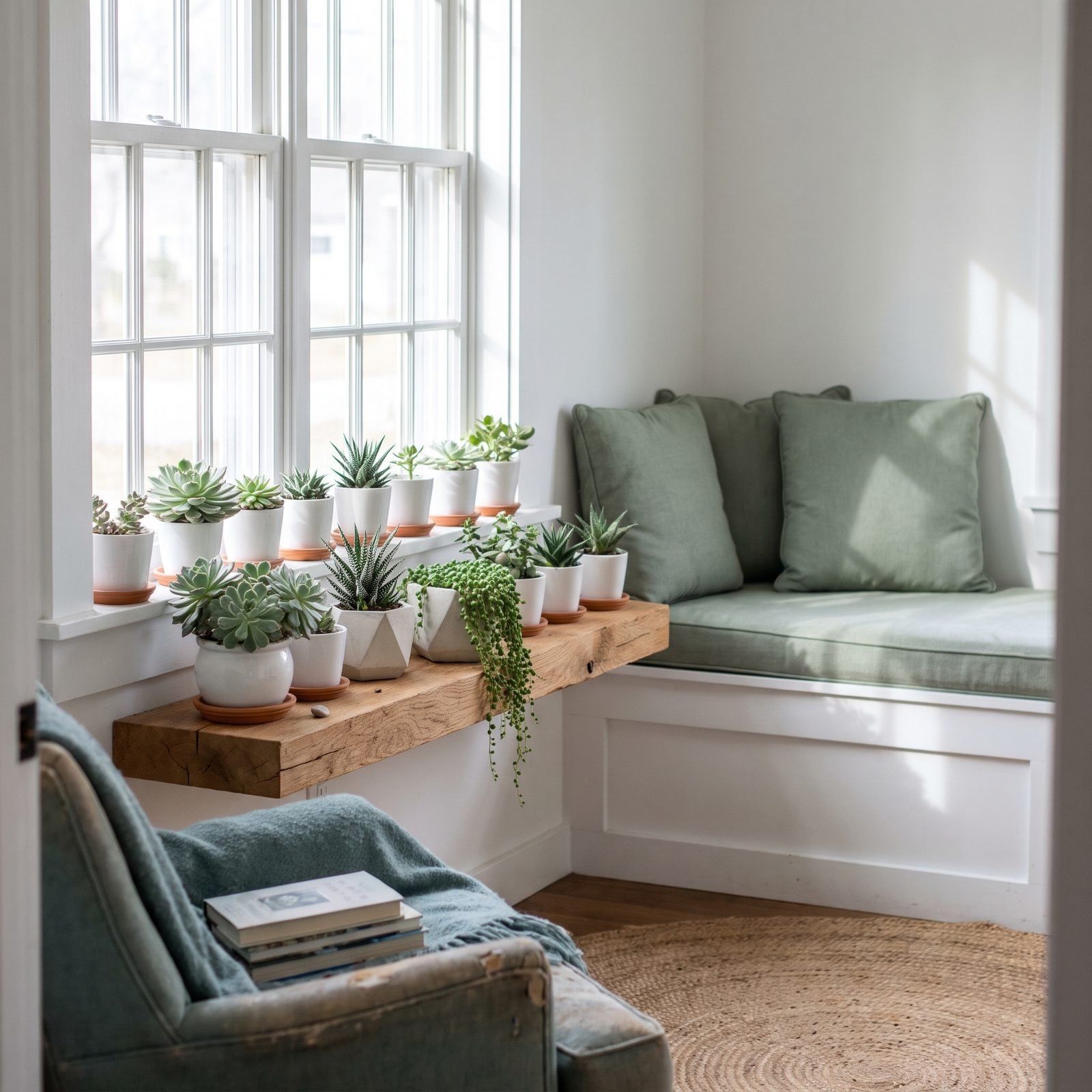
The little army of thumb-sized succulents reads as 2016 the second anyone walks in. Half of them are plastic by now anyway, and the real ones have quietly rotted from overwatering because nobody can resist fussing over something that small.
What’s taking their place is one plant with presence. A single big specimen, a fiddle-leaf fig or a mature snake plant or one sculptural agave in a heavy pot that earns its spot on the floor. Scale does the talking.
19. Oversized Macrame Wall Hangings Behind the Bed
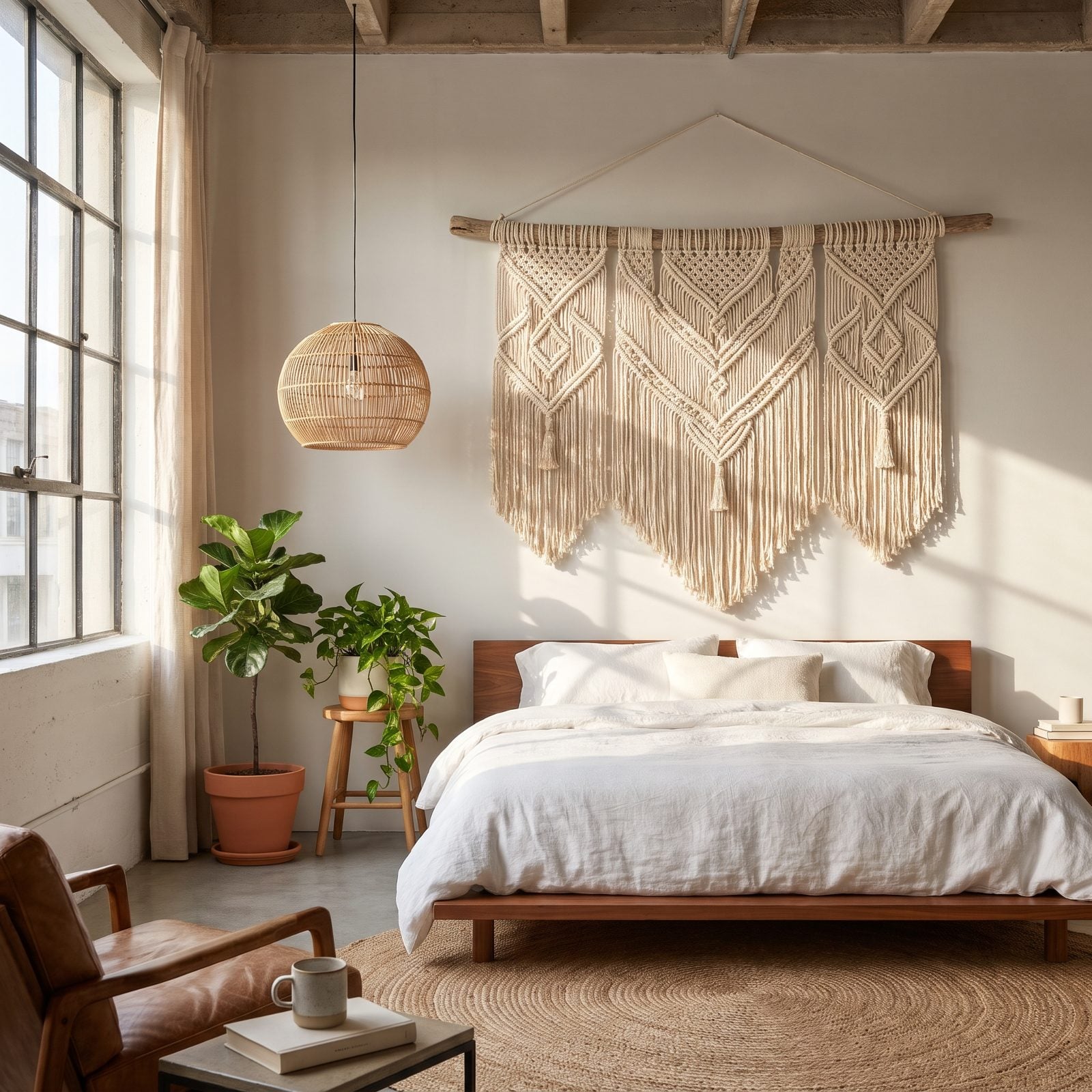
Every rental, every Airbnb, every first apartment had the same cream knotted curtain hanging over the bed around 2018. It arrived as a handmade craft and left as a mass-produced shortcut, and that’s the problem. The moment something handmade shows up identically in a thousand homes, the charm drains out.
The replacement leans into real texture and real story. A vintage woven textile, a framed botanical print, a piece of art you actually had to think about. Walls are getting opinions again.
Hold onto one too long and it collects dust in the fringe like nobody warns you about.
18. Indoor Hanging Egg Chairs in the Living Room
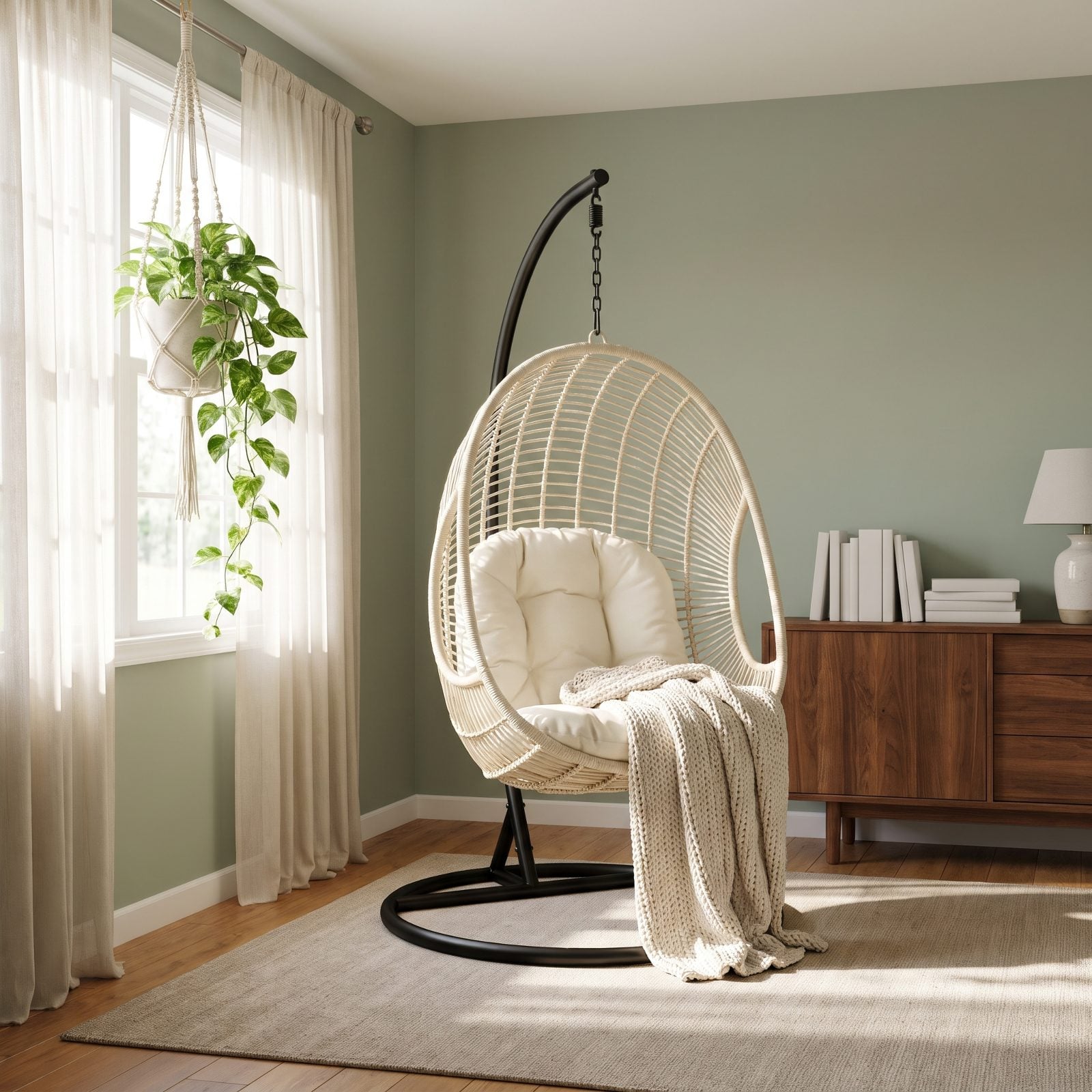
Nobody ever actually sits in these comfortably. The hanging egg chair looked incredible in the listing photo, then turned out to be a wicker basket that swallows you whole and demands a running start to exit. Form way ahead of function.
Coming in to replace it: a proper reading nook with a real armchair, a floor lamp, and a side table that holds your coffee without the whole thing swaying. Comfort you can use on a random Tuesday, not a prop.
17. Cane-Front Furniture Spreading to Every Room
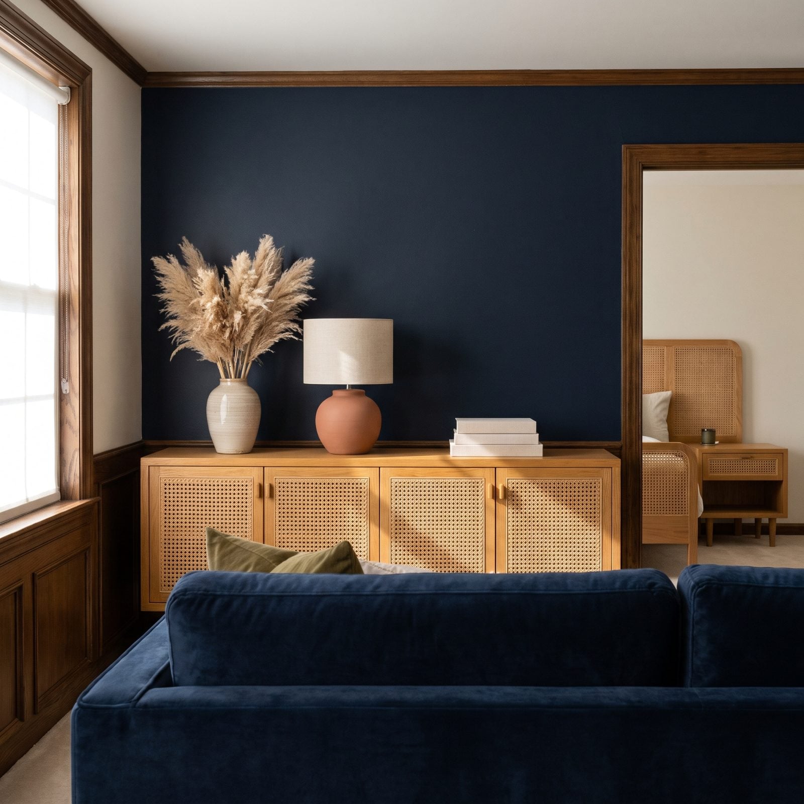
Cane webbing is lovely. The trouble is it stopped being an accent and became the entire house. Cane headboard, cane nightstand, cane sideboard, cane console, cane bar cart. When every piece wears the same woven panel, the whole room flattens into a catalog spread.
The fix is one cane piece as a note rather than the whole song, mixed with solid wood, lacquer, and smooth upholstery so your eye has somewhere to rest. Restraint reads as a considered room now.
16. Cream Boucle Statement Chairs in Every Corner
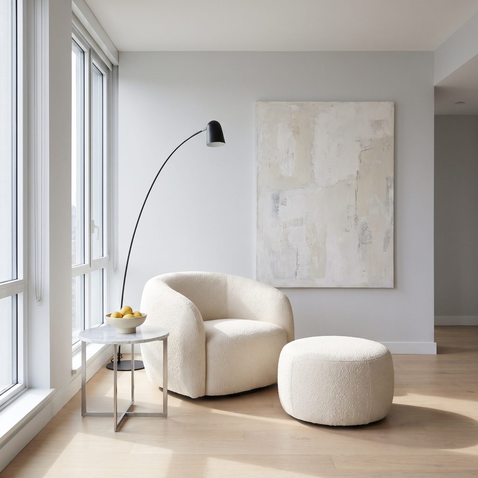
The curvy cream boucle chair was the most photographed piece of furniture of the last few years, which is precisely why it’s starting to feel like a uniform. You’ve seen it in the showroom, the hotel lobby, the dentist’s waiting room, and three friends’ living rooms. Ubiquity kills cool.
Then there’s the practical betrayal nobody mentions. Cream boucle attracts red wine, dog hair, and the one guest who eats spaghetti over the cushion.
Watching rooms fill up with matching bouclé sofas, chairs and benches, a realtor who blogs design concluded: “Bouclé may be the perfect example of a trend that went too hard, too fast.”
15. Low-Slung Cloud Sofas That Swallow the Room
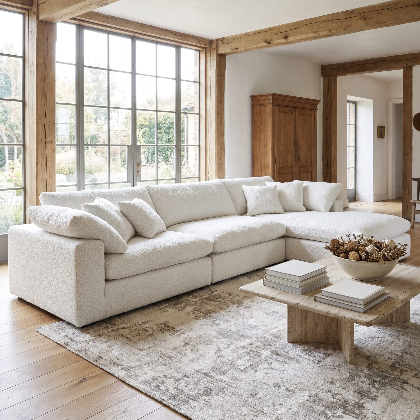
Looks like a marshmallow, sits like quicksand. The ultra-low cloud sofa with feather-stuffed cushions photographs like a dream, then slowly deflates into a pile of wrinkled slipcovers you have to fluff after every single sitting.
Anyone over 50 figured out the real problem fast: hauling yourself up off something that low and that soft is a genuine project. So the replacement comes with actual back support, firmer cushions, and a seat height your knees will thank you for. Tailored is winning over slouchy.
Comfort that fights you isn’t comfort. It’s a nap trap.
14. Scalloped Edges on Every Single Accessory
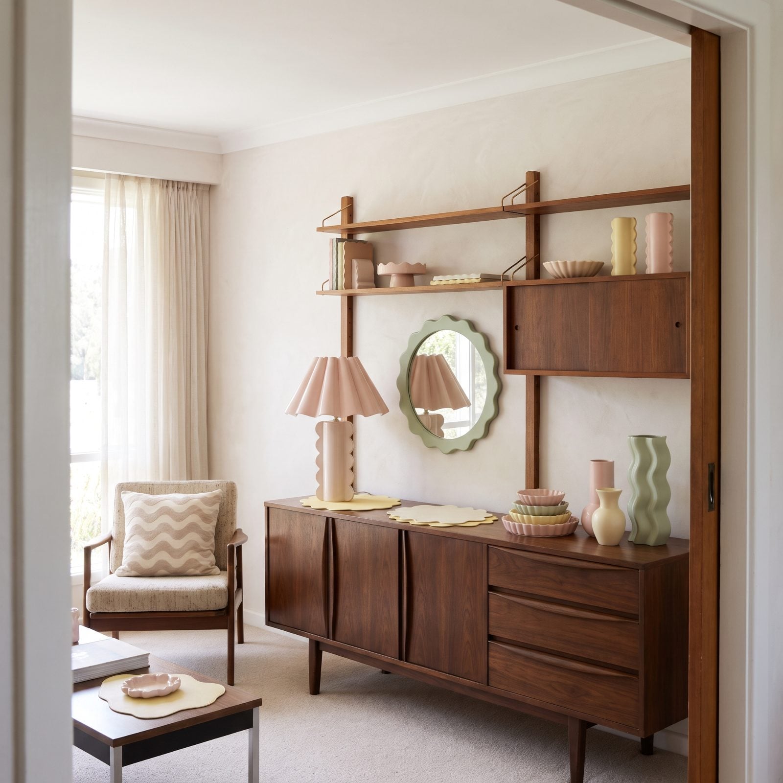
The scallop started as a sweet little detail on a lampshade, then it spread like a rash. Scalloped mirrors, scalloped trays, scalloped placemats, scalloped headboards, scalloped planters. Once a single motif takes over every object in a room, the place reads like a themed gift shop.
What’s replacing it is cleaner lines with one playful shape used once, on purpose. The trend didn’t fail because scallops are ugly. It failed because we slapped them on everything and the delight wore off by object number nine.
13. Fluted and Reeded Cabinets Everywhere
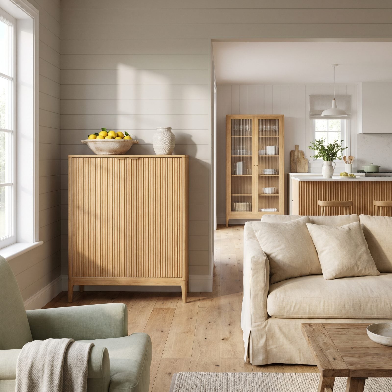
Those vertical ridged panels turned up on cabinet doors, then kitchen islands, then bar fronts, then the reception desk of every new cafe. Fluting was genuinely fresh for a minute. Then it went everywhere, and anything that goes everywhere gets a timestamp.
The move now is flat, calm surfaces, with the character coming from the wood itself, the hardware, the proportions. One more thing: those grooves pack dust into every channel, and there’s no quick way to wipe them out.
Comparing fluting to chevron tile and shiplap, one design firm founder explains: “Once every cabinet manufacturer and furniture company adopted it, the detail lost much of what made it special. When a detail becomes the default rather than a deliberate design decision, it starts to feel dated much faster”
12. Hairpin-Leg Tables and Benches as Default
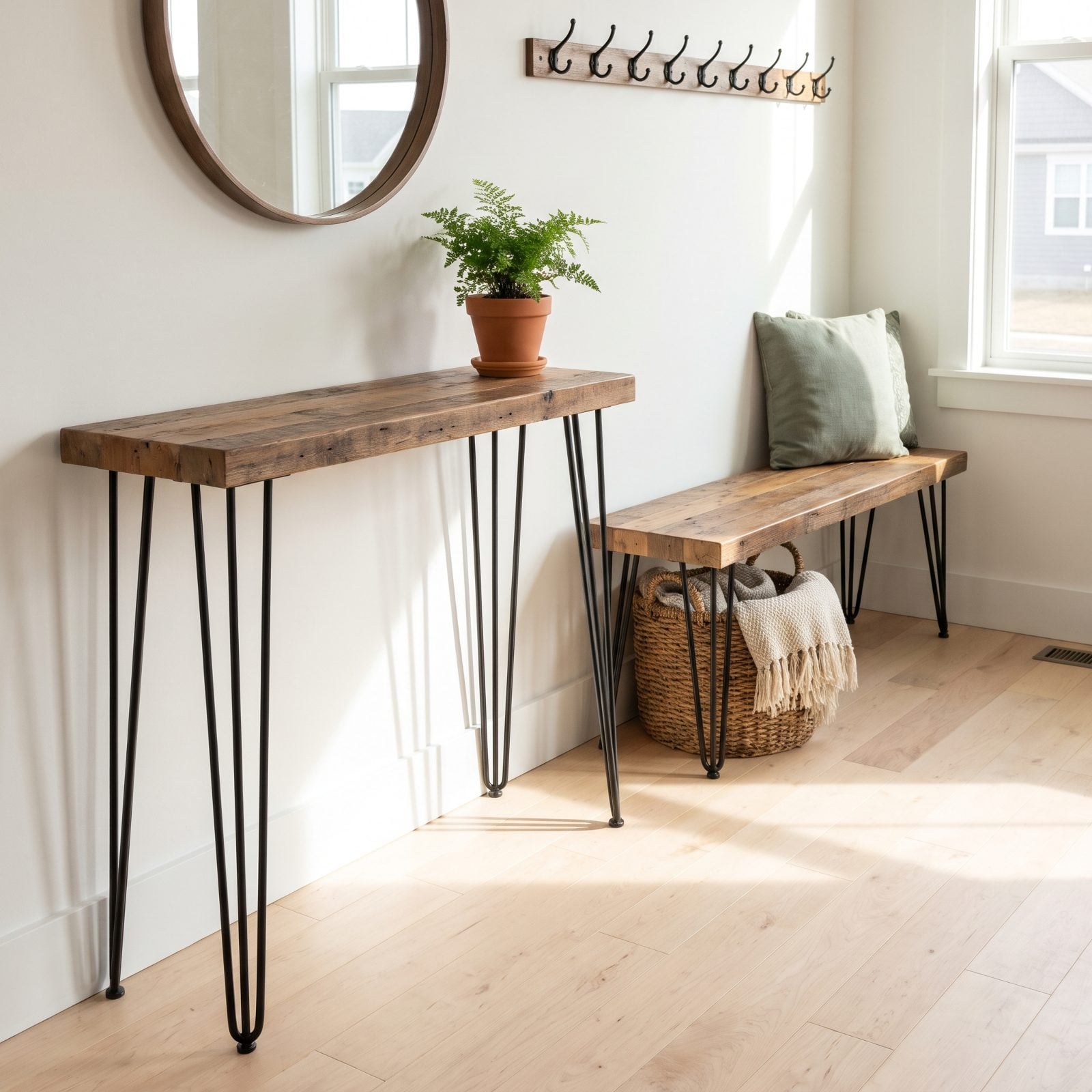
The slim three-rod metal legs under a slab of reclaimed wood defined the DIY era so completely that the design now announces exactly which year it was made. Hairpin legs were everywhere because they were cheap and easy to screw on, which is also why they read as a shortcut now.
Furniture is getting its legs back. Turned wood, tapered pedestals, proper bases with weight. The spindly metal look is giving way to pieces that can hold their ground.
11. Industrial Pipe Shelving Bolted to the Wall
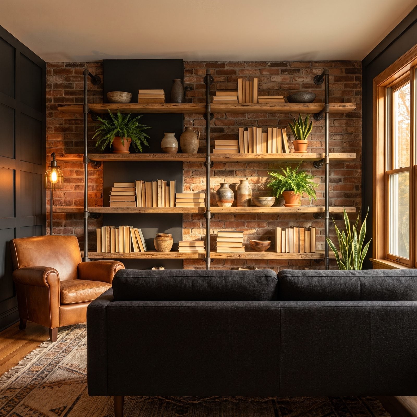
Black pipe fittings and raw-edge planks defined the loft-coffee-shop look for the better part of a decade. Every home bar, every open kitchen shelf, every reclaimed-wood TV stand carried that gas-pipe hardware. Warehouse cosplay, basically. And warehouse cosplay has run its course.
Softer built-ins are moving in: floating wood shelves with hidden brackets, painted millwork, cabinetry that hides the mess instead of staging it on display.
10. Farmhouse X-Back Dining Chairs
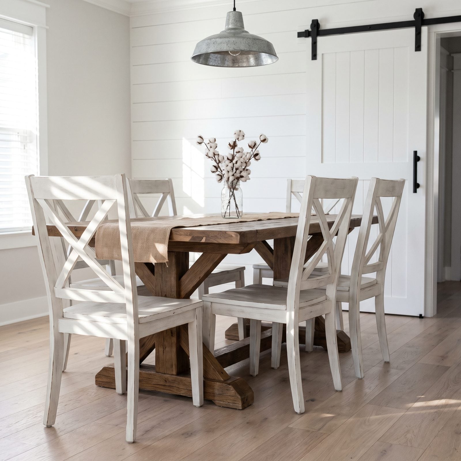
You’ve sat in these at a hundred dinner parties since 2015 — the cross-back silhouette, the chalky distressed paint, the weathering someone added with a sander. For a good long run it read as cozy.
The problem is the manufactured age. Real farm chairs earned their wear over decades of elbows and spilled soup; these arrived pre-faded off a truck, and by now the eye knows the difference at a glance. What’s moving in instead? Solid-wood chairs with clean, unfussy lines, spindle backs in warm walnut or oak, upholstered seats in leather or linen that bring comfort without the costume.
9. Oversized Chunky-Knit Blankets
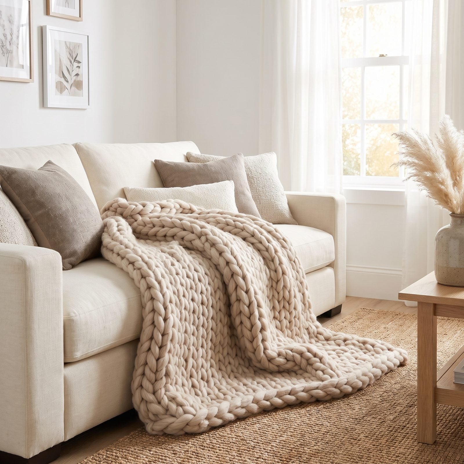
Peak pandemic comfort object. The arm-knit merino throw with loops the size of your fist landed on every sofa and every grid around 2020, and it did its job through a strange couple of years.
The catch nobody mentions? Those giant stitches snag on everything, flatten within months, and shed like a long-haired cat that’s given up. The look is tipping toward finer knits, waffle-weave cotton, and proper wool throws with a visible edge or fringe — texture you can actually live with, not just photograph.
8. Cowhide Rugs
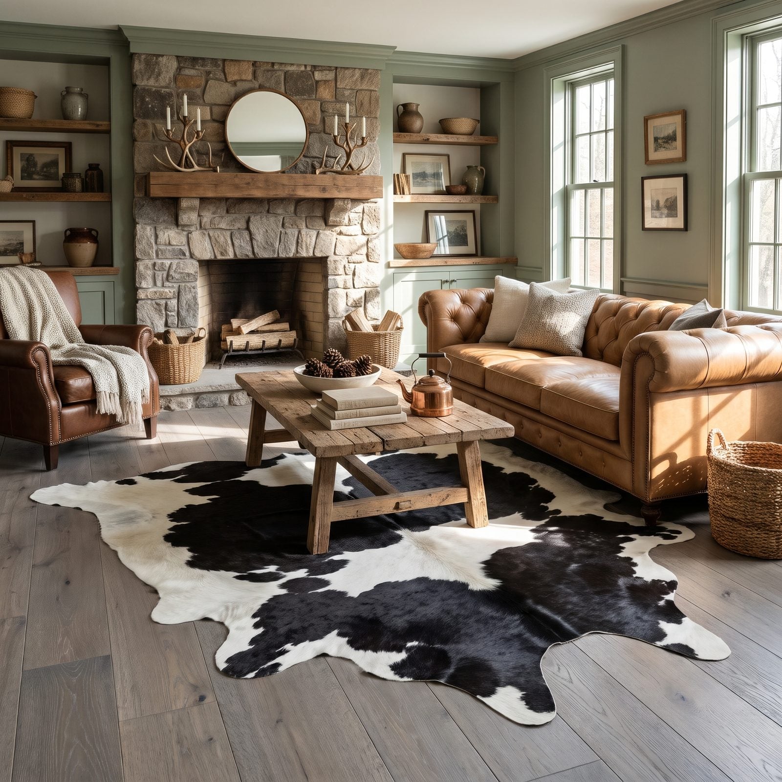
There’s a specific room the cowhide rug built: leather sofa, antler everything, a stone fireplace trying very hard. For about a decade it signaled rugged and a little glamorous at once.
The shift away is partly taste, partly ethics. Buyers increasingly want rugs that feel chosen rather than bagged, and that irregular hide outline picks a fight with every other line in the room. Wool flatweaves, vintage-washed Persians, jute and sisal — they warm a floor without announcing anything.
7. Mushroom-Shaped Lamps
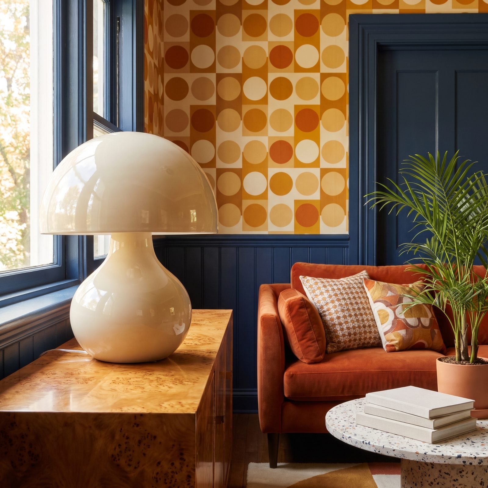
The mushroom lamp had a genuine moment. Rounded dome shade, bulbous base, that friendly 1970s curve turning up in ceramic, glass, and glossy enamel across the design feeds around 2021 and 2022.
Trends that peak that fast tend to fade just as fast. The mushroom became shorthand, and shorthand ages. What’s replacing it reads quieter — sculptural ceramic bases in matte finishes, alabaster, lighting that looks like a small object in its own right rather than a wink at a decade.
6. Exposed Edison Bulbs in Black Metal Cage Fixtures
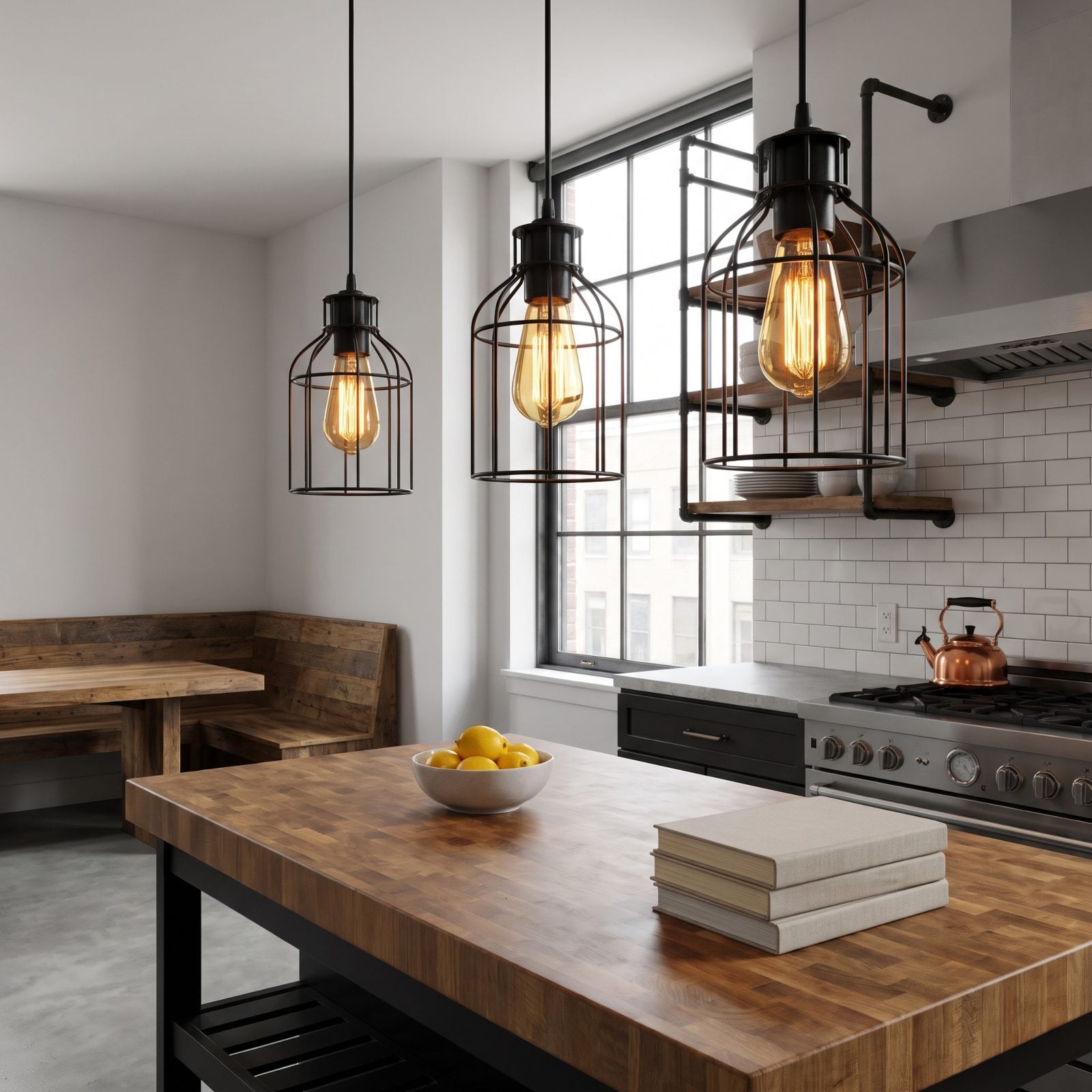
Every coffee shop that opened between 2012 and 2018 had these. Black metal cage, a fat amber Edison bulb glowing inside, filament on full display. It marched straight out of cafes into home kitchens and never quite left.
Two things dated it. The bulbs throw warm, dim, genuinely terrible light for actually cooking, and the whole industrial-loft mood has softened across the board. People are moving to fixtures that light a room properly — frosted globes, aged-brass finishes, shades that diffuse instead of glare.
5. Mason-Jar Chandeliers
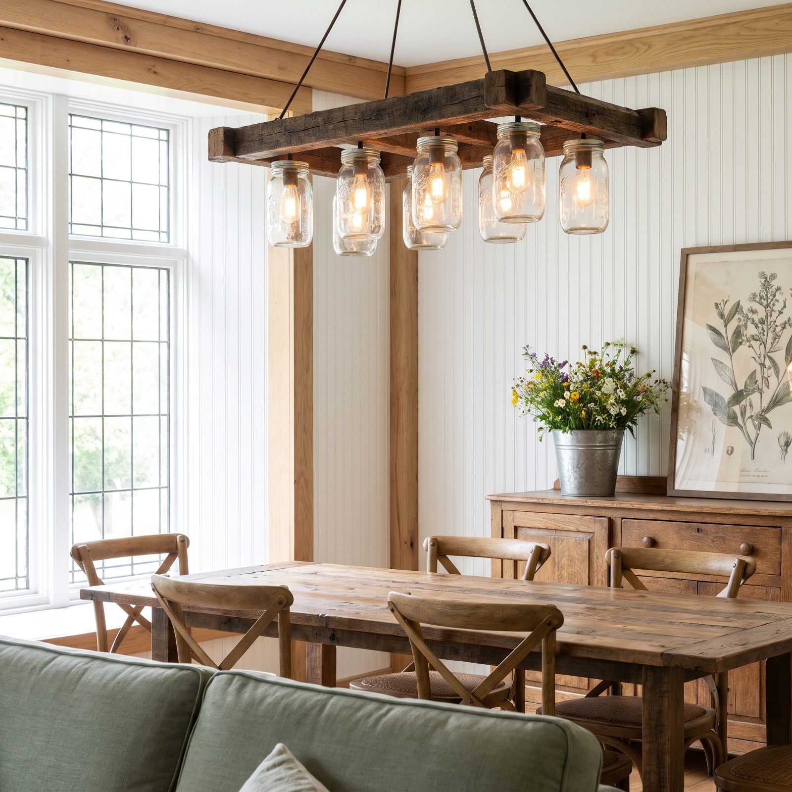
This one goes straight to a very specific era of DIY. The mason-jar chandelier, usually a reclaimed-wood frame with a bulb tucked in each jar, was the centerpiece of a thousand weekend craft projects and barn weddings.
Charming for about a year, then it just looks like a jam shelf wired for electricity. The jars collect dust fast, the light lands unevenly, and the whole thing loses its wink. Simpler clear or seeded-glass pendants are replacing it, keeping the glow and losing the craft-fair energy.
4. Sputnik Chandeliers
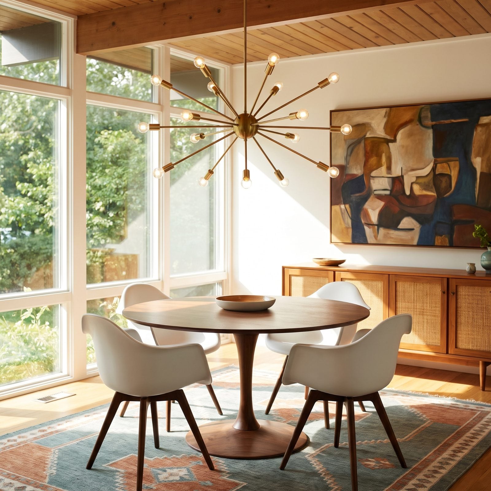
The brass starburst, arms radiating in every direction. The Sputnik rode the mid-century revival hard, and for a while it was the fastest way to signal a room had taste.
Ubiquity kills a statement piece. When a fixture turns up in every builder-grade new build and every flip, it stops saying anything at all. Designers are pivoting to softer sculptural lighting — organic plaster forms, linear fixtures, oversized single pendants that hold a room without the spiky retro wink.
3. Clusters of Clear Globe Pendants
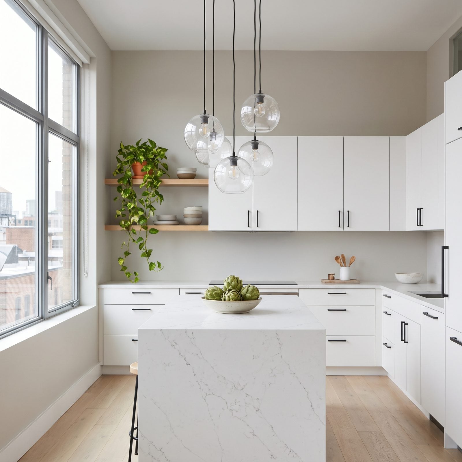
The staggered bouquet of clear glass globes over the island. Slim black cords, bulbs floating inside perfect spheres at different heights — the modern-kitchen move for years running.
Here’s what happened. The cluster photographs beautifully and dates in total silence, which is a sneaky way to go out of style. It’s become the predictable pick, the thing a spec home grabs to look current. Single oversized pendants, pleated fabric shades, warm-metal fixtures with real presence are stepping in. One confident light beats five tentative ones.
2. Oversized Rattan Pendant Lights
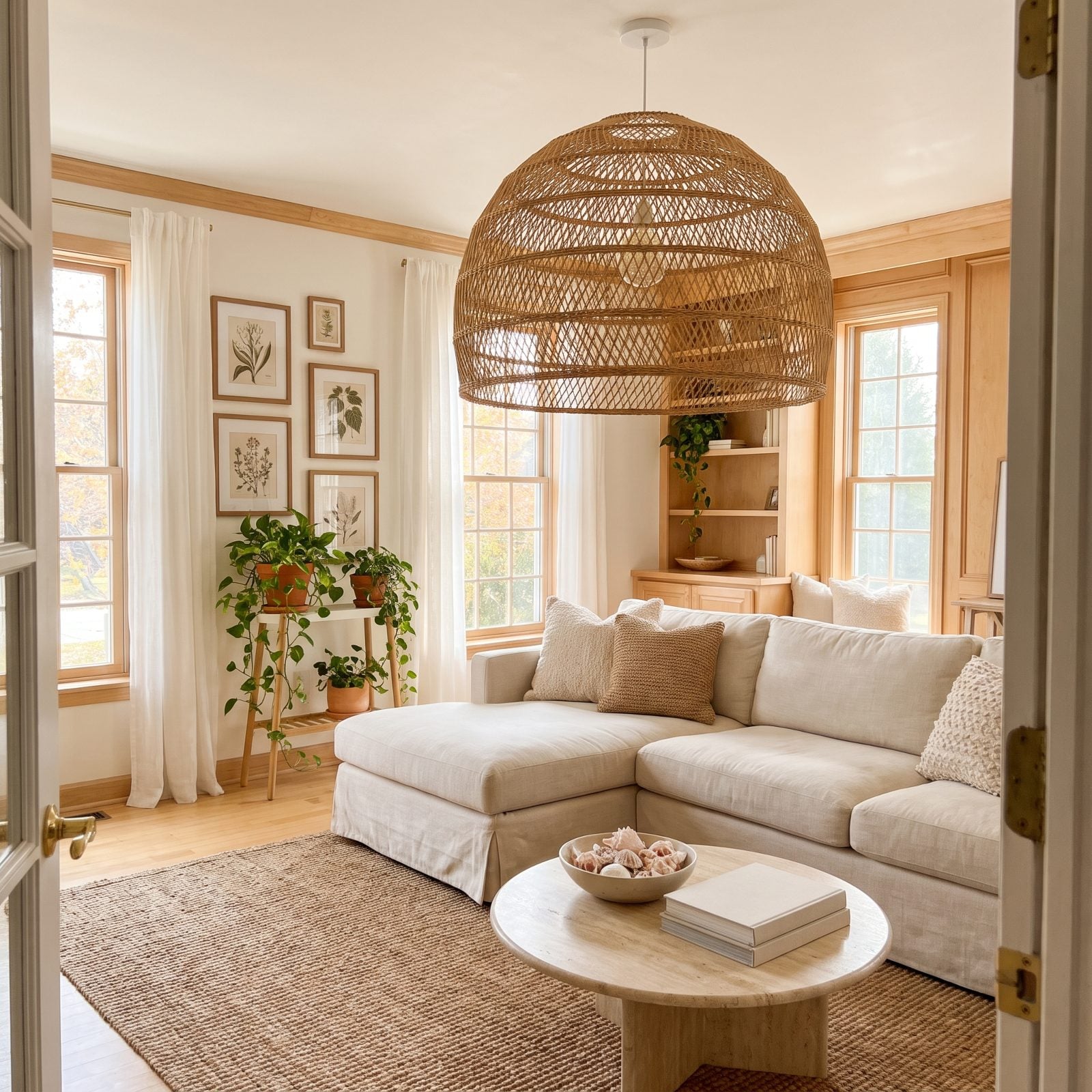
The giant woven dome that defined coastal and boho rooms from roughly 2018 onward. Big enough to count as furniture, throwing those lacy basket-weave shadows everyone loved.
Scale is where it went sideways. The oversized versions swallowed smaller rooms whole, and the look got so common it lost its warmth. Natural materials aren’t going anywhere — but the direction is subtler now. Smaller woven shades, paper and rice-paper lanterns, mixed-material fixtures where rattan is an accent instead of the whole performance.
1. Irregular Wavy Mirrors
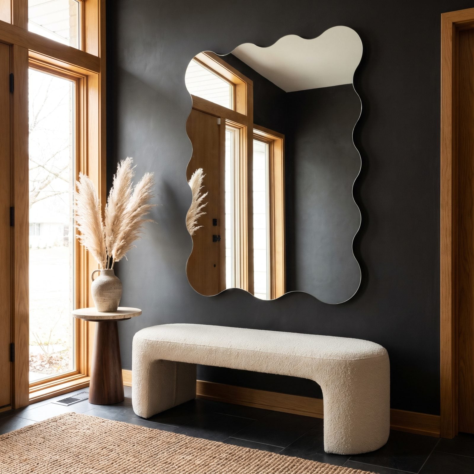
The frameless mirror with the rippling, cloud-like edge. It exploded across social feeds around 2021 as the easy way to make a wall look artful without committing to actual art.
That ease is the whole problem now. The wavy mirror became the single most cloned object in entry-level decor, available everywhere for twenty bucks, which drained off whatever originality it once borrowed from real Italian design. Arched mirrors, antiqued and smoked glass, genuinely sculptural pieces with heft are moving into its spot. The curve isn’t dead. The everywhere-ness is.